Versal
Letters &
Coloured
Capitals
NOTES ON CONSTRUCTION OF VERSALS
(See figs. 80, 81, 85, 165)
Versal Letters are properly built-up (p. 255) with
true pen-strokes (b, fig. 81). Drawn or painted,
they acquire a different character (p. 256). Their
office being to mark important parts of the text,
they are generally distinguished by colour and free¬
dom of form—tending to curves and flourishes.
The pen has an extra long slit (f inch to § inch),
and the writing-board may be lowered (see fig. 46, b)
to permit of the thick, liquid colour running out
freely. The nib is of the ordinary shape (but not
too oblique), and generally rather less in width
than the nib used for the accompanying text (я,
fig. 81. See also p. 257 and especially fig. 165).
The outlining strokes are quickly written and
immediately filled in, each letter being loaded well
with the colour, which thereafter dries evenly, with
a slightly raised “flat” surface. The liquid colour
should be fairly thick (see Colours, p. 142).
“Gothic lettering” is a term used for “Black-
letter” and related types, as distinguished from
“Roman” types. “Gothic” capitals tend to round¬
ness, the small-letters to angularity, but in each
the abrupt change from thick to thin strokes, and
the resulting contrast of stroke, are characteristics
—the outcome of penwork.1 Versals, though pri¬
marily Roman letters,2 have this contrast strongly
marked ; the ends of the thinner strokes spread (see
p. xxiii), and the heavy parts are crossed by thin serifs.
The early Versals approaching the “Roman
1 The pen, in direct proportion to the breadth of the nib,
tends to give a “Gothic” character to all letter forms.
* See Plate 5 in “Manuscript & Inscription Letters.”
84
Letter” (p. 258) make excellent models, the later
ornate “Lombardie” type (p. xxx) is not so safe.
Versals are capable of great variety, and the “round”
or “square” D, E, H, M, and W may be used at
pleasure.
I The Stems curve in slightly on
d. either side. When they are very
tall the mid part may be quite
straight, imperceptibly curving out
towards the ends (b, fig. 82). This
gives an effect of curvature through¬
out the length, while keeping the
letter graceful and straight. The
head of a stem (especially of an
ascender) may with advantage be
made slightly wider than the foot
(fig- 83)- This applies generally to
all kinds of built-up capitals.
Ык
Fig. 83.
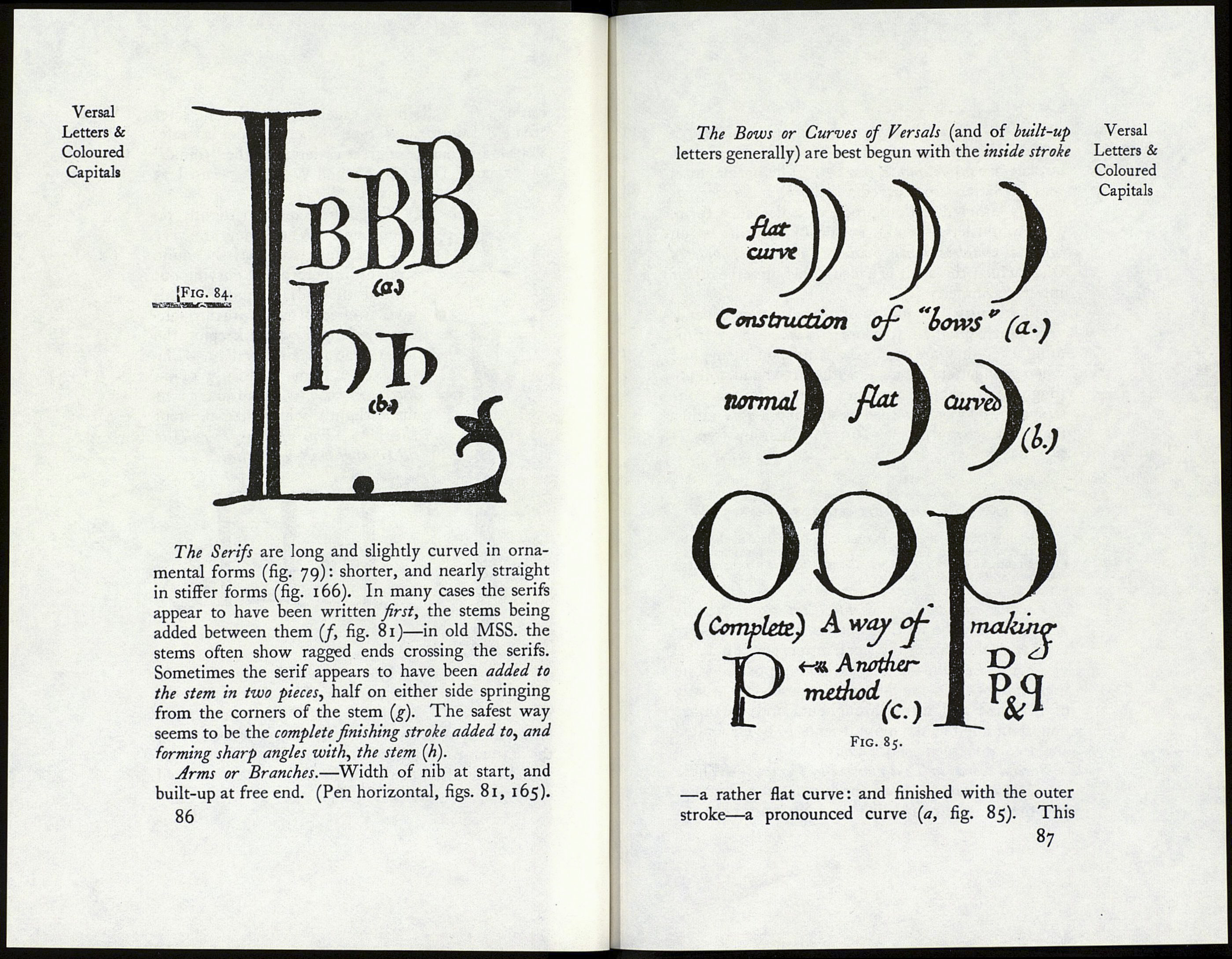
Fig. 82. The stem width may be nearly
the same in Versals of different
heights (a, fig. 84): generally the
letters tend to become more slender in proportion as
the letters grow taller (h). Very large Versals (or
initials) are often made with a hollow stem to avoid
a heavy appearance (L, fig. 84).
85
Versal
Letters &
Coloured
Capitals
