Versal
Letters &
Coloured
Capitals
ttianuti nel negatu
рттиШГш
fonda mtti
•ал Гипс-ч alia tin'
tta-udfubftatma
mmmfUC-ibecclu
aiutò dL nit namn
etmrnmcíTemtnt
tbcoficnr ипд efldt
umtfonîpô-muifi
^Ui^ufimufmlthio
cjuofc еСс. ratti
Certi- аіта nomina
tnmtaCpamfongc
tzmcum-fiuooiien
-i alia ümilm-Spin
luvtfmo.-гЬести
ne wftuigiuttairS
win. eflhngetuti
gmmun араяѵ-^
tfcfcuiqòpiarerefl
non biftmguiciit*a
fornita-*tfpf fondi
” enrnrcmnfj
temgemruf»
Fig. 79.
(13th century.)
80
own colour, or by
dotting, outlining, or
ornamenting them,
with a contrasting
colour (see fig. 79,
from an old MS.),
evolved the Illumi¬
nated Initial.
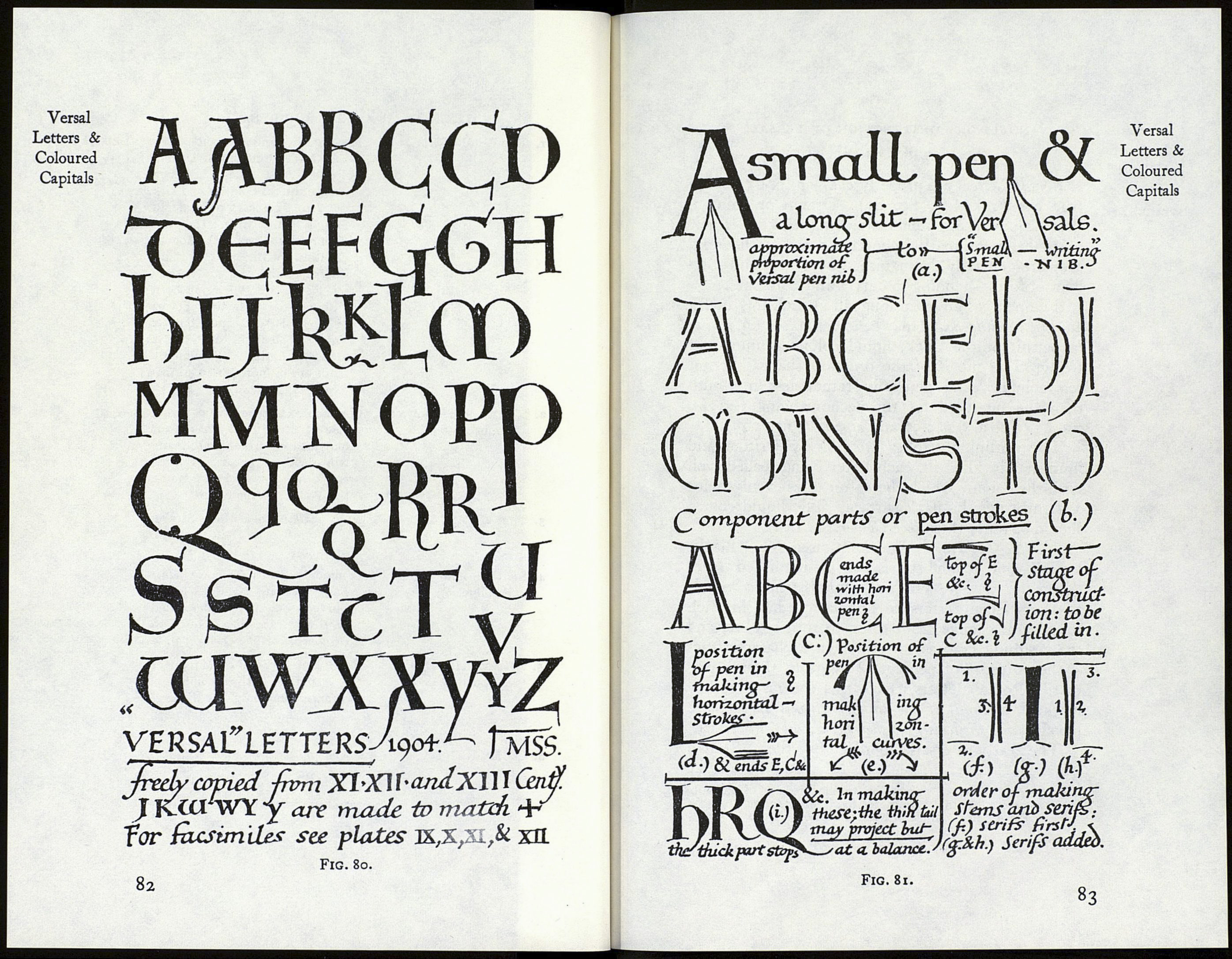
Types of Ver sal
Letters (examples :
Plates IX, X, XI,
XII, and figs. I, 78
to 94,150,161,165,
166, 189).—The
earlier Versals had
very simple and
beautiful pen shapes,
and are the best mo¬
dels for the modern
penman to follow.
After the fourteenth
century they were
often fattened and
vulgarised and over¬
done with ornament.
In this way they not
only lost their typi¬
cal forms; but their
“ essential forms ”
—as letters derived
from the Roman
Alphabet — became
much disguised and
confounded (see
fig. 128).
GENERAL ANALYSIS OF VERSALS
The LETTERS:
STEMS and Heavy
Limbs :
Thin ARMS, &c. :
SERIFS and
Terminals :
ARRANGING
& Spacing:
Essentially Pen-made and Com¬
pound—i.e. Built-up of Double
Strokes and filled in—-they
exaggerate the Contrast of Thick
& Thin Strokes natural to
Simple Pen Writing. They are
(Commonly Coloured) Roman
Capitals with a “Gothic”
Character and of great Variety
(cf. figs. 166 & 79), using both
“Round” & “Square” Forms
of D, E, H, &c., and Short &
Fat, or Medium, or Tall &
Slender, Letters. (Commonly
made one or more Writing-Line-
Spaces High—v. figs. 71, 166.)
Commonly Curved-in on either
side of Stem. The Stem-Waist
may measure from two to many
Nib’s-Widths across. Curved
and other Heavy Parts match
the Weight of the Stems.
Full width, Single Pen Stroke,
with free end Built-up (figs.
81 & 80).
Commonly Pen’s Thinnest Hair
Stroke, Long and slightly
Curved, sometimes Ornamented
(v. Head Strokes of h & I, & Tail
Ornaments of I & Q, fig. 79).
Singly, set in Text or Margin or
part in both (fig. 86) :
In Words, Commonly One Writing-
Line-Space apart (figs.
92, 166).
Versal
Letters &
Coloured
Capitals
.COMPONENT
A has approx. 10 strokes & filling.
