Acquiring
a Formal
Hand:
(3) Models
freedom, the concluding or “ coupling ” stroke not
being slowed down, but written with a dash, which
i.ajcd£hiJ W І0^11 bdmvI to any. "Ql/Q/. join abotvj in fnmt~. ^ $ ( join above ffi.|TWiprvwxyt|(bÄ wbjoSUJLp have no cmwlina'— I § usually joiiW betcnvSfirmuJ may join above tor »> “i Ex tu üju tuui : tnty * right • rt. ( doubtml). yermissibae . special fl fF COUPLING OF LETTERS J^reftvmce оп/у* Fig. 52. is covered by the first stroke of the succeeding letter. 42 therefore permits closer spacing of the text. It should It is preferable to couple letters below, if possible. spacing: letters, words, & lines The letters of a word are fitted together so that It is sufficient for the beginner to take care that If the curves are too far apart there will be spots 43 Acquiring
•Amy in ChssM-J thus &
S/uiving fûnv tfîe Otters ofSerif*I.jotTmottr
It keeps the individual words more distinct, and
be observed, however, that, excepting the Irish Half-
Unciaì forms where coupling is a characteristic, all
the most formal manuscripts are structurally uncoupled
(see Plates VIII, X, XXI, & comp. opp. tendency
in Plate XII). The freer and more cursive the
hand, the greater is the tendency to join and run
letters together, as in ordinary writing.
Couplings above are sometimes apt. to confuse the
reading; for example, the cross-bar of t (though the
most natural coupling for the scribe to use—see
petatis, Plate VII) should generally be made to pass
over or fall short of the succeeding letter (fig. 52).
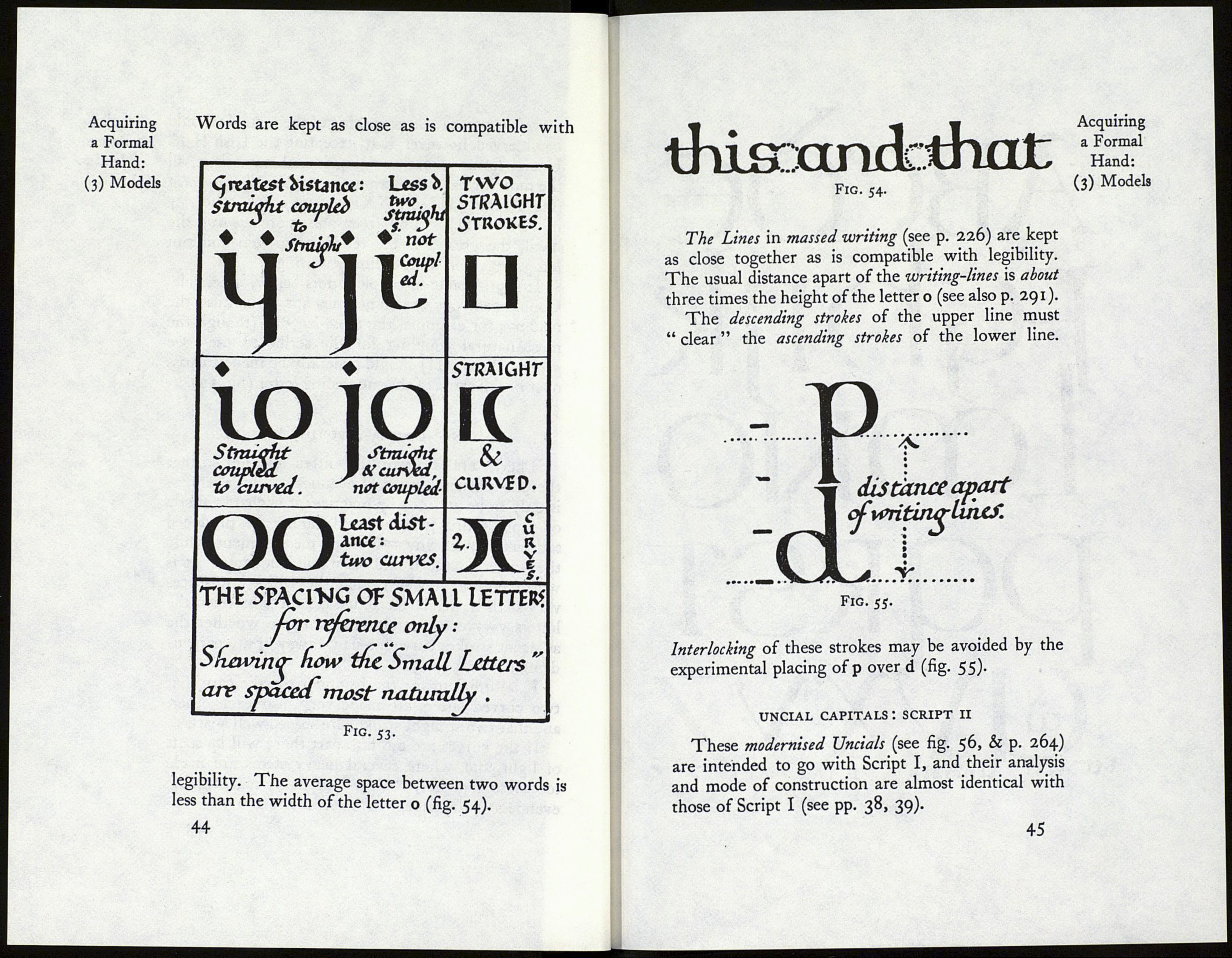
there is a general effect of evenness. This evenness
is only to be attained by practice : it is characteristic
of rapid skilful writing, and cannot be produced
satisfactorily by any system of measurement while
the writer’s hand is still slow and uncertain. It is
worth noting, however, that the white interspaces
vary slightly, while the actual distances between the
letters vary considerably, according to whether the
adjacent strokes curve (or slant) away or are perpen¬
dicular (figs. 53, i52)-
two curved letters are made very near each other,
and that two straight strokes are spaced well apart.
of light, and, where several heavy stems are made
too close together, “blots” of dark, mai ring the
evenness of the page.
a Formal
Hand:
(3) Models
