Inscriptions elementary form of the letter be cut firmly and
in Stone directly, it will be found that the chisel will suggest
how that form may be ornamented. This may be
shown, for example, by an attempt to carve a quite
simple Incised letter with no Serifs and with all the
strokes equally thick. In making the ends of the
strokes nice and clean it will be found that there
is a tendency to spread them into Serifs, and the
letter is at once, in some sort, ornamented (see
fig. 209).
SIZE & SPACING
Drawing out.—Take paper and pencil, or what
you will, and write out the words of the Inscription
in Capitals, or small-letters (or both), without any
regard to scale or the shape of the space the Inscrip¬
tion is to go in. The carver will then see easily
of what letters and words his Inscription is com¬
posed. Next draw the shape of the Inscription
space (say to 1 inch or i| inch scale), and in that
space set out the Inscription, either “Massed” or
“Symmetrical,” as has been decided. The drawing
should be neither scribbled nor elaborated. The
carver will thus be able, after a little experience, to
calculate quite easily what size he will be able to
carve his letters, what space he will be able to
leave between the lines, and what margins he can
afford.1
1 Some advice from the letter-cutter might be useful to the
client as to the number of words and the space they will occupy in
cases where it is possible to adapt the one to the other.
З56
The Size of Lettering depends on where it is to Inscriptions
go (i.e. outdoors or indoors, far away or near), the in Stones
material to be used, and the space at the carver’s
disposal.
Out of Doors capital letters should, as a rule, be
not less than 1J inch high, more if possible.1
Indoors smaller lettering may be carved, but even
then i inch is quite small enough, and that only in
marble, slate, or the finest stones.
In such stones as Ancaster or Ham-Hill it is not
possible to carve good letters less than 3 inches high.
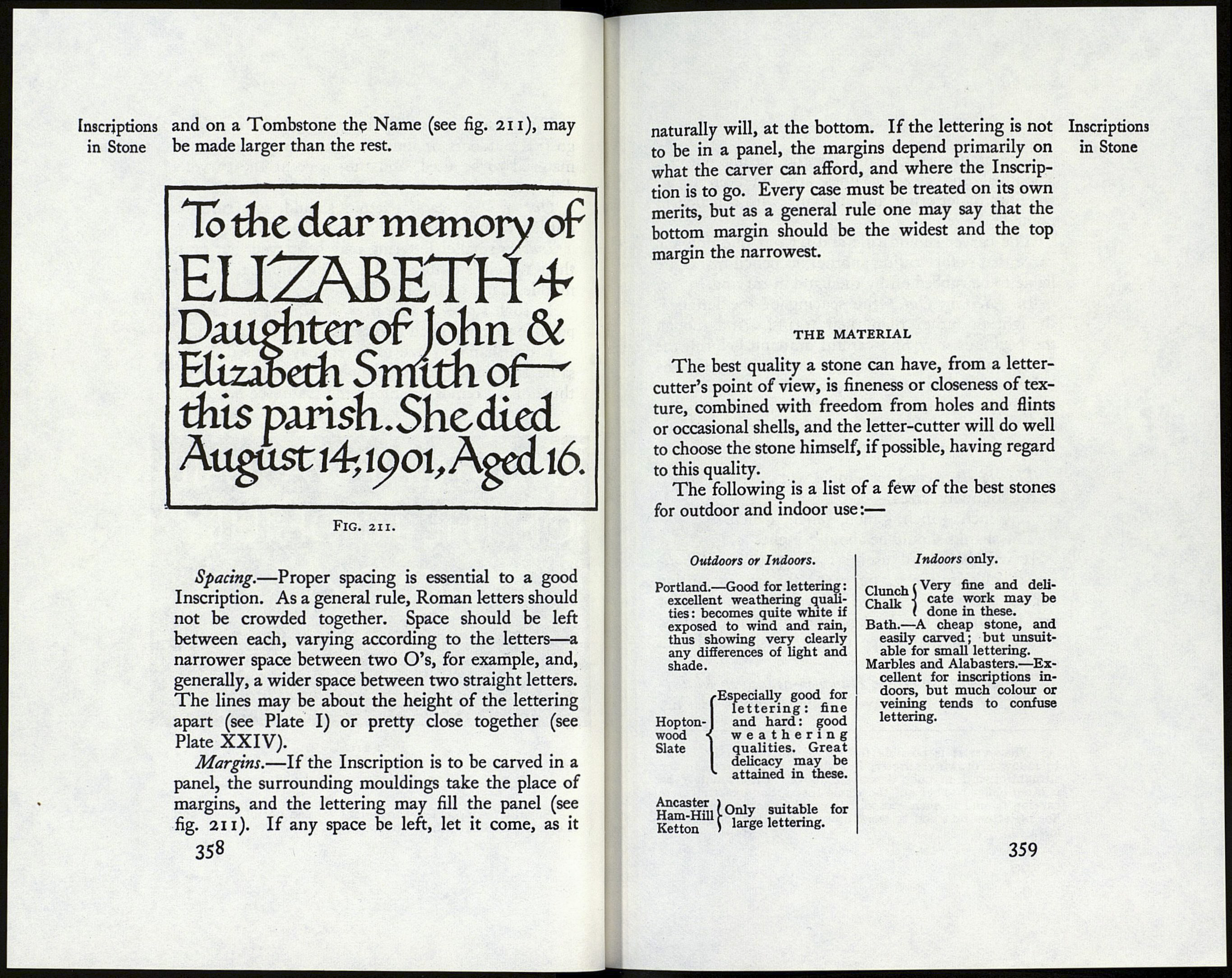
More than one size of letter may be used in the
same Inscription to give emphasis to certain words,
thus: on a Foundation Stone the Date (see fig. 210),
This stone was laid
ON THE4-thOF JULY
1904
Fig. 210.
Small lettering is less convenient to read out of doors, and
is apt to get filled with dirt or moss.
357
