Special better: though contrasts of size, form, or colour
Subjects (see p. 291)—such as printing one or two words in
large CAPITALS, or in piacfe Hetter (p-
295), or part in red—may sometimes be used with
good effect. When the types are rather varied, single
or double framing lines (called “rules”) placed round
the page have the effect of binding the whole to¬
gether. The page may also be divided into parts by
transverse “rules”—these further solidify it. Black
rules áre preferable to red (p. 110): if they are
double, the outer line may be thicker than the
inner.1
Relation of Title Pages, &c., to the Text.—Gene¬
rally the practical part of the book is to be con¬
sidered and settled before the ornamental and the
decorated Title page conforms to the treatment of
the text pages, and should be clearly related to them
by the character of its letters or its ornaments. Its
margins (especially the top margin) should be approxi¬
mately the same as those of the text pages, though
framing borders may occupy part of, or nearly all,
the marginal space. Without doubt the artless,
ordinarily printed title page is preferable to those
specially designed “title pages” that have little or
no relation to the rest of the book.
Wood Engraving (see pp. 329, 335).—Of all the
“processes,” wood engraving agrees best with print¬
ing. The splendid effect of Title and Initial pages
engraved in wood may be seen in the books of the
Kelmscott Press. In early printing, woodcut orna¬
ments or borders were commonly used to decorate
1 The use of “rules,” though quite legitimate, will be found
misleading if it be depended on to “doctor” and “pull to¬
gether” any weak arrangement of lettering.
328
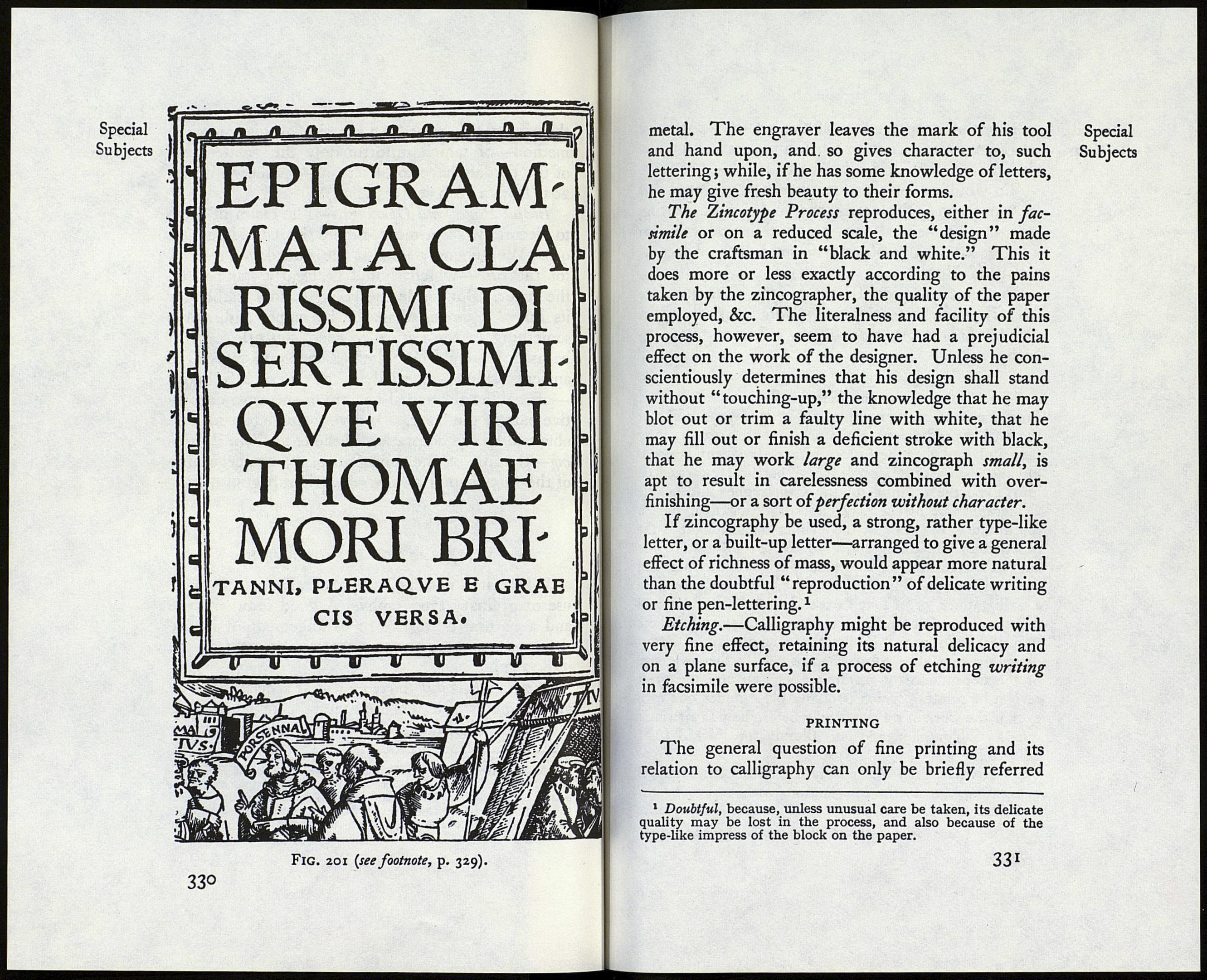
the printed title page. An example of this combined
method—of which unfortunately the greater part
of the borders have to be left out—is shown in fig.
201 (from a 16th century book).1
Initial Pages and Openings.—The claim of these
to decorative treatment should be considered (p.
94). We generally look at the outside of a book
for the title—which should be clearly stamped on
the cover. But inside the book we look rather for
its actual beginning than for its name, and, while
something in the nature of the “sub-title” might
be used, it would be quite reasonable to revive the
ancient fashion—especially in the case of MS. Books
—of making the actual beginning the most decora¬
tive part of the book. Or a very fine effect may be
obtained by the decoration of the entire initial open¬
ing—the title on the verso (left page), the beginning
of the first chapter on the recto (right page).
LETTERING FOR REPRODUCTION
Where it is possible, it is generally best to make
use of ordinary typography. A good fount of type
and a natural setting-up or arrangement of it, are
more effective than many special designs (see pp.
328, 231).
Wood and Metal Engraving.—If special forms or
arrangements of letters are required, for which type
is lacking or unsuited, they are best cut in wood or
1 More, Sir Thomas: “Utopia, et Mori et Erasmi Epigram-
mata”: 4to, Froben, Basle, 1518. Woodcut borders and Title
pages by Holbein. (The reproduction is from the title page to
the Epigrams.) Note.—The exceptionally fine type of capitals
(see p. 337) here shown is used throughout the book for
headings, &c.
З29
Special
Subjects
