The Roman
Alphabet
& its
Derivatives
Contrasts of form, “weight,” and size.—These
are generally obtained by the use of large built-up
Capitals, together with a simple-written (or
ordinarily printed) text (fig. 187).
CONTRASTof ЮЖ
WeiGHT& S1ZE4
GENERAUX 00L01R
Fig. 187.
A marked contrast usually being desirable, the
built-up capitals (especially if black) are safest kept
distinct from the rest of the text (see fig. 197): if
they are scattered among the other letters they are
apt to show like blots and give an appearance of
irregularity to the whole. As a rule, the effect is
improved by the use of red or another colour (see
figs-91.93)-
Contrast of form—for decorative purposes—is
usually combined with contrast of weight (e.g.
“Gothic,” heavier, p. 300) or size (e.g. Capitals,
larger, p. 335).
ORNAMENTAL LETTERS
(See Chaps. VII, Vili, X, XII, & pp. xxx, 215,
xxiv.)
To give ornament its true value we must distin¬
guish between ordinary occasions when simplicity and
directness are required, and special occasions when
elaboration is desirable or necessary.
The best way to make ornamental letters is to
develop them from the simpler forms. Any plain
294
type may be decoratively treated for special purposes
—some part or parts of the letters usually being
rationally “exaggerated” (p. 216). Free stems,
“branches,” tails, &c., may be drawn out, and ter¬
minals or serifs may be decorated or flourished (fig.
203).
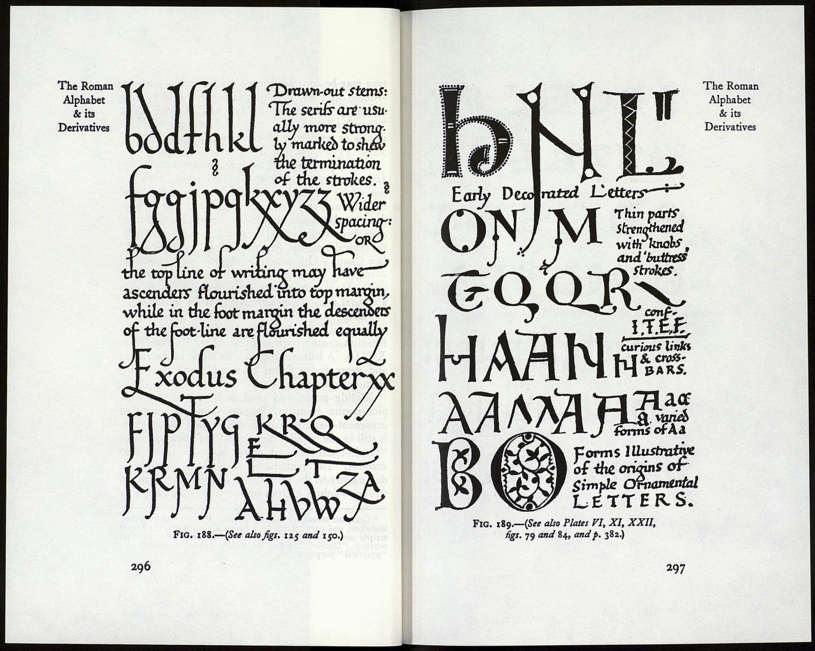
Built-Up Forms.—Even greater license (see fig.
161) is allowed in Built-Up Letters—as they are
less under the control of the tool (p. 256)—and
their natural decorative development tends to pro¬
duce a subordinate simple line decoration beside or
upon their thicker parts (fig. 189 & p. xxiv). In MSS.
the typical built-up, ornamental form is the “Versal”
(see Chap. VII.), which developed—or degenerated
—into the “Lombardie” (fig. 1). Here again it is
preferable to keep to the simpler form and to develop
a natural decorative treatment of it for ourselves.
“Black Letter” or “Gothic,” still in use as an
ornamental letter (fig. 190), is descended from the
fifteenth-century writing of Northern Europe (Plate
XVII.). A better model may be found in the earlier
and more lively forms of twelfth and thirteenth
century writing (fig. 191).
Rightly made, and used, it is one of the most
picturesque forms of lettering—and therefore of
ornament—and besides its ornamental value, there
is still in the popular fancy a halo of romance about
“black letter,” which may fairly be taken into
account. Its comparative illegibility, however,—
due mainly to the substitution of straight for curved
strokes—debars it from ordinary use.1 Though its
1 Compare monotone and monotone. For general purposes,
therefore, and particularly for forming a good hand, the earlier
scripts are to be preferred (or the late Italian) : even twelfth-
century “Gothic writing is hardly readable enough for
"practical” purposes.
295
The Roman
Alphabet
& its
Derivatives
