The Roman right, and very freely written (commonly with a
Alphabet “ slanted pen"). The serifs generally consist of slight
& its natural terminal hooks, &c.—though in p and q a
Derivatives finishing stroke is sometimes added. Ascending and
descending strokes (in b, d, f h, b, I, g, j, p, q, y)
are commonly rather long, and often end in curves,
sometimes in flourishes (fig. 177).
иш I uu w
§uiy>k -smj'and Jbiuishedjtalics
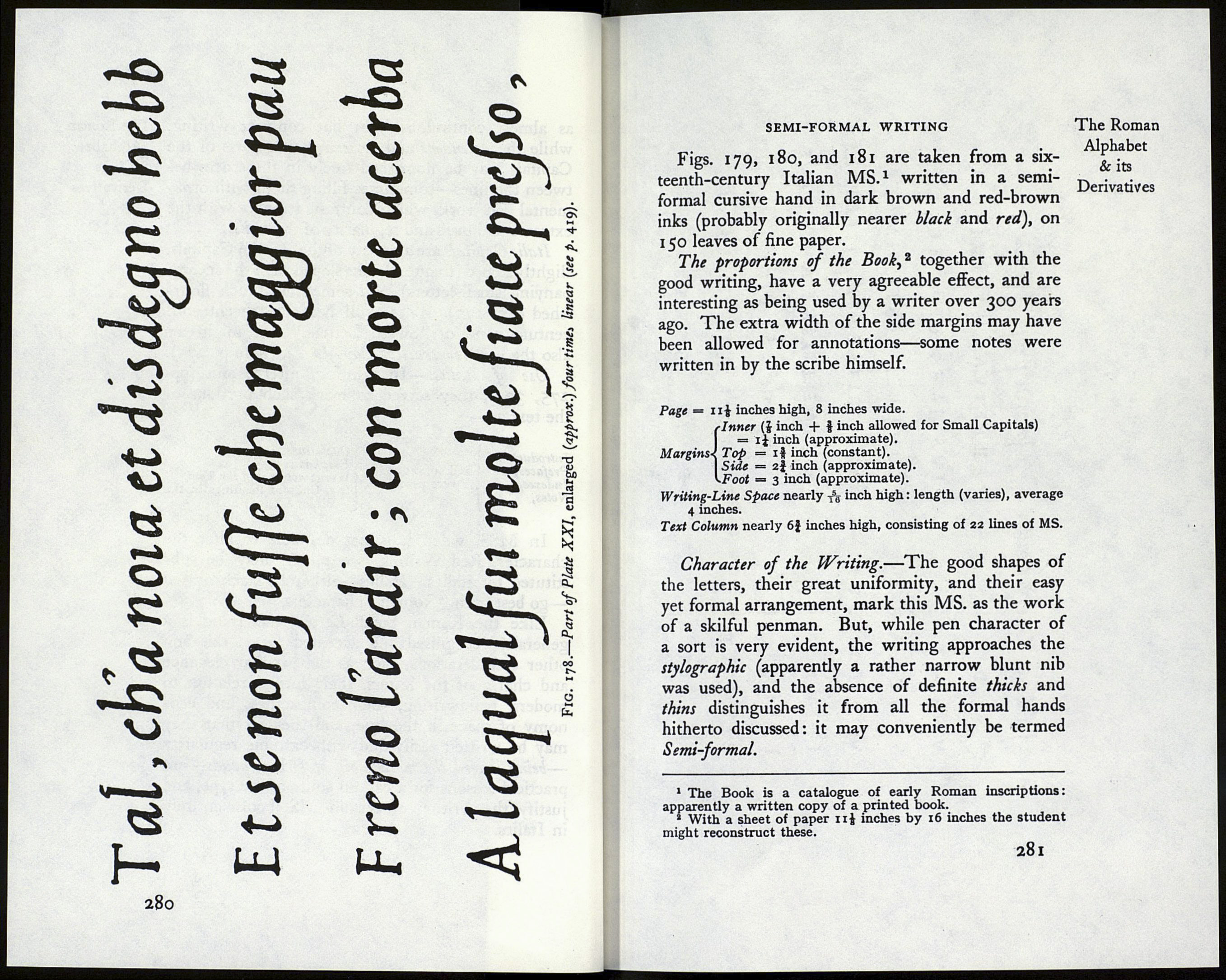
ЬЩ ЖЪѣ Fig. 177. The lines of writing are generally widely spaced Л as almost continuous light but compact writing, Italic Capitals are a variety of the Roman Capitals, Use of Italics.—In printing, after Aldus (pp. Introductions, Prefaces, Indexes, Notes, and subsequently Quotations, Emphasising, Words not part of the Text, In MSS. when it is not desirable to alter the Like the Roman Small-Letter, the Italic is a 279 The Roman
—allowing for the long stems: the bodies of the
letters being narrow are generally rather closely
packed, and frequently the lines of writing appear
278
while the ascenders and descenders and parts of the
Capitals may be flourished freely in the spaces be¬
tween the lines—sometimes filling them with orna¬
mental pen work, which contrasts strongly with the
extreme plainness and regularity of the bodies.
slightly sloped (frequently less sloped than the accom¬
panying small-letters), and sometimes much flour¬
ished (fig. 177). These still bear the seventeenth
century name of “Swash Letters.” We might try
also the early contrast of Caps & I.e. (note p. 275).
275, 337), they served to mark such portions of
the text as—
were used for
(e.g. Chapter headings in the
Bible, &c.).
character, Red Writing (see p. 96) may be sub¬
stituted for italics. Italics—either in black or red
—go best with “Roman” characters.
generally recognised and accepted form: this and
other considerations, such as the peculiar elegance
and charm of the letters, their formal relation to
modern handwriting, their compactness and eco¬
nomy of space in the line, and the fact that they
may be written easily and with extreme regularity
—being indeed the most rapid of formal hands—are
practical reasons for a careful study of the type, and
justify the writing of certain MS. books entirely
in Italics.
Alphabet
& its
Derivatives