The Roman lies, I think, in their relation to the Roman Small-
Alphabet Letter (pp. 380-1 '& 415-20), and their great
& its possibilities of development into modern formal
Derivatives hands approaching the “Roman” type.
ROMAN SMALL-LETTERS
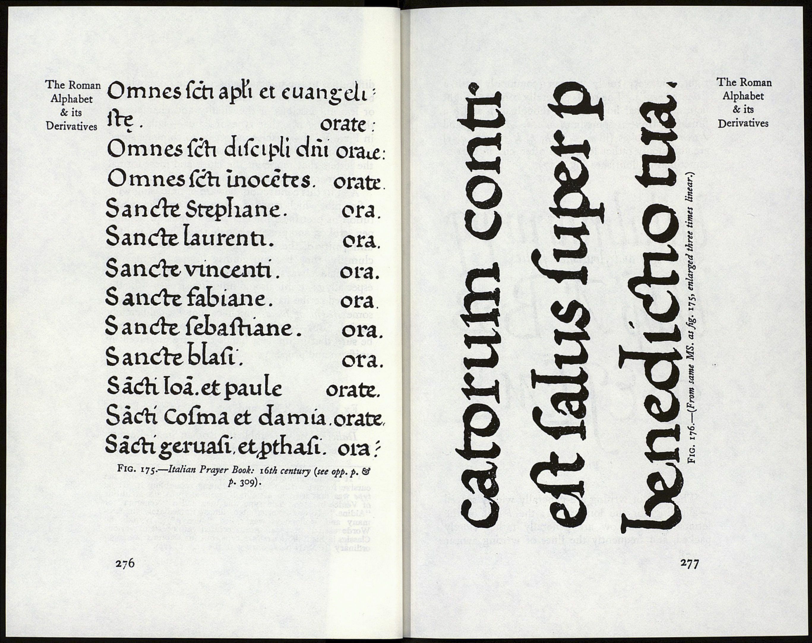
Ex.: (Italian) Plates XIX, XX (15th century);
figs. 175, 176 (16th century) : figs. 147, 148 (modern
MS.). .
The Roman Small-Letter is the universally recog¬
nised type in which the majority of books and papers
are printed. Its form has been in use for over 400
years (without essential alteration) and as far as we
are concerned it may be regarded as permanent.
And it is the object of the scribe or letter-maker
gradually to attain a fine, personal, formal hand,
assimilating to the Roman Small-Letter; a hand
against the familiar and present form of which no
allegations of unreadableness can be raised, and a
hand having a beauty and character now absent or
««familiar. The related Italic will be mastered for
formal MS. work (p. 279), and the ordinary hand¬
writing improved (p. 287). These three hands point
the advance of the practical, modern scribe.
The Roman Small-Letter is essentially a pen form
(and preferably a “slanted-pen” form; p. 269), and
we would do well to follow its natural development
from the Roman Capital—through Round Letters and
Slanted-Pen forms—so that we may arrive at a truly
developed and characteristic type, suitable for any
formal manuscript work and full of suggestions for
printers and letter-craftsmen generally.
A finished form, such as that in Plate XX—
or even that of fig. 175—would present many
274
difficulties to the unpractised scribe, and one who so
began would be apt to remain a mere copyist, more
or less unconscious of the vitality and character of
the letter. An earlier type of letter—such as that
in Plate VIII—enables the scribe to combine speed
with accuracy, and fits him at length to deal with
the letters that represent the latest and most formal
development of penmanship.
And in this connection, beware of practising with
a fine nib, which tends to inaccuracy and the substi¬
tution of prettiness for character. Stick to definite
pen strokes, and preserve the definite shapes and the
uniformity of the serifs (p. 288): if these be made
clumsily, they become clumsy lumps. It may be
impossible always to ascertain the exact forms—
especially of terminals and finishing strokes—for the
practised scribe has attained a great uniformity and
some sleight of hand which cannot be deliberately
copied. But—whatever the exact forms—we may
be sure that in the best hands they are produced by
uniform and proper pen strokes.
ITALICS
Ex.: Plate XXI, and figs. 94, 177, 178 (en¬
larged).
Italics1 closely resemble the Roman Small-Letters,
but are slightly narrowed, slightly sloped to the
1 It is convenient to use the term “Italics” for both the
cursive formal writing and the printing resembling it. Italic
type was first used in a “Virgil” printed by Aldus Manutius
of Venice in 1500. The type was then called "Venetian or
“Aldine.” It was counterfeited almost immediately (in Ger¬
many and Holland it was called “cursive”); Wynkin de
Worde used it in 1524. Aldus printed entire texts of various
Classics in his italic lower-case type, but his Capitals are small
ordinary ROMAN (in contrast with the I.e.—p. 279).
275
The Roman
Alphabet
& its
Derivatives
