The Roman
Alphabet
& its
Derivatives
The main types are the “round” Uncial and
Half-Uncial, commonly written with an approxi¬
mately “straight pen."1 They are generally treated
as fine writing (p. 226), and written between ruled*
lines: this has a marked effect in preserving their
roundness (see p. 376).
They are very useful as copy-book hands (see p. 36),
for though the smooth gradation of their curves,
their thin strokes, and their general elegance unfit
them for many practical purposes, yet their essential
roundness, uprightness, and formality afford the finest
training to the penman, and prevent him from falling
into an angular, slanting, or lax hand. Their very
great beauty, moreover, makes them well worth
practising, and even justifies their use (in a modern¬
ised form) for special MSS., for the more romantic
books — such as poetry and “fairy tales”—and
generally where speed in writing or reading is not
essential.
With an eye trained and a hand disciplined by
the practice of an Irish or English Half-Uncial, or
a modified type, such as is given in fig. 50, the
penman may easily acquire some of the more
practical later “slanted-pen” types.
“slanted-pen” small-letters
Typical Examples:—
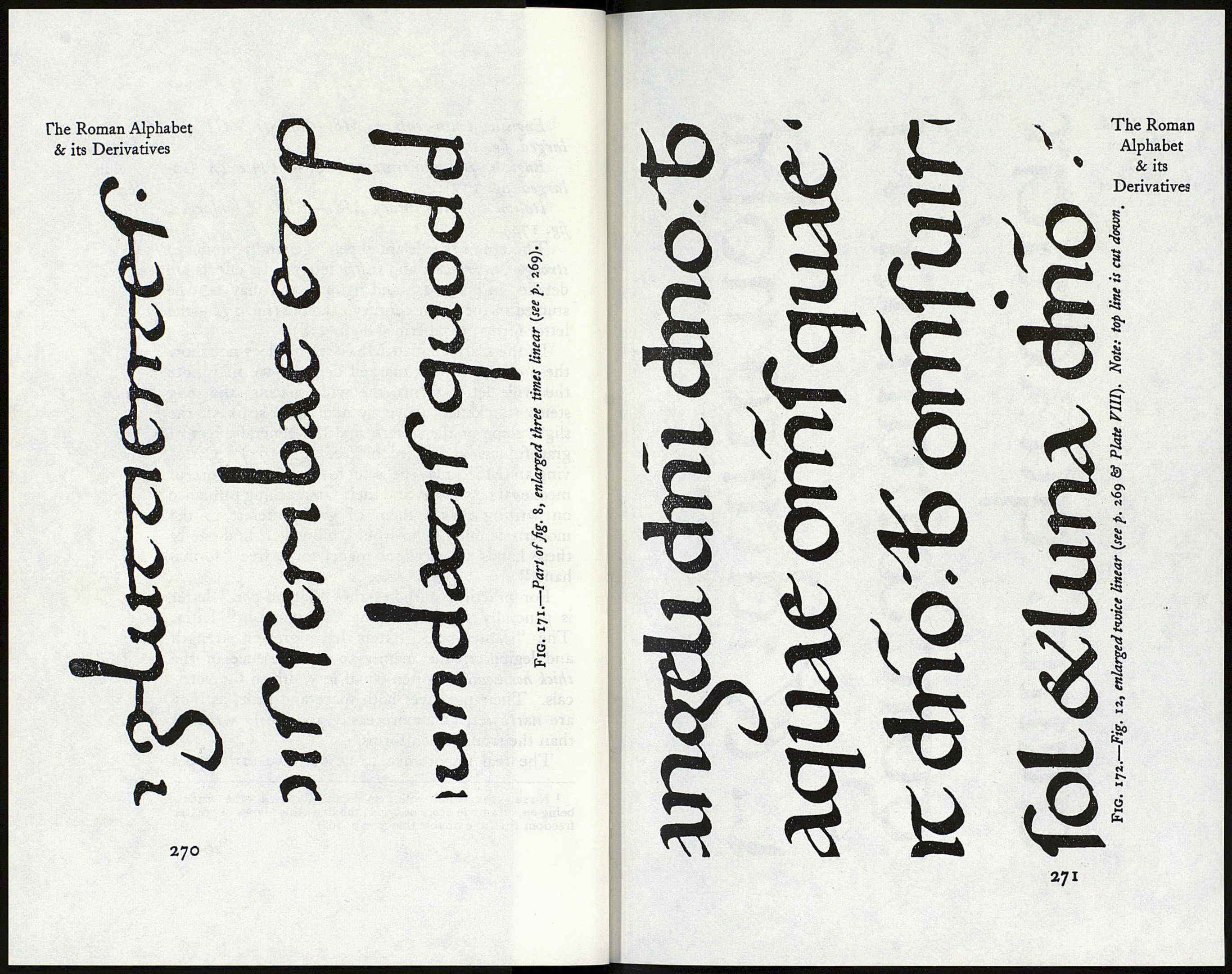
Carlovingian ninth-century MS. — Fig. 8 (en¬
larged, fig. 171):
1 The writing in fig. 170 shows a slightly slanted pen. To
make quite horizontal thins is difficult, and was probably never
done, but it is worth attempting them nearly horizontal for the
sake of training the hand.
268
English tenth-century MS. — Plate Fill (en¬
larged, fig. 172):
English eleventh-century MS. — Plate IX (en¬
larged, fig. 173):
Italian twelfth-century MS.—Plate X (enlarged,
fig. 174).
The use of the “slanted pen” generally produced
stronger, narrower, and stiffer letters. Its effects are
detailed in pp. 9-13, and fig. 11, and may best be
studied in the tenth-century example (fig. 172—the
letter forms are described on p. 378).
In the Carlovingian MS.—which does not show
these effects in any marked degree—we may note
the wide letter forms, the wide spacing, the long
stems (thickened above by additional strokes), the
slight slope of the letters, and the general effect of
gracefulness and freedom (see fig. 171). Carlo¬
vingian MSS. may be said to represent a sort of
mediaeval copy-books, and their far-reaching influence
on writing makes them of great interest to the
modern penman, who would, moreover, find one of
these hands an excellent model for a free “formal
hand.”
For practical purposes the “slanted-pen” letter
is generally superior to the “straight-pen” letter.
The “slanted-pen” letters have greater strength
and legibility, due mainly to the presence of the
thick horizontals—often equal in width to the verti¬
cals. Their use saves both space and time, as they
are narrower, and more easily and freely written1
than the straight-pen forms.
The real importance to us of these early types
1 Note.—S*»igii-line ruling is commonly used—the writing
being on, or a little above or below, the line : this allows of greater
freedom than the double line (see p. 268).
269
The Roman
Alphabet
& its
Derivatives
