The Roman
Alphabet
& its
Derivatives
of Y has the arms curving out and ending in points
(see fig. 167).
Zi. See C, 3 and 4.
2. The lower arm of Z is sometimes
drawn out (see E, 3): it may be curved
and pointed (or flourished).
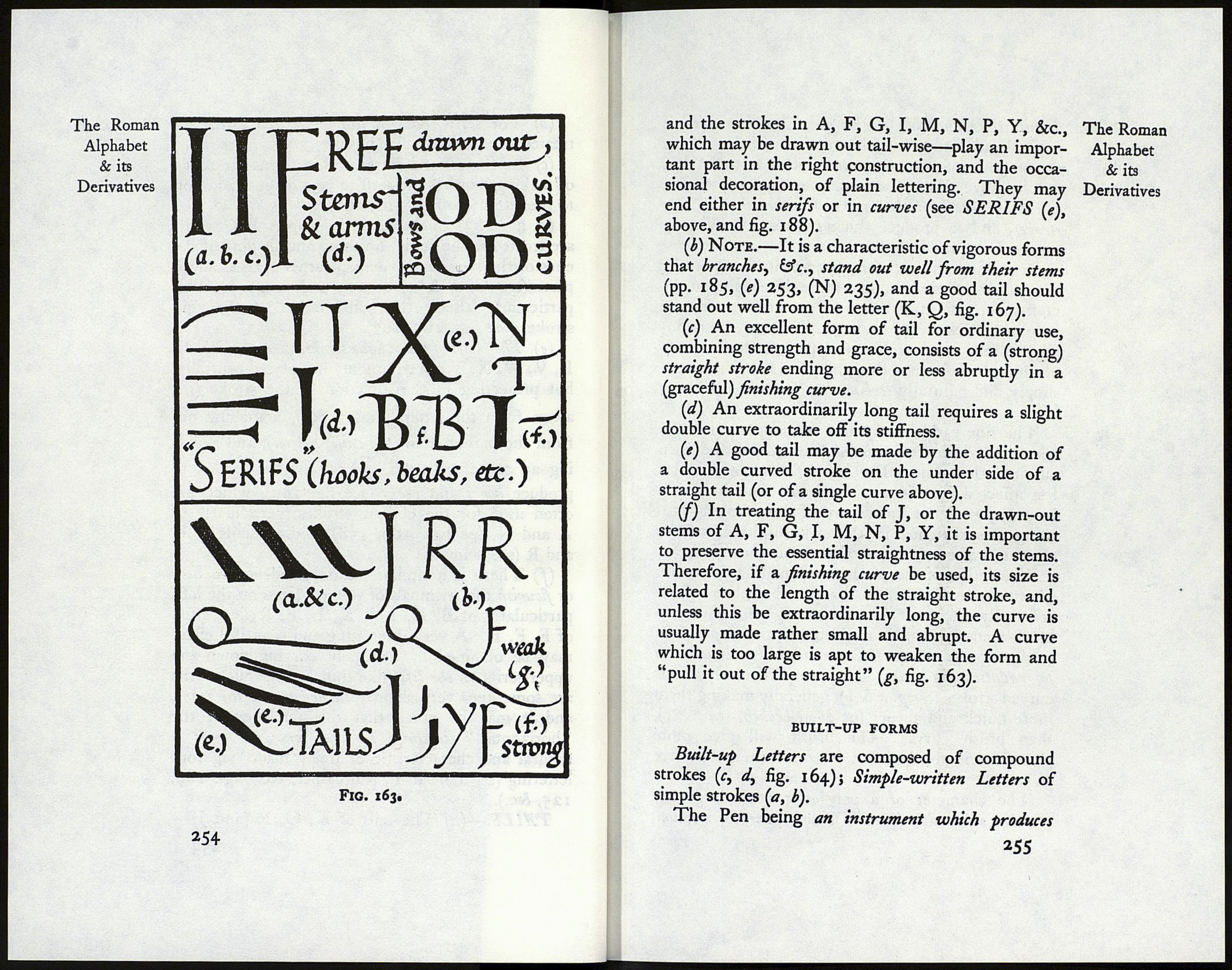
General Remarks on the characterisation of Roman
Capitals and related forms, illustrated in fig. 163.1
VERTICAL STEMS.—{a, fig. 163) Thick (ex¬
cepting in the thin stemmed N and M).
(b) Slightly curved in on either side (see fig. 116),
or appearing so because of the outward curve of the
serifs (see figs. 204, 206).
(c) A fine effect is obtained when the stem is
made wider above than below (see p. 85).
(d) Free stems occasionally are drawn out (see
above, F, 3 and 4, and pp. 215, 224, 296).
OBLIQUE STROKES or STEMS.—In A, K,
&c., from the left \ thick, to the right / thin—
otherwise like vertical stems (above), see also
serifs (e) (below).
HORIZONTALS, ARMS, BRANCHES, or
BARS.—Thin: free ends sometimes drawn out
and flourished (see figs. 125, 188).
BOWS and CURVES.—Gradated, and follow¬
ing the О (see pp. 10, 87, 234, 249).
SERIFS or FINISHING STROKES. —(a)
Note.—Terminals of some sort are practically
essential to the proper characterisation of an alphabet
(see figs. 147, 148, 162), and should generally have
a certain uniformity (p. 288).
1 The more ornamental treatment of Stems, Bows, Serifs, Tails,
&c., is referred to in p. 295, and in figs. 188, 189.
252
(b) The serifs, &c., of simple-written forms are The Roman
treated at p. 208 (see fig. 145). Alphabet
(c) In Versals and certain other forms the mode & its
of making requires the serif to be a distinct addition Derivatives
to the letter (see figs. 116, 166).
{d, fig. 163) In the finest built-up A В Cs serifs
are treated as the actual finishing and shaping of the
ends of the stems and branches, rather than as added
parts (see C, 3 & 4, p. 245 and p. 204). This
particularly affects the construction of the thin
strokes (see figs. 165, 167).
(e) The serifs of the oblique strokes in А, К, M, N,
R, V, W, X, Y are commonly not placed centrally,
but projecting in the direction of the stroke {i.e.
away from the letter, thus: branching out
from the parent stem (see tails, below), and avoid¬
ing an acute angle (as Л). This has tended to
produce hooks and beaks (see fig. 163), which are
often used for the oblique strokes, particularly of
A and N (see figs. 189, 158), and the tails of К
and R (see below).
(/) There is a similar natural tendency to hook
ox flourish the terminals of vertical stems on the left,
particularly of B, D, I, J, K, L, P, R; less often
of E, F, H. A very interesting and beautiful effect
may be obtained by delicately curving down the
upper serifs on the left (like thin beaks). Such serifs
are sometimes very slightly turned up on the right,
and it may be noted that this tendency of the
“horizontals” to curve up and forward , " is
natural and characteristic of freely made, vigorous
lettering (see Uncial T, pen dashes, &c., figs. 169,
125, &c.).
TAILS.—{a) The tails of K, Q, R (and J)—
253
