The Roman
Alphabet
& its
Derivatives
its actual position above the centre.1 And further,
by a reasonable enlargement of the lower part, these
letters acquire a greater appearance of stability.
It would be well, I think, for the letter-craftsman
to begin by making such divisions at the apparent
centre {i.e. very slightly above mid-height; see
E, F, X, Plate II), so keeping most nearly to the
essential forms (see p. 239). Later he might con¬
sider the question of stability (see B, Plate II).
The exaggerated raising (or lowering) of the divi¬
sion associated with “Art Lettering” is illegible
and ridiculous.
A The lower part is essentially bigger, and
the cross-bar is not raised, as that would
make the top part disproportionately small.
F usually follows E, but being asymmetrical and
open below it may, if desired, be made with
the bar at—or even slightly below—the actual
centre.
RIn early forms the bow was frequently
rather large (see Plate II), but it is safer
to make the tail—the characteristic part—more
pronounced (see Plates III, XXIV).
PThe characteristic part of P is the bow,
which may therefore be a little larger than
the bow of R (see Plate III).
Sin the best types of this letter the upper
and lower parts are approximately equal ;
there is a tendency slightly to enlarge the lower
1 It is interesting to note in this connection that the eye
seems to prefer looking upon the tops of things, and in reading,
is accustomed to run along the tops of the letters—not down
one stroke and up the next. This may suggest a further reason
for smaller upper parts, viz. the concentration of as much of the
letter as possible in the upper half.
238
part. (In Uncial and early round-hands the top part
was larger: see Plates IV to VII.)
Y varies: the upper part may be less than that
of X, or somewhat larger.
ESSENTIAL OR STRUCTURAL FORMS
The essential or structural forms (see p. 204) are
the simplest forms which preserve the characteristic
structure, distinctiveness, and proportions of each indi¬
vidual letter.
The letter-craftsman must have a clear idea of
the skeletons of his letters. While in every case the
precise form which commends itself to him is matter
for his individual choice, it is suggested in the
following discussion of a typical form—the Roman
В—that the rationale of his selection (whether
conscious or unconscious) is in brief to determine
what is absolutely essential to a formi and then how
far this may be amplified in the direction of the practi¬
cally essential.
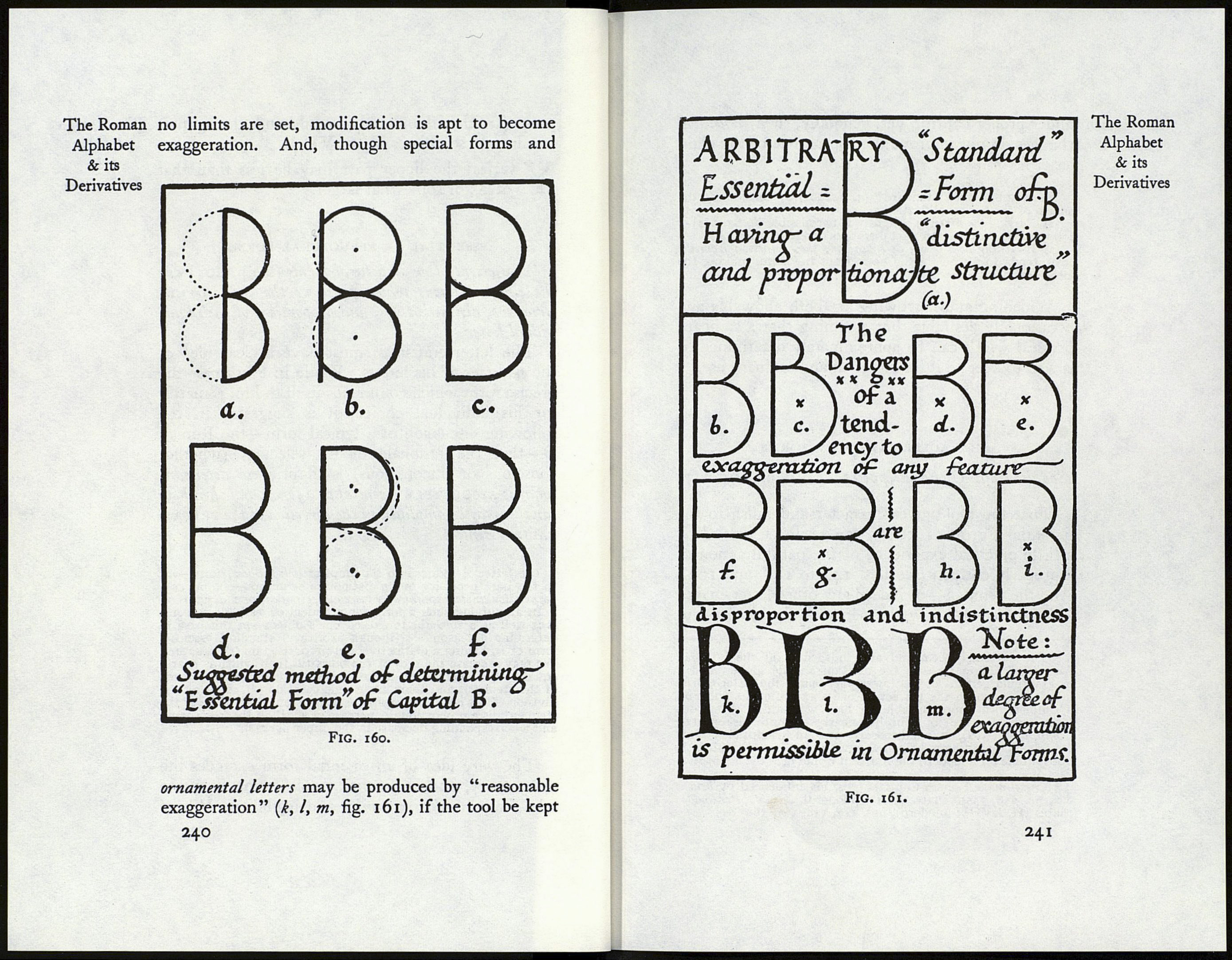
The letter В reduced to its simplest (curved-bow) form—i.e.
to the bare necessity of its distinctive structure—comprises a
perpendicular stem spanned by two equal, circular bows (a, fig. 160).
In amplifying such a form for practical or aesthetic reasons,
it is well as a rule not to exceed one’s object—in this case to
determine a reasonable (though arbitrary) standard essential
form of B, having a distinctive and proportionate (/) structuré.
We may increase the arcs of the bows till their width is nearly
equal to their height (b), make their outer ends meet the ends
of the stem (c), and their inner ends coincide (d). Raising the
division till its apparent position is at or about the middle of the
stem entails a proportionate increase of width in the lower part,
and a corresponding decrease in the upper part («).
The very idea of an essential form excludes the
««necessary, and its further amplification is apt to
take from its distinctiveness and legibility. Where
239
The Roman
Alphabet
& its
Derivatives
