The Roman
Alphabet
& its
Derivatives
The “Round” Wide Letters—0, Q, C, G, D.—
О may be regarded as the Key letter of an
alphabet. Given an О and an I of any
alphabet, we can make a very good guess at the
forms of the other letters.
In fine Inscriptions the external line of О is
commonly an almost perfect circle (see Plate II)
—i.e. its height and width are equal. This may be
regarded as the ideal shape, though a slight widen¬
ing or narrowing of the letter (fig. 157) is quite
permissible.1
ООО
circular, narrower, wider.
ѣіа^тт —
. ; - I Su^stù
: \| the re-wlations of
tlieBsnpwihJMfas.
Fig. 157.
Q, C, G, and D follow the proportions of О
1 Note.—There is less danger of spoiling letters by narrowing
them than by widening, because the limits to the possible narrow¬
ing of a letter are more obvious than the limits to its possible
widening. Further, when letters are widened there is a ten¬
dency to thicken their parts and make them heavy and vulgar.
234
very nearly, and, though C, G, D are a little nar¬
rower, they have the same effect of roundness and
width.
The “Square ” Wide Letters—-M, W, and H,
(U), J, N, T, T, (Z)-
MT T Г Their mean width is properly
“ VV about equal to their height.
H Width equal to, or a little less than, height
(fig. 158), but if made too narrow it would
look heavy, being double-stemmed.
U (see pp. 251, 248) resembles H.
AM £ ~\T are double-stemmed, and have
9 -L 4 9 V internal angles, moreover,
which would become too sharp—and tend to close
&
height equal
narrower.
-Vy
WiHe formsAr'N,&V; anb
dangers of too sharp arises.
Z
z.
narrow^
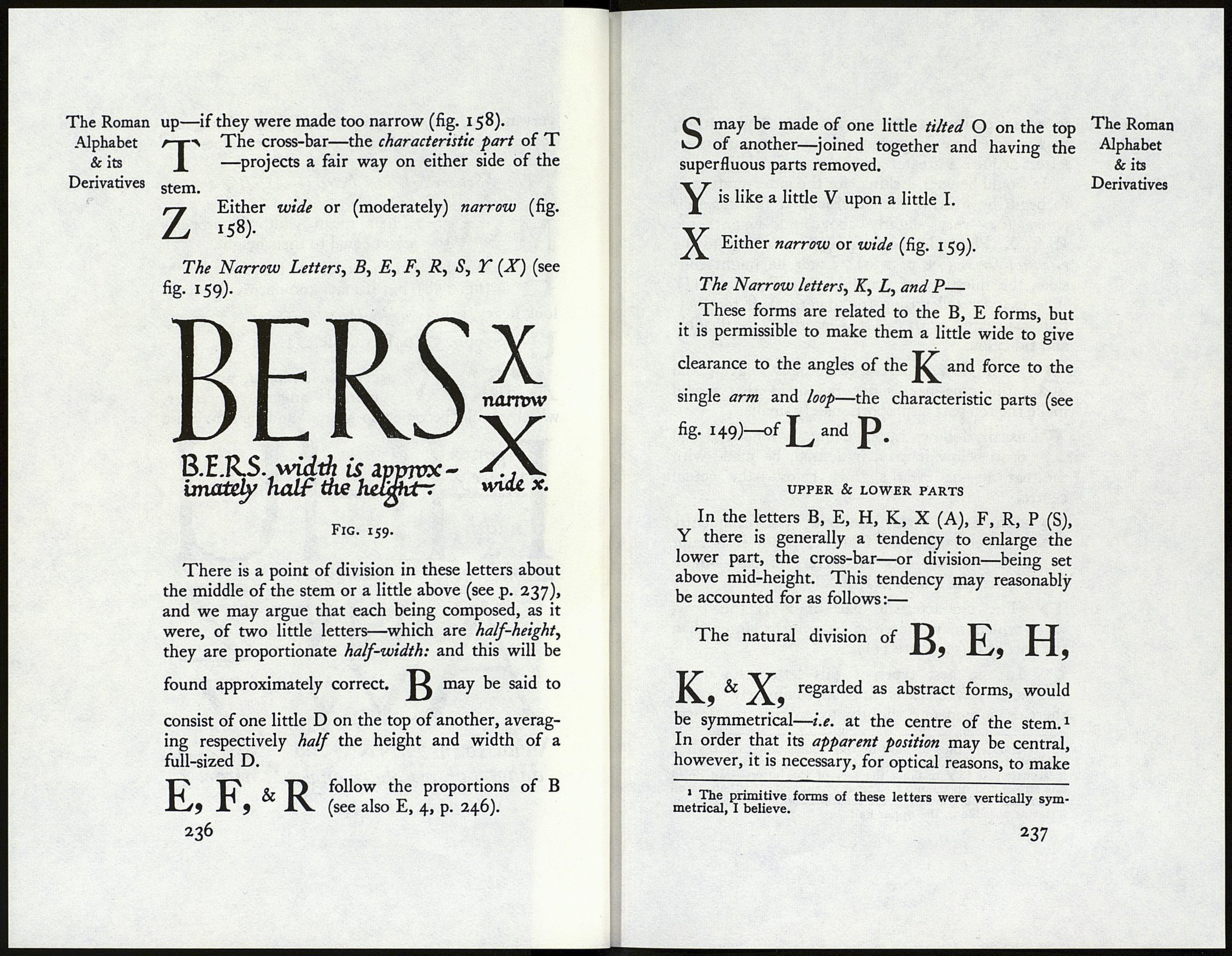
The Roman
Alphabet
& its
Derivatives
Fig. 158.
235