Good is natural and obvious, and no fault of the scribe’s.
Lettering— Such an arrangement, or rather, straightforward
Some writing, of poetry is often the best by virtue of its
Methods of freedom and simplicity (see p. 335).
Construction In many cases, however, a more formal and
& Arrange- finished treatment of an irregular line text is to be
ment preferred (especially in inscriptions on stone, metal,
&c.), and the most natural arrangement is then an
approximately symmetrical one, inclining to “Fine
Writing” in treatment. This is easily obtained in
inscriptions which are previously set-out, but a good
plan—certainly the best for MSS.—is to sort the
lines of the text into longs and shorts (and sometimes
medium lines), and to set-in or indent the short lines
two, three, or more letters. The indentations on
the left balance the accidental irregularities on the
right (fig. 154, and Plate IV), and given an appear¬
ance of symmetry to the page (see Phrasing, p. 348).
Either mode of spacing (close or wide) may be
carried to an unwise or ridiculous extreme. “Lead¬
ing” the lines of type was much in vogue a hundred
years ago, in what was then regarded as “high-
class” printing. Too often the wide-spaced line
and “grand” manner of the eighteenth-century
printer was pretentious rather than effective: this
was partly due to the degraded type which he used,
but form, arrangement, and expression all tended to
be artificial. Of late years a rich, closely massed
page has again become fashionable. Doubtless there
has been a reaction in this from the eighteenth
century to an earlier and better manner, but the
effect is sometimes overdone, and the real ease and
comfort of the reader has been sacrificed to his rather
imaginary aestheticism.
By attaching supreme importance to readableness,
228
the letter-craftsman gains at least a rational basis for
his work, and is saved from the snares which lurk
in all, even in the best, modes and fashions.
EVEN SPACING
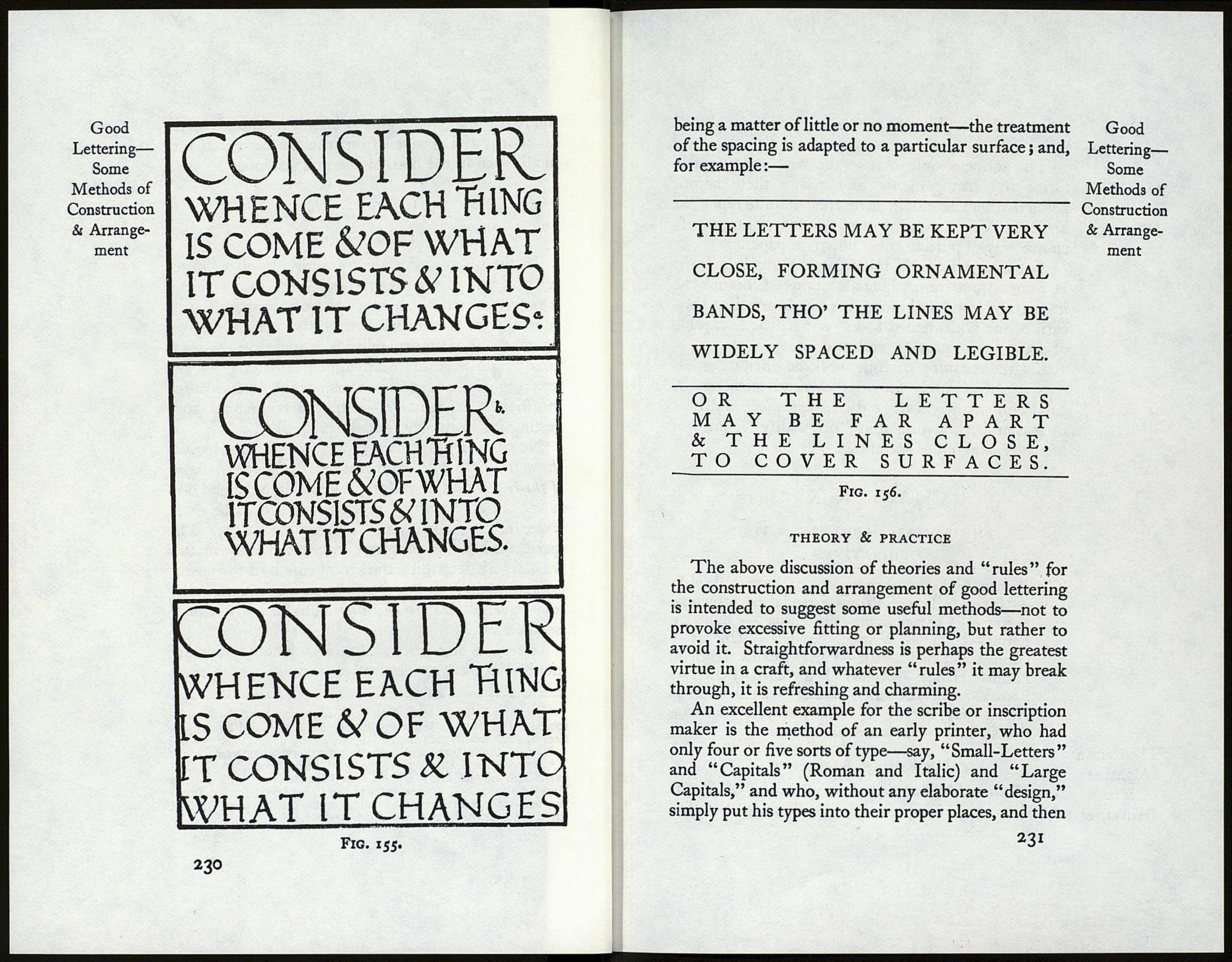
In the spacing of a given inscription on a limited
surface, where a comparatively large size of letter
is required, what little space there is to spare should
generally be distributed evenly and consistently (a,
fig. 155). Lavish expenditure of space on the mar¬
gins would necessitate an undue crowding1 of the
lettering (è), and wide interspacing2 would allow
insufficient margins (c)—either arrangement sug¬
gesting inconsistency (but see p. 316).
Note.—A given margin looks larger the heavier
the mass of the text,3 and smaller the lighter the mass
of the text. And, therefore, if lettering be spread out,
as in “Fine Writing,” the margins should be extra
wide to have their true comparative value. The
space available for a given inscription may in this
way largely determine the arrangement of the letter¬
ing, comparatively small and large spaces suggesting
respectively “Massed Writing” and “Fine Writing”
(see p. 226).
In certain decorative inscriptions, where letters are
merely treated as decorative forms—readableness
1 In (6) fig. 155, the letters have been unintentionally nar¬
rowed. The natural tendency to do this forms another objec¬
tion to such undue crowding.
* In (c) the letters have been unintentionally widened.
* Experiment.—Cut out a piece of dark brown paper the
exact size of the body of the text in an entire page of this
Handbook, viz. 5-fV inches by 3 inches, and lay it on the text:
the tone of the brown paper being much darker than that of
the print makes the margins appear wider.
229
Good
Lettering—
Some
Methods of
Construction
& Arrange¬
ment
