Good In making Built-up letters—which have both
Lettering— outer and inner strokes—the inner strokes should
Some generally be made first (see p. 87).
Methods of Plain and Ornamental Forms.—Not only for the
Construction sake of readableness, but to promote a beautiful
& Arrange- and dignified effect, the forms of letters are kept
ment simple when the text is long. And, generally, the
less frequent the type, the more ornamental may be
its form (see pp. 92, 176, 262, 294).
BEAUTY OF UNIFORMITY
[As the assimilation of the corresponding parts—
“ bodies“limbs,” “heads”—and as the “family
likeness” of the different letters, so that they go
well together)
Right uniformity makes for readableness and
beauty, and is the result of good craftsmanship.
Readableness.—Where the text letters are uni¬
form, the reader is free to give his attention to the
sense of the words, whereas the variations in an
irregular or changing text are distracting.1
Beauty.—The abstract beauty-of-uniformity may
be said to lie in this, that the different letters, or
individual elements, “go well together.” The beau¬
tiful effect of uniform lettering is thus caused by the
united forces, as it were, of all the letters.
Good Craftsmanship.—A pen, or other letter-
making tool, being handled freely and regularly,
the uniform movements of the tool in similar cases
will produce uniform strokes, &c. (On the other
hand, the interruption and loss of freedom to the
1 As when the construction of a part of some letter is peculiar
(all the y or g tails, for example, catching the eye, and standing
out on the page), or, as when promiscuous types are used, giving
the impression of a confused crowd of letters.
218
writer who is irregular, or who forces an unnatural
variety,1 results in inferior work.)
RIGHT ARRANGEMENT
(As having a general fitness in the
placing, connecting, and spacing of
letters, words, and lines, in the dis¬
posal of the lettering in the given
space, and in the proportioning of
every part of the lettering and its
margins)
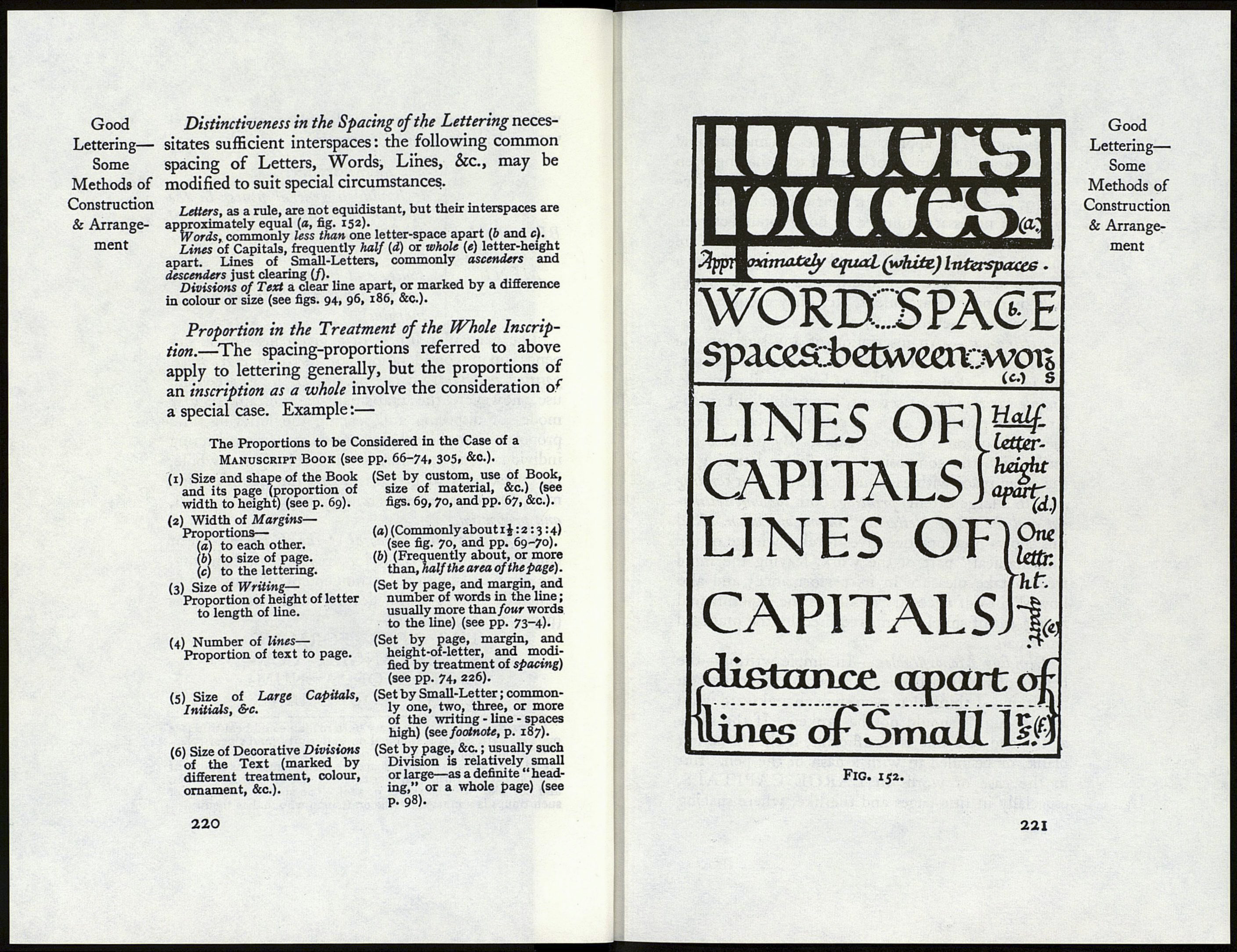
The particular fitness of a given inscription de¬
pends upon considerations of its particular office,
position, material, See. (see pp. 66, 315). For general
use, however, the craftsman has certain regular
modes of disposing and spacing the lettering, and
proportioning the whole. And, as in constructing
individual letters, so in treating lettering as a whole,
he endeavours to give his work the qualities that
make for readableness : viz. simplicity, distinctiveness,
and proportion.
Simplicity in the Disposal of the Lettering.—For
convenience of construction, reading, or handling,
the simple, traditional arrangement of lettering is
generally followed in dealing with flat surfaces
(paper, vellum, &c.) :2—
THE TEXT FORMING
A RECTANGLE, CON¬
SISTING OF A NUM¬
BER OF EQUAL LINES
1 Variety.—There is a variety both readable and beautiful (see
pp. 176, 333), but it is founded on uniformity (and sincerity).
’ “ Bands ” and symmetrical or asymmetrical groups oí letter¬
ing adapted to the available space are used—usually as ornament
—upon friezes, furniture, chests, book covers, flagons, dishes,
and the like (see fig. 156 & p. 300). The special treatment of
such things is a matter for the craftsman who makes them.
219
BEAUTTOF
ARRANGE¬
MENT
Good
Lettering—
Some
Methods of
Construction
& Arrange¬
ment
