Good This summary, while not presuming to define the
Lettering— Virtues, or achieve Beauty by a formula, does indicate
Some some guiding principles for the letter-maker, and
Methods of does suggest a definite meaning which may be
Construction given to the terms “Right Form,” “Right Arrange-
& Arrange- ment,” and “Right Expression” in a particular
ment craft.
It is true that “Readableness” and “Character”
are comprised in Beauty, in the widest sense; but
it is useful here to distinguish them: Readableness
as the only sound basis for a practical theory of
lettering, and Character as the product of a particular
hand & tool at work in a particular craft.
The above table, therefore, may be used as a test
of the qualities of any piece of lettering—whether
Manuscript, Printing, or Engraving—provided that
the significations of those qualities on which “Char¬
acter” depends be modified and adapted to each
particular instance. It is however a test for general
qualities only—such as may help us in choosing a
model: for as to its particular virtue each work
stands alone—judged by its merits—in spite of all
rules.
SIMPLICITY
{As having no unnecessary parts)
Essential Forms and their Characterisation.—The
“Essential Forms” may be defined briefly as the
necessary parts (see p. 239). They constitute the
skeleton or structural plan of an alphabet; and One
of the finest things the letter-craftsman can do, is to
make the Essential Forms of letters beautiful in them¬
selves, giving them the character and finish which come
naturally from a rightly handled tool.
204
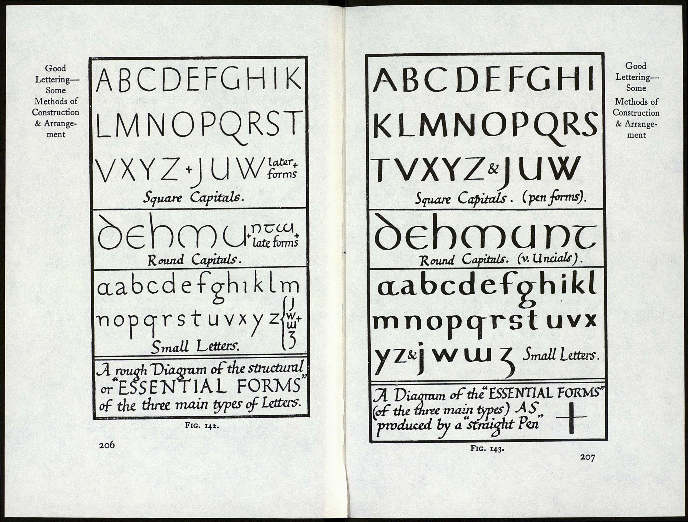
If we take the “Roman” types—the letters
with which we are most familiar—and draw them
in single pencil strokes (as a child does when it
“learns its letters”), we get a rough representa¬
tion of their Essential Forms (see diagram, fig.
142).
Such letters might be scratched with a point in
wax or clay, and if so used in practice would give
rise to fresh and characteristic developments,1 but
if we take a “square cut” pen which will give a
thin horizontal stroke and a thick vertical stroke
(figs. 10 and 40), it will give us the “straight-pen,"
or simple written, essential forms of these letters
(% 143)-
These essential forms of straight-pen letters when
compared with the plain line forms show a remark¬
able degree of interest, brought about by the intro¬
duction of the thin and thick strokes and gradated
curves, characteristic of pen work.
Certain letters (А, К, M, N, V, W, X, Y, and
к, V, w, X, y) in fig. 143 being composed chiefly
of oblique strokes, appear rather heavy.. They are
lightened by using a naturally “slanted” pen which
produces thin as well as thick oblique strokes. And
the verticals in M and N are made thin by further
slanting the pen (fig. 144).
To our eyes, accustomed to a traditional finish,
all these forms—in figs. 143 and 144, but particu¬
larly the slanted pen forms—look incomplete and
unfinished; and it is obvious that the thin strokes,
at least, require marked terminals or serifs.
1 In fact, our “ small-letters ” are the formalised result of the
rapidly scratched Square Capitals of the Roman era (p. 33 &
fig- 3).
205
Good
Lettering—
Some
Methods of
Construction
& Arrange¬
ment
