“Design” in
Illumination
decoratively by a cross (a, fig. 131) than by a contain¬
ed circle; a square is better filled by a “lozenge” or a
circle (b and r) than by a smaller square set square
(M
•)
Fic. 131.
and parallel (compare the diapering of the chequers
in fig. 191 a). A circular or square space might be
filled on this principle with a filigree arrangement
such as is suggested by (d, fig. 131). Note.—In the
case of two curves in the ornament touching (either
internally or externally) they may be linked at this
point by a (gold) band or circle or lozenge (e, fig. 131,
see also Plate XVII).
Miniatures and. Drawing.—In drawing and paint¬
ing, the difficulty which is apt to beset the illumi¬
nator is how to strike a balance between “Natural¬
ism” and “Conventionalism,” so called. While the
only criterion is good taste, we may be guided by
certain general principles.
To limit the number of elements in a “design”
—whether of form or colour—is nearly always an
186
advantage (pp. 143, 147, 164). And the miniaturist, “Design” in
while depicting the nature of a plant, usually limits Illumination
the number of its branches and leaves and shades of
colour. Every part of a “design” should be drawn
clearly and distinctly, and in proportion to the whole.
The miniaturist, therefore, usually draws in careful
outline every branch and leaf , making the whole propor¬
tional with the MS. which it decorates.
In fact, the qualities of good illumination are the
same as the qualities of good writing—Simplicity,
Distinctiveness, Proportion, &c. (see p. 203). And
the “convention” (here literally a coming together)
required is only such as will make the drawing and
colouring of the illumination and the form and
colour of the writing go well together.
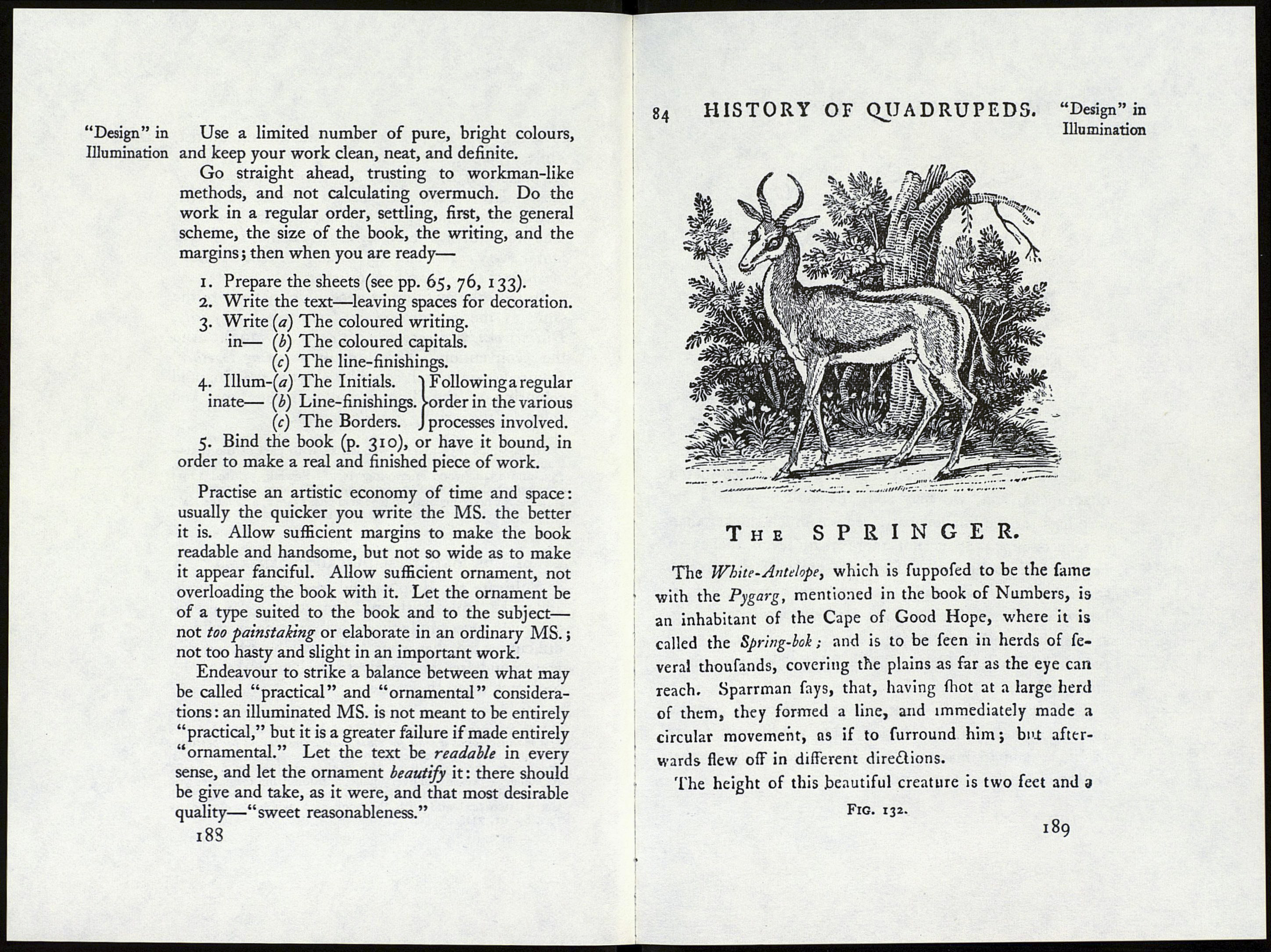
Note.—Figs. 135 to 141 (woodcuts—with part of the text—
from a Herbal printed at Venice in 1571 [p. 333]) and figs. 132,
133, and 134a (wood engravings by T. Bewick, printed I791)
are suggested as examples of drawing—of plants and animals—
suitable for book-decoration (see also figs. 134b, c, d ; Plates XV.,
XVI., XXIII., and notes on “limner’s illumination,” p. 169).
of “designing” MANUSCRIPTS GENERALLY
Cultivate the simplest and most direct methods,
and make “rules of thumb”1 for work-a-day use, to
carry you successfully through all routine or ordinary
difficulties, so that your hand will be trained and
your mind free and ready to deal with the harder
problems when they arise.
1 As an example of a good “rule of thumb,” use the ruled lines
of a manuscript as a scale for other measurements and proportions,
leaving one, two, three, or more of the line-spaces for capitals,
ornaments, &c. : you have this scale—as it were, a “ready'
reckoner”—present on every page, and following it enables you
more easily to make the decoration agree and harmonise with
the written text and with the book as a whole (see p. 94 &
figs. 89, 91, 71).
1 87
