THE SIXTEENTH CENTURY
ship of a set of matrices would explain there being one in the material we acquired
from Jan Roman & Company. We value it highly for its beauty and as an example
of skilful punchcutting. The possession of the original matrices enables us to judge
how greatly the art of founding letters had advanced during a century. A sixteenth-
century cursive was as difficult a problem for a typefounder as a modern script;
ï+Ж Text Oud Gefchreeven. g+J
Ш з.ъъчо^ХѢѢ?*/ iÏÏÏÏW ¡J
ï+к SHs
£.Ц Auguffijn Oud Gefchreeven. Ц+ч
уШ Jqcnvp |)лѵ~ ieu
М-І^Ь; fvfvancc «_>£* -pvivgnf/ &vmtf Tte ;j(W g+J
рЩ Scncxc/ ofovcaí'
f+Ц иаи* au fW« "ос QJllWjctífe/ JaÍW. (\\y~ c£cy~ Щ4
&Щ л Çicr) aime Jßynvvc (3?ат£а.иЪ/ ¿a,Sita.ní "ocio.* Ц+j
&KS'4fetf* ^{)і€€с/ (nvui л -fati §ivc л ѵсж»и|+ѵсѵ/que g«
»I 9ci £W.tf fcWr ^£f «Pf «¿9CVCC л сиГсІ^Исѵ-' &¿ р-іѵ
гИІ fvcW*cvc^ ^ûêfiire^. ^у <{uvy %î *_> rep* Ц+j
L+g**btl ícf Гюі^ (Ь <^>»£феисс/
ѵ+^ S»; chíveme cvntcnfcmcnf л fvu4 ceug л
«"g C^ACUt) <\UÍ ~)ОѴи*Ыеи AffVCtSvc "ÔC ^С Uif (t pOUV Ц+J
H-Ä f^ [ienne aurjfi/ ct>wf»ft CSsj>> ^fy^aSci— ЩЦ
yÚ ■** 1*í*fi|**íí cp**vuetif»eí/ qui f>*>uvv«m{ ГсѵЪіѵ" $j<+,r
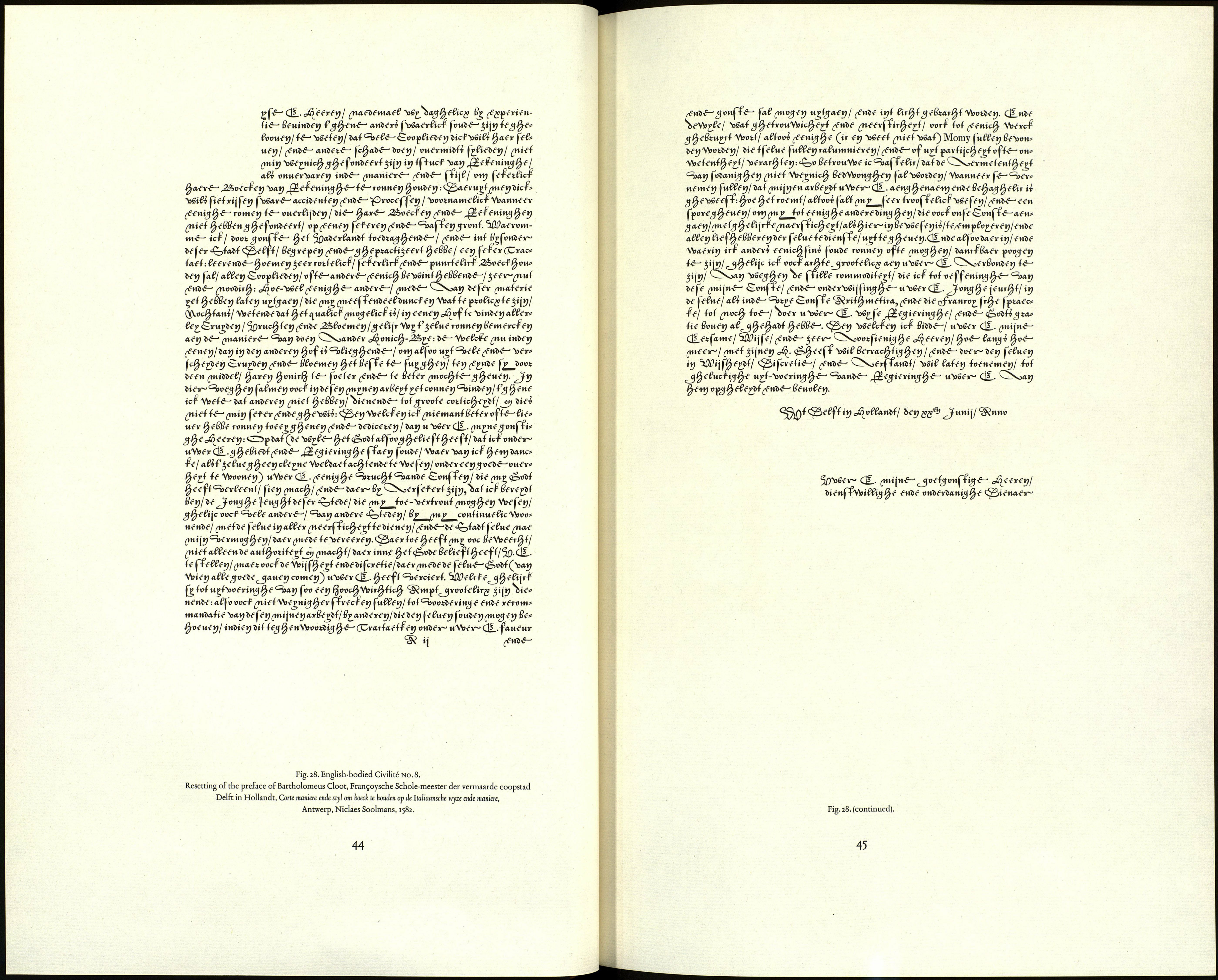
r^S efvanbemeni л fimf F+Ц ¿mei fíi fefpti -4lnf^n¿ &,2*><£С$3 І« »Ц.Ж , 8« ?»^^ Dit battle Gefchreeven Schrift is gefneden voor den vermaarden Boekdruk- ^ *rt *+КФЖФЖФЖФЖФЖ^«Ж«ЖФЖФЖ$ЖФЖ*Ш^ШШФЖ+* Fig. 27. Civilité types no. 8 and No. 9, as they appear in the Enschedé type-specimen of 1768, although the letters do not join up and are not inclined, there is such a profusion Ç£ Type No. 8 is an incomplete set of matrices in which two faces are mixed. 42 CIVILITÉ TYPES Nothing printed with this mixture has come to light that is earlier than Corte maniere Great Frimer civilité No. and at a later time thought of adapting it to a bigger body by cutting additional The matrices for the two founts were in a state of confusion when Johannes As Johannes Enschedé was confident that the type in question was the work of We have done our best to put the typefaces back in the state originally intended, English-bodied civilité No. 8. Great Primer civilité No. 9. 22 capitals: a ^C^gc^^^^^QÎO^OiEe^^^^^cS 1 contracFion, 3 ligatures, and 1 puncFuation mark: 2ß ff ff f* / 28 lower-case sorts common to both founts : [і] р. ф. Carter-Vervliet 210. Vervliet fig. 148. typefaces in one fount were quite common in the sixteenth- [2] CTV 98. Carter-Vervliet type н 3. Vervliet type С 2. nineteenth centuries. One such, the St. Augustin of Granjon [3] The attribution of types Nos. 8 and 9 to Tavernier is with the St. Augustin of Philippe Danfrie, served for the speci- not supported by the studies of his work undertaken since men of the Cursive Françoise in Pierre Simon Fournier le jeune, Charles Enschedé wrote. Mixtures of two or more Civilité Manuel typographique (1764-1766), 2, pp. 141,192, 265. 43
rj.ví ker Chriftoffel Plantyn te Antwerpen, door Ameet Tavernier, Letterfnyder. xíj.*'
where they were ascribed to Ameet Tavernier.
of flourishes and projecting hair lines that most of the sorts have to be kerned.
Needles to say, a good, stifF type-metal is needed for them.
The capitals С D E J Y are uniform with the lower case, the other capitals have been
imported from Type No. и (Granjon's lettre françoise on English body). The matrices
for the two components are different in appearance. Capital P is lacking in no. 8.
от boecV te nouden (Antwerp, N. Soolmans, 1582) cited by Enschedé.1 The lower-case
letters regarded by Charles Enschedé as common to Types nos. 8 and 9 are found
in that book and are best regarded as belonging to this set.]3
sorts. This is a likely explanation of our having matrices for two alphabets of capitals
and two forms of the ascending and descending letters. In sixteenth-century books
the two sizes of letter are found mixed together; but that is due to the printer's
carelessness.3
Enschedé bought them, and by the time he used them for his specimen-book of
1768 he had not had time to sort them (fig. 27). He had not noticed that there
were two founts with letters in common. Besides that, he cast with the face on
English body some sorts which did not belong either to it or to the Great Primer.
Among the 'wrong founts' were a d e f p t and some ligatures, all much too small.
Curiously enough, these sorts belonged to a fount which I shall describe later on,
owned at that time by the Brothers Ploos van Amstel. The capitals, for the most
part, were those of our English-bodied fount, but the lower case was quite difFerent.
Tavernier as used by Plantin he mentioned this as a facF in his type-specimen. Later
he began to have some doubts. This we can readily understand. The tied letters
and the lower case sorts, which he mistakenly took to belong to the fount in spite
of their differences, nevertheless caused an overall impression that difFered con¬
siderably from the works of Tavernier and Plantin.
so that the two founts are made up as follows.
25 capitals: ^^^flçf^Jfi^^oyoiao^^cc^^X^
17 lower-case letters: ^V^^fiícJ ^§^ev(is
1 contracFion, 1 ligature, and 1 puncFuation mark: 31 f+7
16 lower-case letters: ßSS/f^f Jtsfef ^*l>ff
