THE FIFTEENTH CENTURY
now. The very faulty copper matrices for these types, however much they may inter¬
est us now precisely because of their wretched workmanship, must have ceased to
be of any use when typographical equipment reached a certain stage in its develop¬
ment. About the middle of the sixteenth century our early Dutch typefaces gave
way to some of a more modern fashion, and owing to improvements in the tech¬
niques of typefounding the owners of such ancient matrices were in a position to
offer types of superior make. Once that stage was reached, these primitive matrices
were worth little more than the value of old copper, and one may suppose that only
an oversight saved them from the melting-pot. The period of their use may be
reckoned at some 75 years, and thereafter they were put away and lay forgotten for
two centuries. It is now 125 years since Johannes Enschedé rescued them from ob¬
scurity, and during those years they have played a brillant part in the collection at
our printing office as venerable relics of the early days of printing. We shall be mind¬
ful of our ancestor's bidding to preserve them with the greatest care.1
The English-bodied Black Letter N0.1 of our inventory has lost some of the double letters and
contractions belonging to the fount at the time of its use by Eckert van Homberch.
The figures 1,2,3 and 5 are wanting, and there is no sort for zero except the lower¬
case o. More surprising is the survival of so much of the fount, for it has as many as
56 contractions of a kind that went out of use hundreds of years ago. English-bodied
Black Letter N0.1 has the following sorts:
24 capitals: Ш€&е$т}Ш^№&<&^&%>ЪѢХ&1ер%
5 capital-letter contractions: %$ф<й&
28 lower case letters: аЬсЬсЩ\)Штп^рцпи(П\\}т^рщ
13 double letters : dttaíztoftñttüüUullbtí
51 lower case contractions: ШШссС0і|і|І)І)иГіптпооо|Зрруя?ЛР^^ФфФ^
ёвШшипрщрІг
9 punctuation marks and signs: ♦/=î^(f[Hh
5 figures: 4.6*789
9 superiors for contraction: *е."?1°.Ѵ.І"
Great Primer BÏacïe Letter N0.3 has :
23 capitals and one capital-letter contraction :
28 lower case letters: abCdefgb*klmnOpqri0ftUOtti]Cpi#
5 double letters and 31 contractions: йзШМШ
7 punctuation marks and signs: ♦/^♦* 4ЕНЬ
(The contraction £ and the seven points and signs are of more recent cut than the
rest).
[1] An allusion to the last wishes of Johannes I Enschedé.
»
28
EARLY GOTHIC AND ROMAN TYPES
Great Vrimer Black Letter N0.5 has :
22 capitals: ШСЪЩ&Ш^т fi<ЬрШ<В>ЪЖЪ
27 lower case letters: abC&efgtytjklmn0pqn$fíU&jq?5
5 double letters, 8 contractions, 1 punctuation mark: ffftuftlt fllJCtU 0UÌ) (
(The two contractions 0 and $ were cut later).
Lombardie Initials No. 4 lacks the last two letters of the alphabet ; and No. 2 of the same
description is without L, but has two versions of A.
One peculiarity of all the examples of fifteenth-century printing done in these rechûc\ueof
types deserves a note. The letters were never cast as the punchcutter must have in- casUnS
tended : the mould closed so far that the shank of the type was too thin for the face ;
therefore the beginning strokes at the head and the ending strokes at the foot of the
letters disappeared and adjoining letters touched one another. The probable expla¬
nation is that the early typefounders could not cast well enough to get clean outlines
to the letters and bring the hair-strokes up properly. They had to rely on subsequent
rubbing to conceal the variations in the ch.aract.ers, and it is an operation more
easily done when the types are cast thin. My own opinion, however, is that this pro¬
ceeding did not harm the look of the letters on the page.
Anyone who studies early printing with a careful eye must often be struck by
the failure to get particular sorts to stand in line with the rest. These irregularities
of alignment have been used by some authorities as an argument to prove that the
letters were not cast but cut on little blocks of wood. The view of Johannes Enschedé,
quoted on an earlier page (p. 3), was that movable type must always have been
cast. But he was never able to account for these faults of alignment so commonly
found in one or other letter of the alphabet in fifteenth-century printing. Our ances¬
tor cites a remarkable example of this phenomenon. It is the Fasciculus temporum,
printed by Nicolas Götz de Sletzstat in Cologne about 1474.1
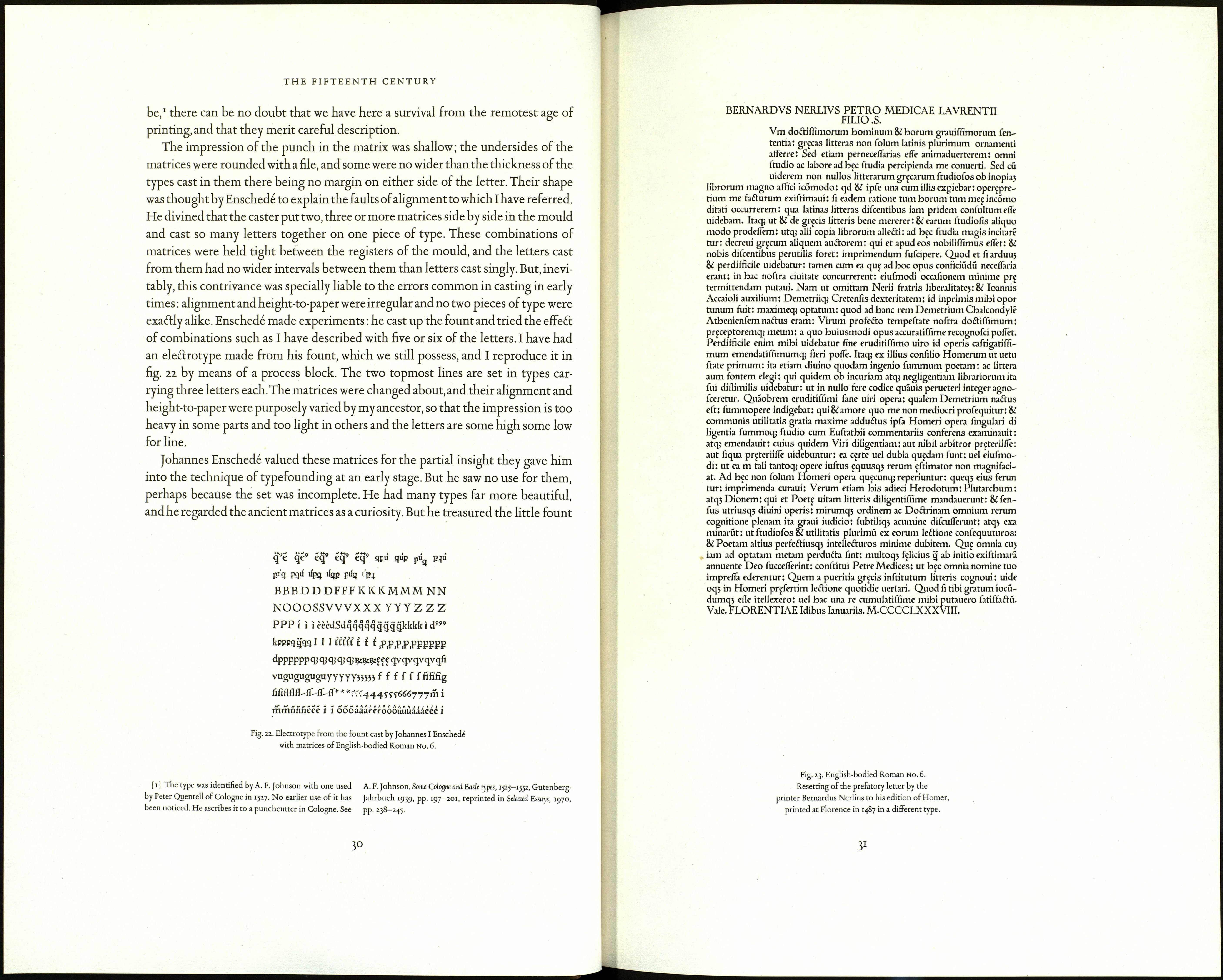
English-bodied Roman No. 6.2 On 26 August 1768 Johannes Enschedé was given a frag- Roman type from
ment of a fifteenth-century book printed by Peter Schoeffer of Gernsheim and some Colo8ne
sixty matrices. The gift was from Jacob Scheffers, a printer at 's-Hertogenbosch,
where his ancestors had pursued his calling for a long time. According to tradition
the matrices had been in the family more than 250 years. Johannes Enschedé thought
them older even than his Black Letters. The face was a Roman of the kind used by
the Venetian printers Jenson and Johannes and Wendelinus de Spira. Scheffers, the
printer, was a descendant of Peter Schoeffer,* and because the matrices had been
so long in the possession of this family at 's-Hertogenbosch, Enschedé suspefted
that the punches for them might have been Schoeffer's work. However that may
[*] For the genealogy of the Schoeffer family see Ch. С graph Peter Schoefler of Gernsheim, 1950.]
V. Verreyt, Het ejeslacht Schoejfer, 1888. [See further A. Ruppel, [1] Voulliéme Köln 1027. Catalogue auction Enschedé 1867, lot 967.
Peter Schäfer aus Gernsheim, 1937 and H. Lehmann-Haupt's mono- [2] CTV 66.
29
