THE EIGHTEENTH CENTURY
in
this direction De Groot offered his customers a Two-line English Roman identical
with our No. J84 (fig. 286, p. 255) cut by the elder Rosart with alternative Italics,
the first N0.785, which I showed in fig. 290, p. 256, the second No. 882 (fig. 488, p. 391).
Harmsen went beyond that and offered a Two-line Great Primer, now our No. 883
(fig. 489), completely French in style and quite unsuitable for use with Rosart's
Romans. The capitals of this face were displayed over again in Harmsen's specimen
as Titling Letters No. 884, and he showed a similar Titling on Two-line English No. 885, which
had no lower-case (fig. 490).
When we bought Harmsen's matrices in 1818, the Italics in French style soon
displaced those of Rosart in the affections of the owners of our foundry, who
thought,nevertheless,that the capitals were too massive; so they mated the new
lower-case alphabets with Rosart's capitals.
The scripts that De Groot had got from Rosart were supplemented in Harmsen's
time with a smaller one very much like those that Fleischman made for Ploos van
Amstel (see p. 242). Only the most minute examination reveals the difference. It
is unfortunate for me as a historian that the matrices for this script have not sur¬
vived, for they are a good example of the trouble that was taken to simulate the
work of the great punchcutter. But this very resemblance was reason enough for
their being discarded once they came into our possession.
On the other hand, the large initials provided by De Groot for his scripts were
quite unlike Rosart's. They are shown in fig. 491 as they were in De Groot's speci¬
men, cast on Two-line Pica, and with them are smaller initials, fig. 492, which were
first printed in Harmsen's specimen. Both of them are cut in brass.
The Harmsen That completes the tale of the types from De Groot's foundry which we still
foundry nave an¿ tne additions made to them by De Groot's successor. It remains to de¬
scribe six sets of ornamented capitals made at the very end of the eighteenth
century and bought by Harmsen. They are anything but beautiful, but they come
within our period and they are of interest as showing the retrogression of the
Le Directeur à la
mode, femblable au
médecin, flatte, con¬
fole, encourage.
Fig. 489. Two-line Great Primer Italie no. 883.
Resetting of part of the type-specimen of Harmsen & Co, 1804.
392
TYPEFOUNDING AT THE HAGUE: DE GROOT
DIDOT GANDO
Two-line Great Primer Italic Titling Capitals no. 884.
ULRICH ANN A M
Two-line English-bodied Italic Titling Capitals no. 885.
Fig.490. Tiding Capitals from Harmsen & Co, Amsterdam.
Fig. 491. Four-line Pica Script Capitals no. 886, from the foundry of J. de Groot, The Hague.
Fig. 492. Eight-line Pica Script Capitals no. 887, from Harmsen & Co, Amsterdam.
art of punchcutting towards the end of it. They figure in our Inventory as Orna¬
mented Capitals on Two-line English, No. 888, Ornamented Capitals on Two-line Brevier, No. 889,
Ornamented italic Capitals on Two-line Brevier, No. 890, Ornamented Capitals on English, No. 891, Orna¬
mented Italic Capitals on English, No. 892 (fig. 493).
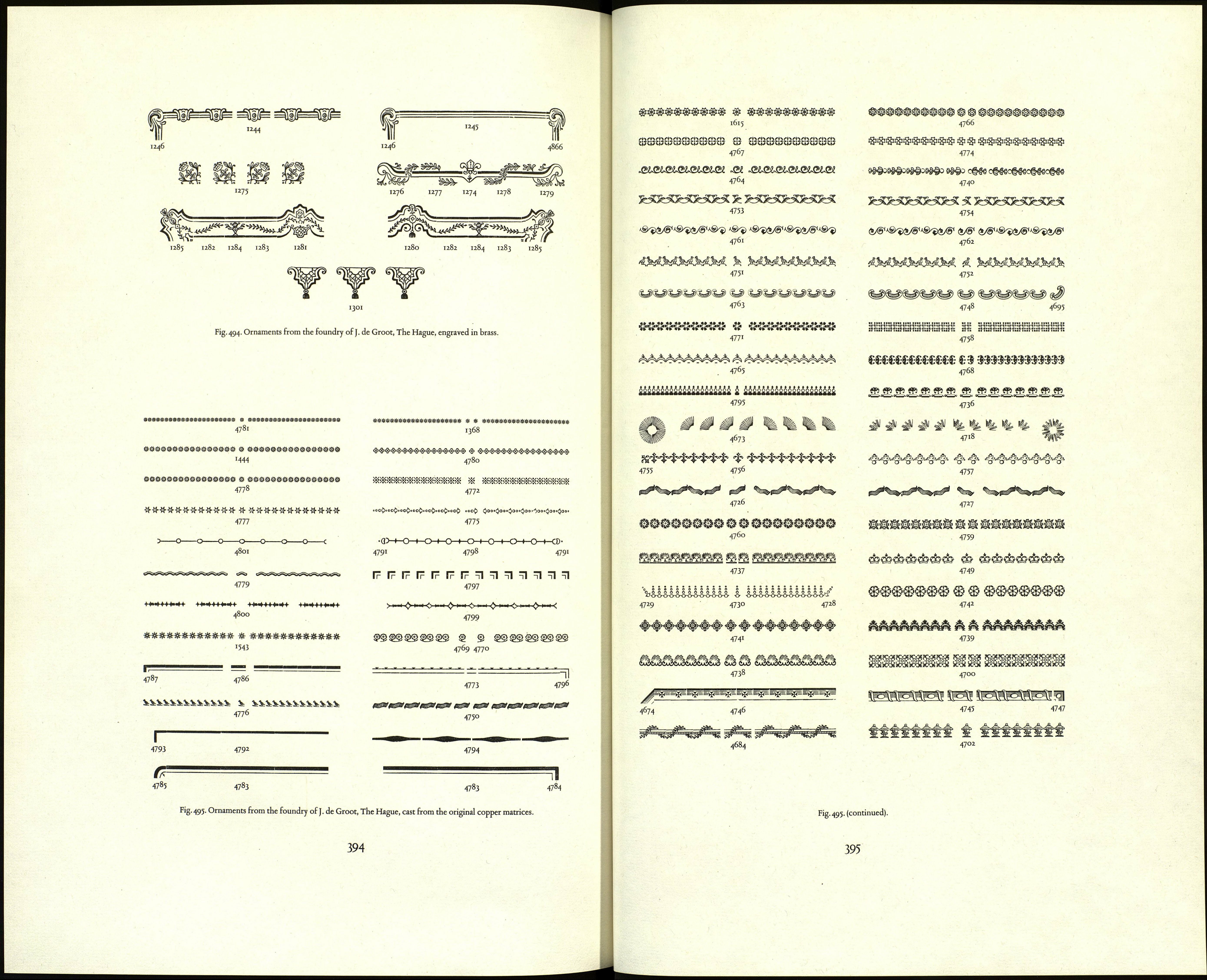
I append the flowers and ornaments which came to us with the stock of Harm-
sen & Co. in 1818 (figs 494—497, pp. 394—401).
HENDRIK BRUYN BE GROOT
English-bodied Ornamented Inclined Titling Capitals no. 892.
PLOOS VAN AMSTEL HARMSEN
English-bodied Ornamented Titling Capitals no. 891.
HENDRIK VAN STADEN
Two-line Brevier Ornamented Inclined Tiding Capitals no. 890.
J. DE GROOT HENDRIK BRUYN
Two-line Brevier Ornamented Titling Capitals no. 889.
ІШТІІ0¥¥ ЕШ7¥¥
Two-line English-bodied Ornamented Tiding Capitals N0.888.
Fig. 493. Ornamented titling capitals from the Harmsen foundry.
393
