Breaking free
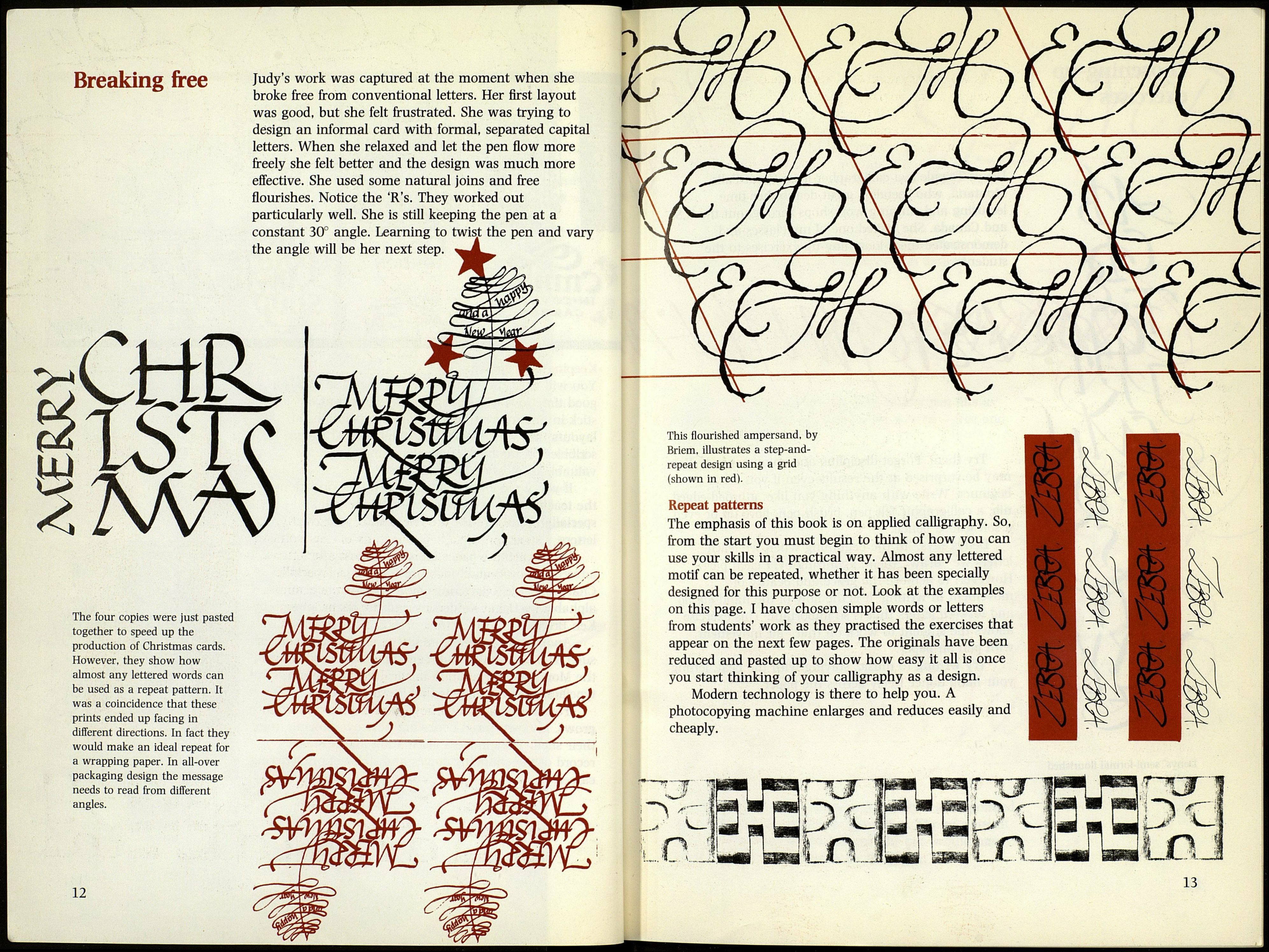
Judy's work was captured at the moment when she
broke free from conventional letters. Her first layout
was good, but she felt frustrated. She was trying to
design an informal card with formal, separated capital
letters. When she relaxed and let the pen flow more
freely she felt better and the design was much more
effective. She used some natural joins and free
flourishes. Notice the 'R's. They worked out
particularly well. She is still keeping the pen at a
constant 30° angle. Learning to twist the pen and vary
the angle will be her next step.
CtffiL
The four copies were just pasted
together to speed up the
production of Christmas cards.
However, they show how
almost any lettered words can
be used as a repeat pattern. It
was a coincidence that these
prints ended up facing in
different directions. In fact they
would make an ideal repeat for
a wrapping paper. In all-over
packaging design the message
needs to read from different
angles.
12
This flourished ampersand, by
Briem. illustrates a step-and-
repeat design using a grid
(shown in red).
Repeat patterns
The emphasis of this book is on applied calligraphy. So,
from the start you must begin to think of how you can
use your skills in a practical way. Almost any lettered
motif can be repeated, whether it has been specially
designed for this purpose or not. Look at the examples
on this page. I have chosen simple words or letters
from students' work as they practised the exercises that
appear on the next few pages. The originals have been
reduced and pasted up to show how easy it all is once
you start thinking of your calligraphy as a design.
Modern technology is there to help you. A
photocopying machine enlarges and reduces easily and
cheaply.
