If you are already equipped as a calligrapher all you
may need in the way of tools are a few new brushes
and pens.
Pens with a good ink flow are needed for larger,
freer lettering. Try automatic pens and coit pens too,
both of which have good reservoirs.
Balsa wood makes the most flexible of implements,
and produces subtle textures. To make yourself one of
these pens all you need is the side of a balsa wood
matchbox. If you cannot get one then you can buy the
thinnest quality from a model-maker's shop. Trim the
balsa wood across the grain with sharp scissors or a
knife, then slot it into a suitable stick to make a
handle. The only disadvantage of your home-made pen
is that it does not carry much ink.
Experiment with fine fibre pointed pens. Some of
those now on the market compare favourably with
expensive technical drawing instruments.
Do not forget the humble carpenter's pencil. It is
always a pleasure to use for roughs, and can produce
free finished letters too. Graphite blocks work in the
same way. They can be easily carved into any size.
You will see how to use these broad edges to construct
Roman capitals on page 26. Double pencils are not just
a beginner's tool. On page 36 you will see how their
double lines form the basis of large drawn letters.
You should not need reminding to keep your pens
scrupulously clean, and your points sharpened. A true
craftsman can be judged by the condition of his tools.
Keeping a scrap book
You will need the stimulus of new ideas, so this is a
good time to start keeping a scrap book. Cut out and
stick in any interesting lettering or typographical
layouts that you may find. Remember that rough
scribbles on the back of envelopes may prove as
valuable as glossy advertisements.
If you go to classes, always keep the corrections
the teacher makes on your work. These will be
specially useful as they are relevant to your own
letters.
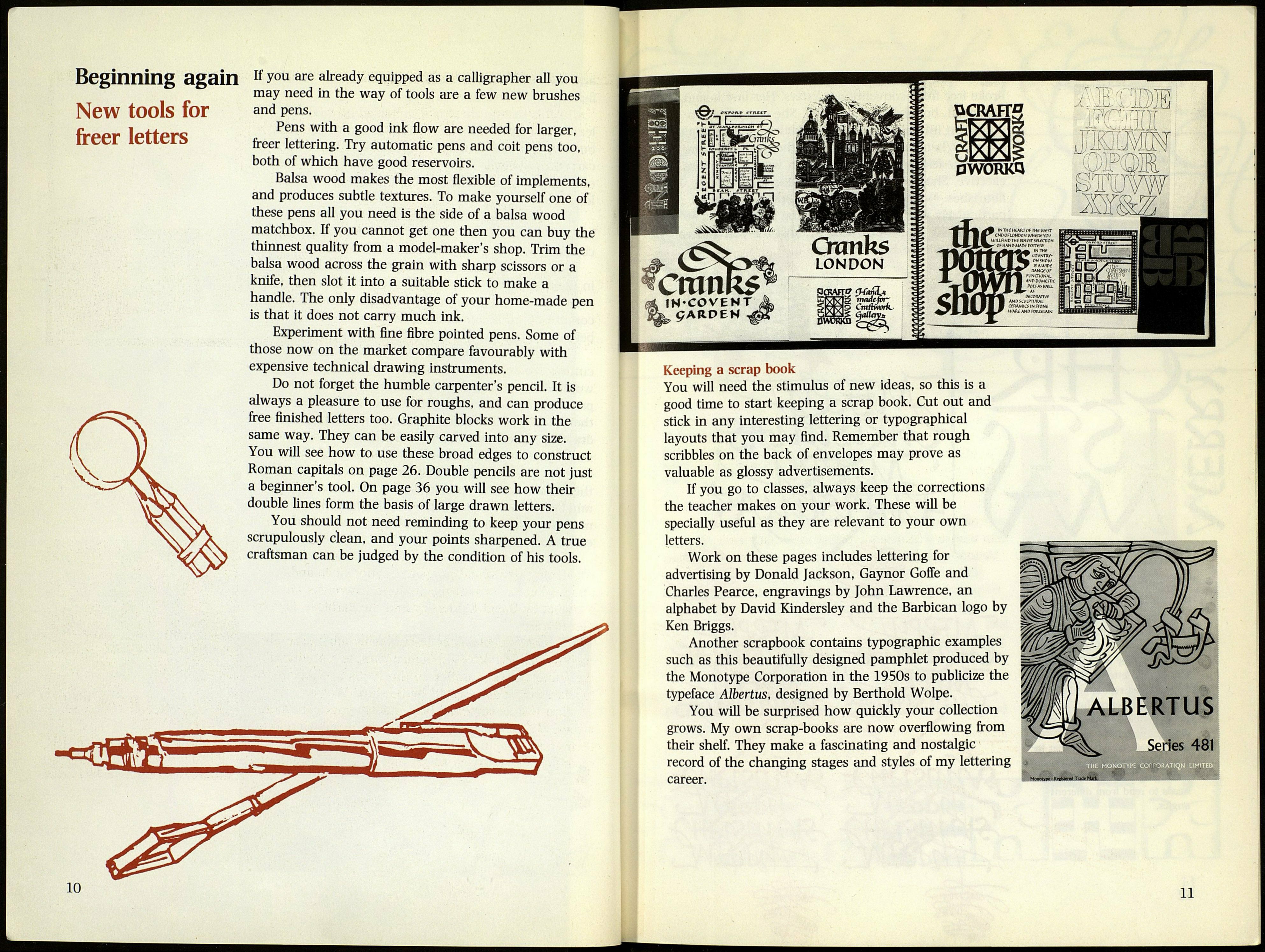
Work on these pages includes lettering for
advertising by Donald Jackson, Gaynor Goffe and
Charles Pearce, engravings by John Lawrence, an
alphabet by David Kindersley and the Barbican logo by
Ken Briggs.
Another scrapbook contains typographic examples
such as this beautifully designed pamphlet produced by
the Monotype Corporation in the 1950s to publicize the
typeface Albertus, designed by Berthold Wolpe.
You will be surprised how quickly your collection
grows. My own scrap-books are now overflowing from
their shelf. They make a fascinating and nostalgic
record of the changing stages and styles of my lettering
career.
ALBERTUS
Series 481
Monotype-Rrltond Traut
11
