Street name plates
and a system for
letterspacing
Street name-plates must be instantly readable, often
from a moving vehicle and usually at an oblique angle.
As a result of a survey which he carried out in the late
1940s David Kindersley was asked by the Ministry of
Transport to produce a revised alphabet which could
be used whenever new signs were needed.
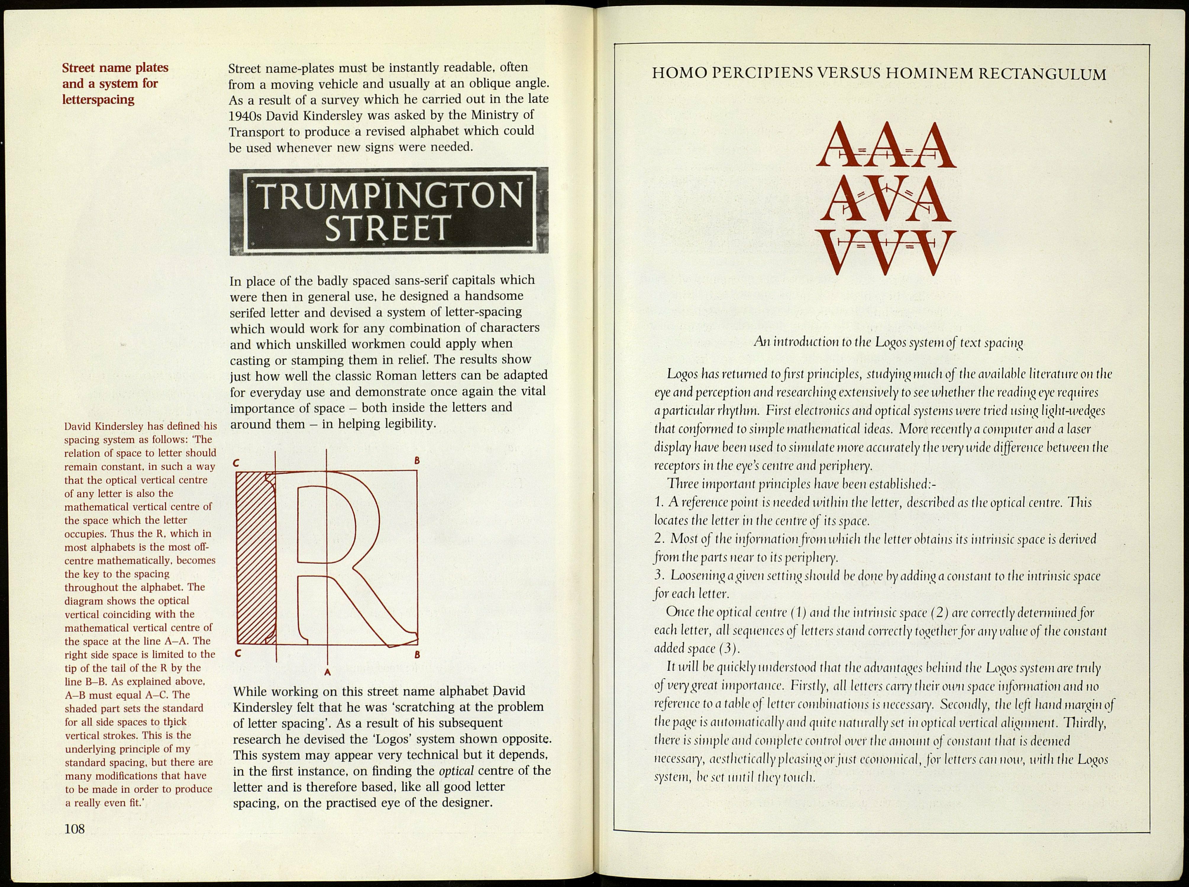
David Kindersley has defined his
spacing system as follows: 'The
relation of space to letter should
remain constant, in such a way
that the optical vertical centre
of any letter is also the
mathematical vertical centre of
the space which the letter
occupies. Thus the R, which in
most alphabets is the most off-
centre mathematically, becomes
the key to the spacing
throughout the alphabet. The
diagram shows the optical
vertical coinciding with the
mathematical vertical centre of
the space at the line A-A. The
right side space is limited to the
tip of the tail of the R by the
line B-B. As explained above,
A-B must equal A-C. The
shaded part sets the standard
for all side spaces to thick
vertical strokes. This is the
underlying principle of my
standard spacing, but there are
many modifications that have
to be made in order to produce
a really even fit.'
TRUMPÌNGTON
STREET
In place of the badly spaced sans-serif capitals which
were then in general use, he designed a handsome
serifed letter and devised a system of letter-spacing
which would work for any combination of characters
and which unskilled workmen could apply when
casting or stamping them in relief. The results show
just how well the classic Roman letters can be adapted
for everyday use and demonstrate once again the vital
importance of space - both inside the letters and
around them - in helping legibility.
While working on this street name alphabet David
Kindersley felt that he was 'scratching at the problem
of letter spacing'. As a result of his subsequent
research he devised the 'Logos' system shown opposite.
This system may appear very technical but it depends,
in the first instance, on finding the optical centre of the
letter and is therefore based, like all good letter
spacing, on the practised eye of the designer.
108
HOMO PERCIPIENS VERSUS HOMINEM RECTANGULUM
AAA
An introduction to the Logos system of text spacing
Logos has returned to first principles, studyingmuch of the available literature on the
eye and perception and researching extensively to see whether the reading eye requires
aparticular rhythm. First electronics and optical systems were tried using light-wedges
that conformed to simple mathematical ideas. More recently a computer and a laser
display have been used to simulate more accurately the wry wide difference between the
receptors in the eye's centre and periphery.
Three important principles have been established::-
1. A reference point is needed within the letter, described as the optical centre. This
locates the letter in the centre of its space.
2. Most of the information from which the letter obtains its intrinsic space is derived
from the parts near to its periphery.
3. Loosening a given setting siiould he done by adding a constant to the intrinsic space
for each letter.
Once the optical centre ( I) aiid the intrinsic space (2) are correctly determined for
each letter, all sequences of letters stand correctly together Jbr any value of the constant
added space (3).
It will be quickly understood that the advaììtages behind the Logos system are truly
of very great importance. Firstly, all letters cany their own space information and no
reference toa fable oj letter combinat ions is necessary. Secondly, the left liand margin of
the page is automatically and quite naturally set in optical vertical alignment. Thirdly,
there is simple and complete control over the amount of constant that is deemed
necessary, aesthetically pleasing or just economical, for letters can now, with the Logos
system, beset until they touch.
