Typography and printing Meeting Will Carter one gets the impression of a truly
contented man who is never bored with creating
classic examples of his chosen craft. He says that he is
happy to be known as just a good workman. However,
those who know of his contribution to letterforms
would consider that something of an understatement.
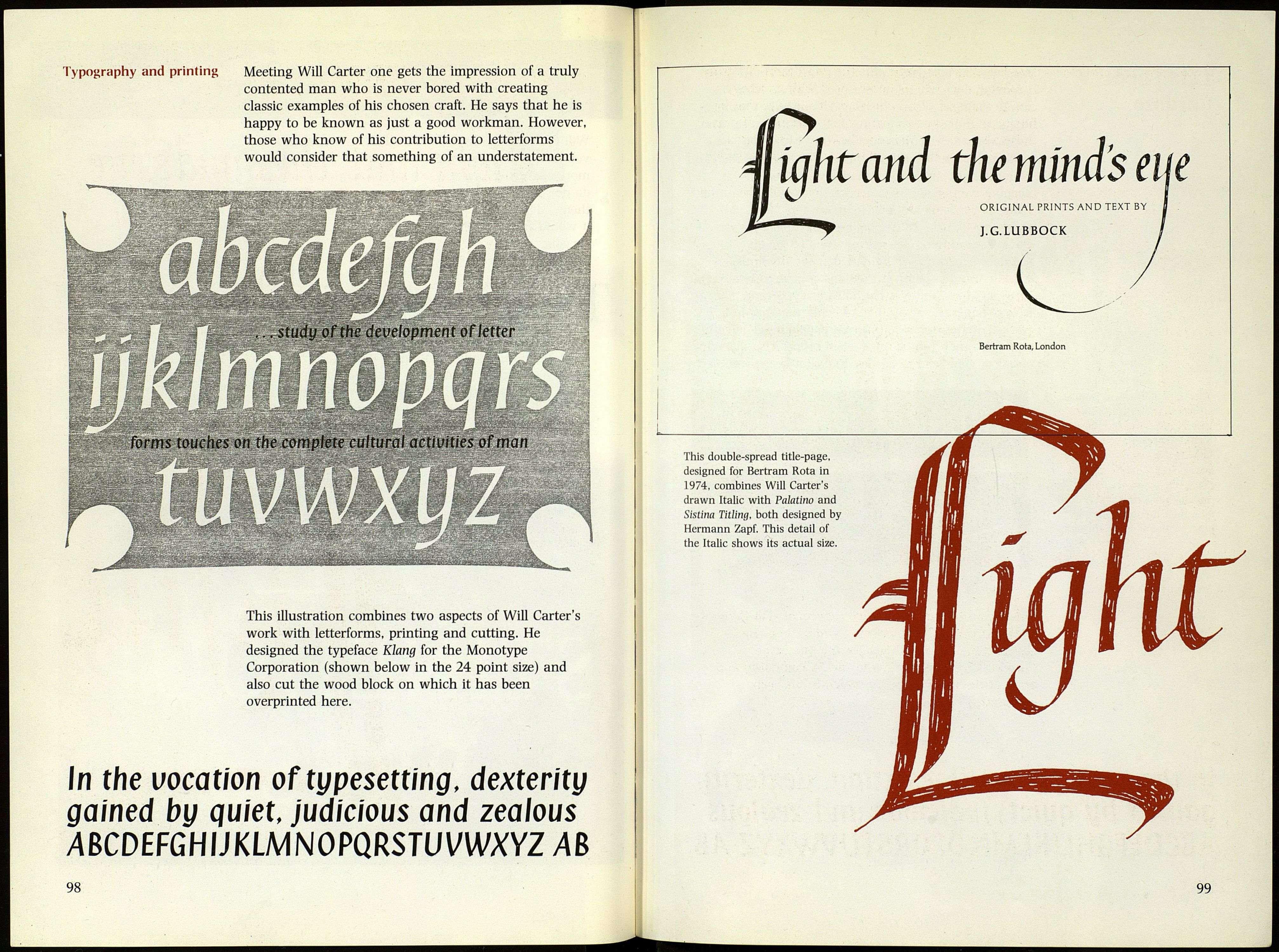
This illustration combines two aspects of Will Carter's
work with letterforms, printing and cutting. He
designed the typeface Klang for the Monotype
Corporation (shown below in the 24 point size) and
also cut the wood block on which it has been
overprinted here.
In the vocation of typesetting, dexterity
gained by quiet, judicious and zeaious
ABCDÍFGHUKLMNOPQRSWVWXYZ AB
98
eight and the mind's a
ORIGINAL PRINTS AND TEXT BY
J.G.LUBBOCK
Bertram Rota, London
This double-spread title-page,
designed for Bertram Rota in
1974, combines Will Carter's
drawn Italic with Palatino and
Sistina Titling, both designed by
Hermann Zapf. This detail of
the Italic shows its actual size.
99
