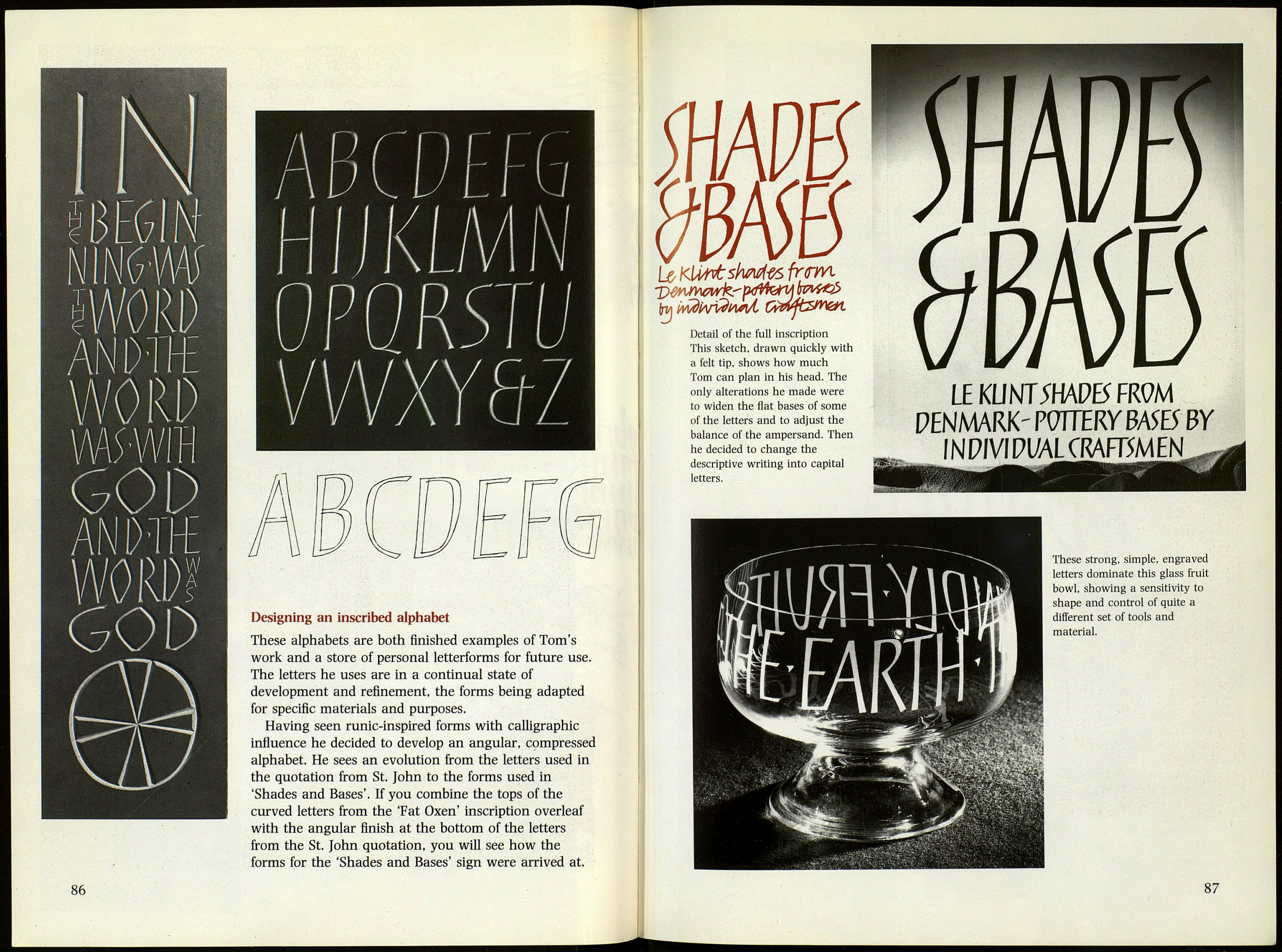
Designing an inscribed alphabet
These alphabets are both finished examples of Tom's
work and a store of personal letterforms for future use.
The letters he uses are in a continual state of
development and refinement, the forms being adapted
for specific materials and purposes.
Having seen runic-inspired forms with calligraphic
influence he decided to develop an angular, compressed
alphabet. He sees an evolution from the letters used in
the quotation from St. John to the forms used in
'Shades and Bases'. If you combine the tops of the
curved letters from the 'Fat Oxen' inscription overleaf
with the angular finish at the bottom of the letters
from the St. John quotation, you will see how the
forms for the 'Shades and Bases' sign were arrived at.
Detail of the full inscription
This sketch, drawn quickly with
a felt tip, shows how much
Tom can plan in his head. The
only alterations he made were
to widen the flat bases of some
of the letters and to adjust the
balance of the ampersand. Then
he decided to change the
descriptive writing into capital
letters.
LE KLMSHADES FR9M
PENMARK' POTTERY BA5E5 BY
INPIVIPI/ALCRAFT5MEN
These strong, simple, engraved
letters dominate this glass fruit
bowl, showing a sensitivity to
shape and control of quite a
different set of tools and
material.
87
