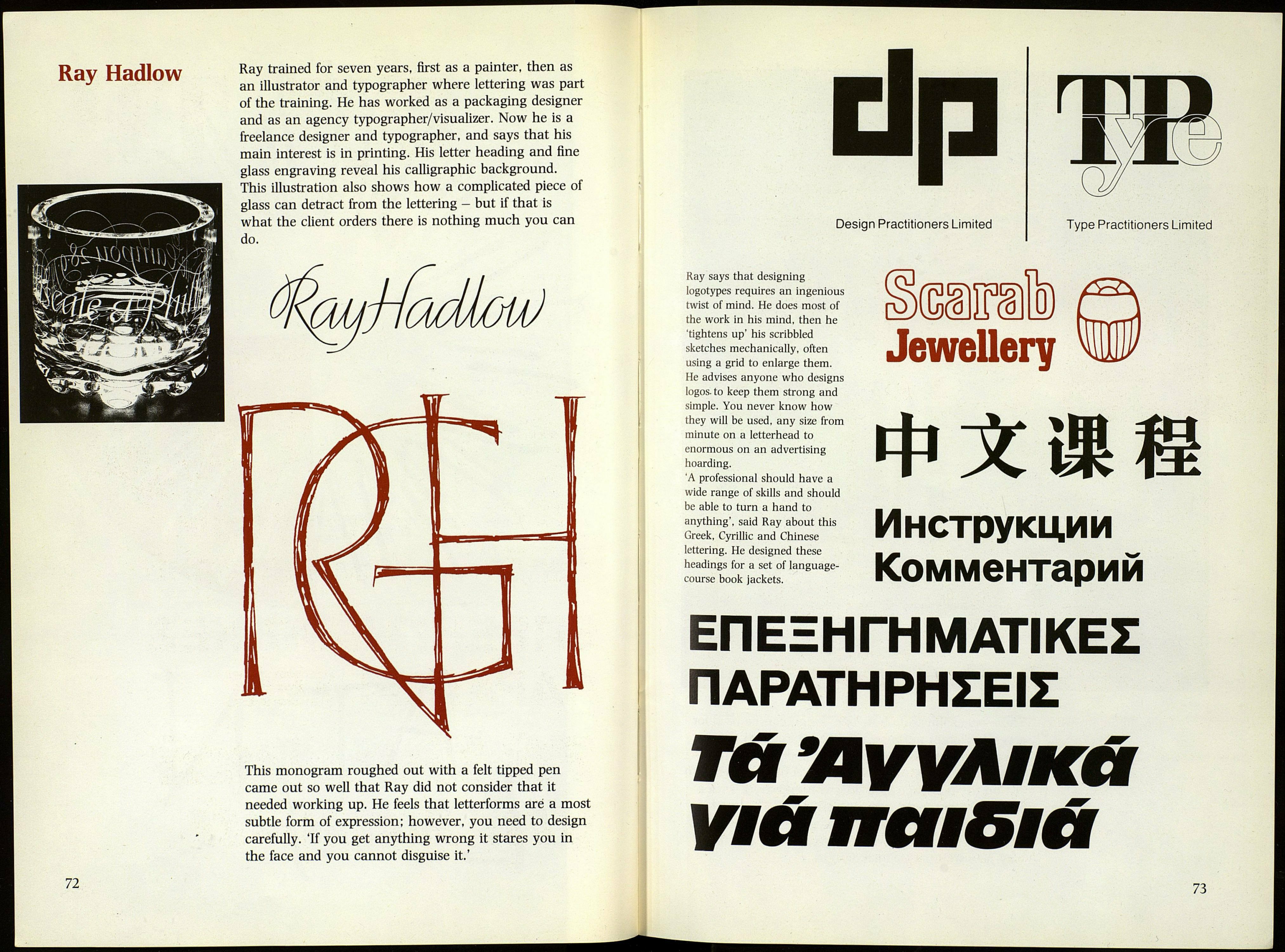
Ray trained for seven years, first as a painter, then as
an illustrator and typographer where lettering was part
of the training. He has worked as a packaging designer
and as an agency typographer/visualizer. Now he is a
freelance designer and typographer, and says that his
main interest is in printing. His letter heading and fine
glass engraving reveal his calligraphic background.
This illustration also shows how a complicated piece of
glass can detract from the lettering - but if that is
what the client orders there is nothing much you can
do.
This monogram roughed out with a felt tipped pen
came out so well that Ray did not consider that it
needed working up. He feels that letterforms aré a most
subtle form of expression; however, you need to design
carefully. 'If you get anything wrong it stares you in
the face and you cannot disguise it.'
Design Practitioners Limited
Type Practitioners Limited
Ray says that designing
logotypes requires an ingenious
twist of mind. He does most of
the work in his mind, then he
'tightens up' his scribbled
sketches mechanically, often
using a grid to enlarge them.
He advises anyone who designs
logos, to keep them strong and
simple. You never know how
they will be used, any size from
minute on a letterhead to
enormous on an advertising
hoarding.
A professional should have a
wide range of skills and should
be able to turn a hand to
anything', said Ray about this
Greek, Cyrillic and Chinese
lettering. He designed these
headings for a set of language-
course book jackets.
ФЗСх
Инструкции
Комментарий
ЕПЕЕНГНМАТІКЕІ
riAPATHPHZEIZ
TU 'AVVAlKá
ѴШ ïïïïdE Già
73
