The Author's
page
Teaching and writing have taken up so much of my
time that I have not been able to produce much work
recently. I have also become increasingly involved with
research into handwriting problems. Anyhow, I would
describe myself as a designer who uses letters and
lettering techniques rather than a designer of letters -
and the design of letters is what this section is really
about. However, I would like to include a few examples
if only to persuade calligraphers to use their skill with
a pen more widely and imaginatively.
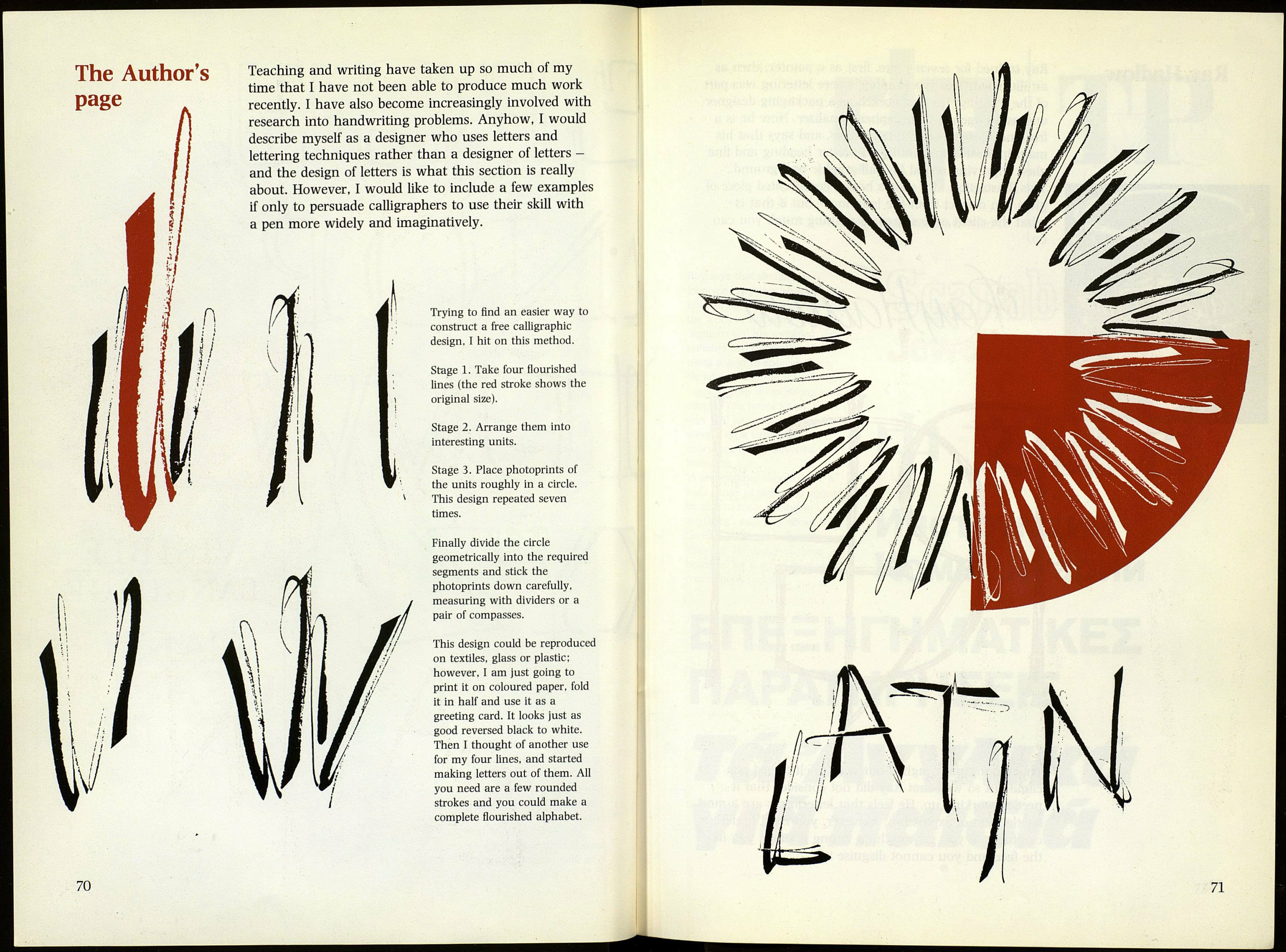
Trying to find an easier way to
construct a free calligraphic
design, I hit on this method.
Stage 1. Take four flourished
lines (the red stroke shows the
original size).
Stage 2. Arrange them into
interesting units.
Stage 3. Place photoprints of
the units roughly in a circle.
This design repeated seven
times.
Finally divide the circle
geometrically into the required
segments and stick the
photoprints down carefully,
measuring with dividers or a
pair of compasses.
This design could be reproduced
on textiles, glass or plastic;
however, I am just going to
print it on coloured paper, fold
it in half and use it as a
greeting card. It looks just as
good reversed black to white.
Then I thought of another use
for my four lines, and started
making letters out of them. All
you need are a few rounded
strokes and you could make a
complete flourished alphabet.
70
71
