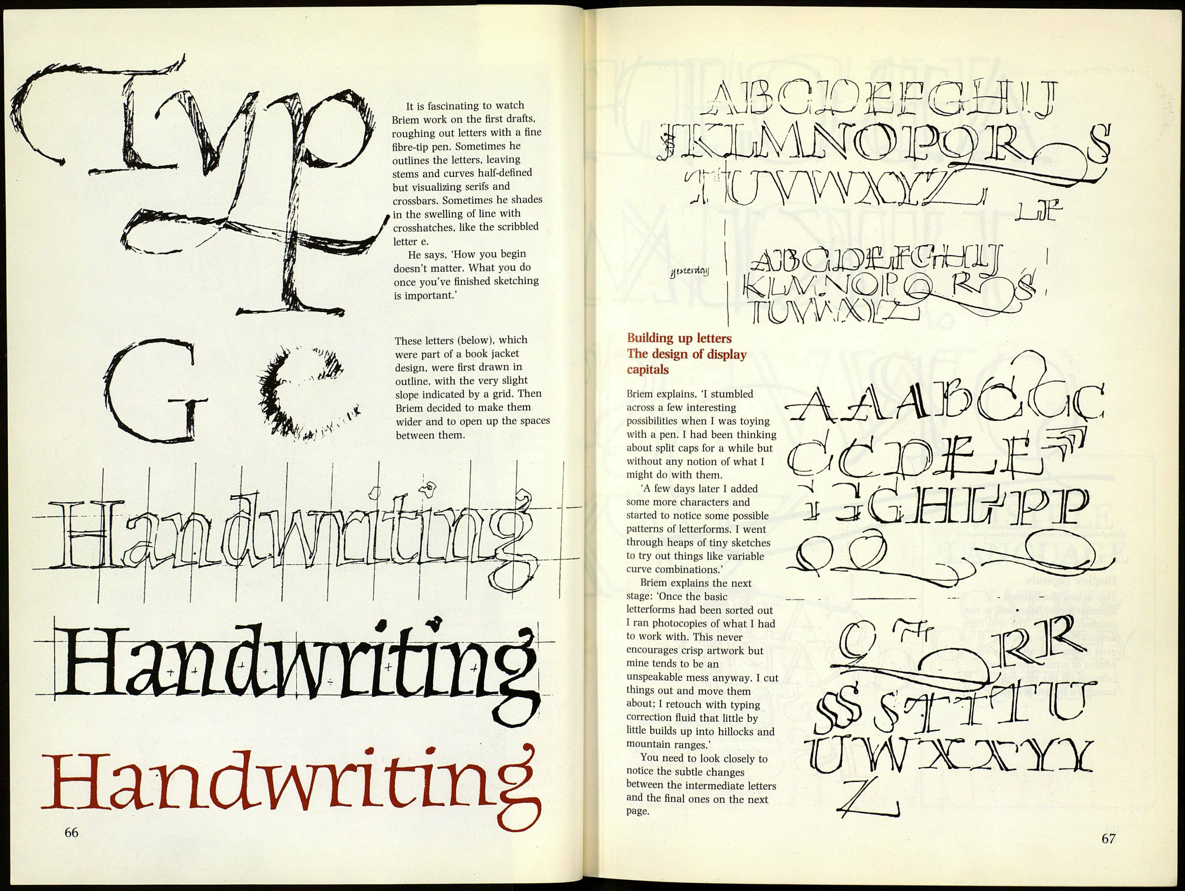
It is fascinating to watch
Briem work on the first drafts,
roughing out letters with a fine
fibre-tip pen. Sometimes he
outlines the letters, leaving
stems and curves half-defined
but visualizing serifs and
crossbars. Sometimes he shades
in the swelling of line with
crosshatches, like the scribbled
letter e.
He says. 'How you begin
doesn't matter. What you do
once you've finished sketching
is important.'
These letters (below), which
were part of a book jacket
design, were first drawn in
outline, with the very slight
slope indicated by a grid. Then
Briem decided to make them
wider and to open up the spaces
between them.
%
W !•
Я
А Ш П m E ID (Г2.Ш \\ 1
Ui avjl=^
iV-JJL. ^>
i-
ИШО
'^
a
fptmtrtjj
u?
К\ьм,ыО\?
тишот '
Building up letters
The design of display
capitals
Briem explains, 'I stumbled
across a few interesting
possibilities when I was toying
with a pen. I had been thinking
about split caps for a while but
without any notion of what I
might do with them.
A few days later I added
some more characters and
started to notice some possible
patterns of letterforms. I went
through heaps of tiny sketches
to try out things like variable
curve combinations.'
Briem explains the next
stage: 'Once the basic
letterforms had been sorted out
I ran photocopies of what I had
to work with. This never
encourages crisp artwork but
mine tends to be an
unspeakable mess anyway. I cut
things out and move them
about: I retouch with typing
correction fluid that little by
little builds up into hillocks and
mountain ranges.'
You need to look closely to
notice the subtle changes
between the intermediate letters
and the final ones on the next
Page.
/
■АЛ-АЪООе
VWJCJCYX
67
