International
exhibition
of calligraphy
Al£jóole0
syning á
skrautskrift
Living
Letters
College of 'Lifandi
letur
Art and Crafts
Iceland
Easter 82 Myndlista-og
handíoaskóli
islands Ь--------
Gunnlaugur SE Briem
Páskar 82,
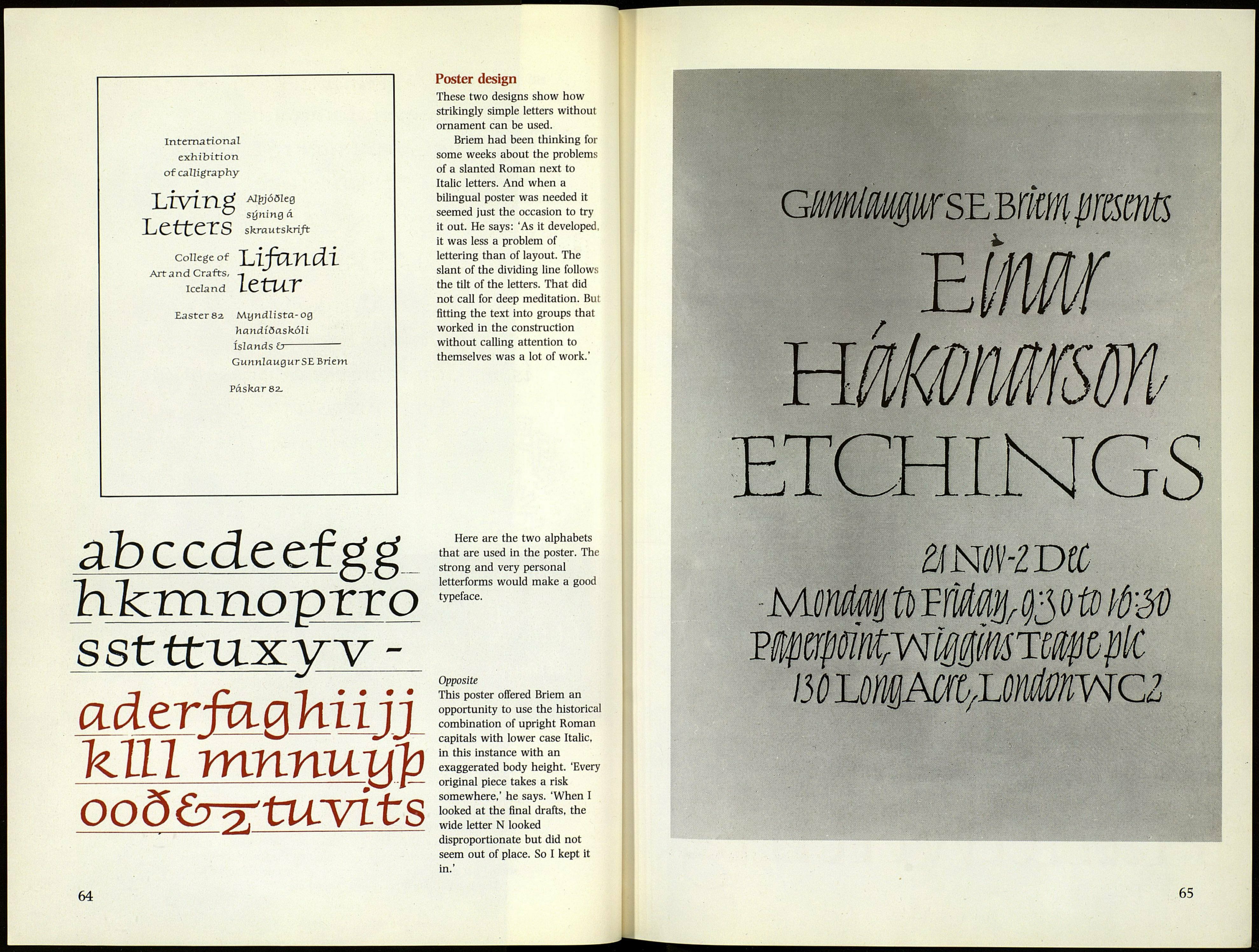
Poster design
These two designs show how
strikingly simple letters without
ornament can be used.
Briem had been thinking for
some weeks about the problems
of a slanted Roman next to
Italic letters. And when a
bilingual poster was needed it
seemed just the occasion to try
it out. He says: 'As it developed,
it was less a problem of
lettering than of layout. The
slant of the dividing line follows
the tilt of the letters. That did
not call for deep meditation. Bui
fitting the text into groups that
worked in the construction
without calling attention to
themselves was a lot of work.'
ab cede ef g g
hJcmnoprro
ssttfU-xyv-
aderfagltiiji
kill mnnuUp
ooöb^tuvits
Here are the two alphabets
that are used in the poster. The
strong and very personal
letterforms would make a good
typeface.
Opposite
This poster offered Briem an
opportunity to use the historical
combination of upright Roman
capitals with lower case Italic,
in this instance with an
exaggerated body height. 'Every
original piece takes a risk
somewhere,' he says. 'When I
looked at the final drafts, the
wide letter N looked
disproportionate but did not
seem out of place. So I kept it
in.'
64
:
65