Briem certainly had an international training: his
formal art education started in his native Iceland and
he studied letterforms in Denmark and Switzerland. He
finished his postgraduate education in London with a
PhD from the Royal College of Art. He described
himself as a designer who specializes in lettering, but
would not call himself a calligraphier. His lectures on
the alphabet are usually within a historical framework.
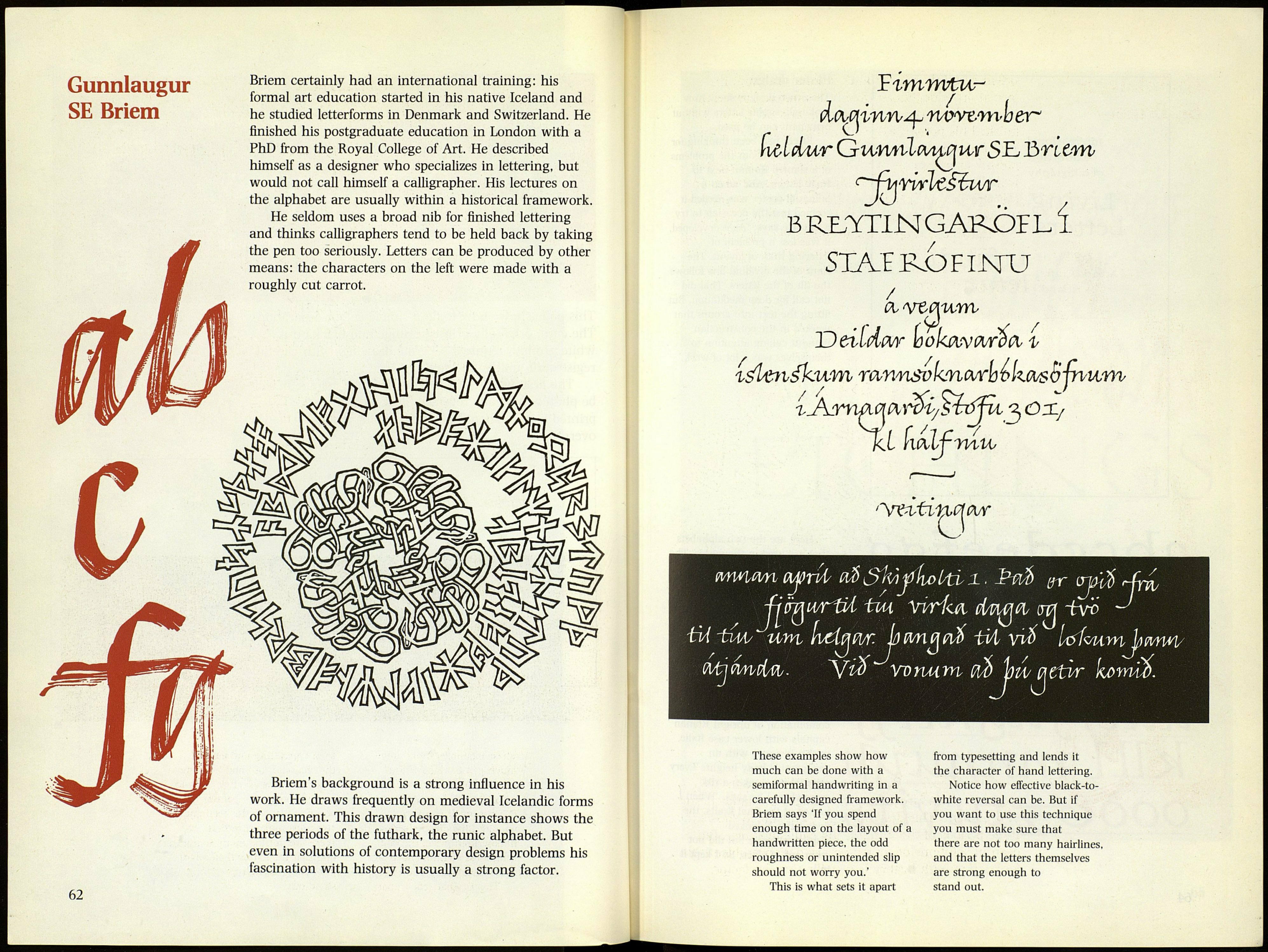
He seldom uses a broad nib for finished lettering
and thinks calligraphers tend to be held back by taking
the pen too seriously. Letters can be produced by other
means: the characters on the left were made with a
roughly cut carrot.
Briem's background is a strong influence in his
work. He draws frequently on medieval Icelandic forms
of ornament. This drawn design for instance shows the
three periods of the futhark, the runic alphabet. But
even in solutions of contemporary design problems his
fascination with history is usually a strong factor.
doictinri^ nvwrnoeir'
mícUtr оѵтльісшйріѵ 5Ь Згіспѵ
В Rb-YTIN GARDIL í
/
SXA.EROFINU
/
(X'Vtc\urrb
mi
Ueildw юокяѵрьгйсг i
гЛ^лшшгді/Ві^рі^ОХ/
■тпи,
'Лге^г'Сьп.ййА'
MWlWl
ótá\V№ÍMj- V¿0 ѵопмт (M) Ьм/ iïttvr komio.
These examples show how
much can be done with a
semiformal handwriting in a
carefully designed framework.
Briem says 'If you spend
enough time on the layout of a
handwritten piece, the odd
roughness or unintended slip
should not worry you.'
This is what sets it apart
from typesetting and lends it
the character of hand lettering.
Notice how effective black-to-
white reversal can be. But if
you want to use this technique
you must make sure that
there are not too many hairlines,
and that the letters themselves
are strong enough to
stand out.
