Calligraphy
for reproduction
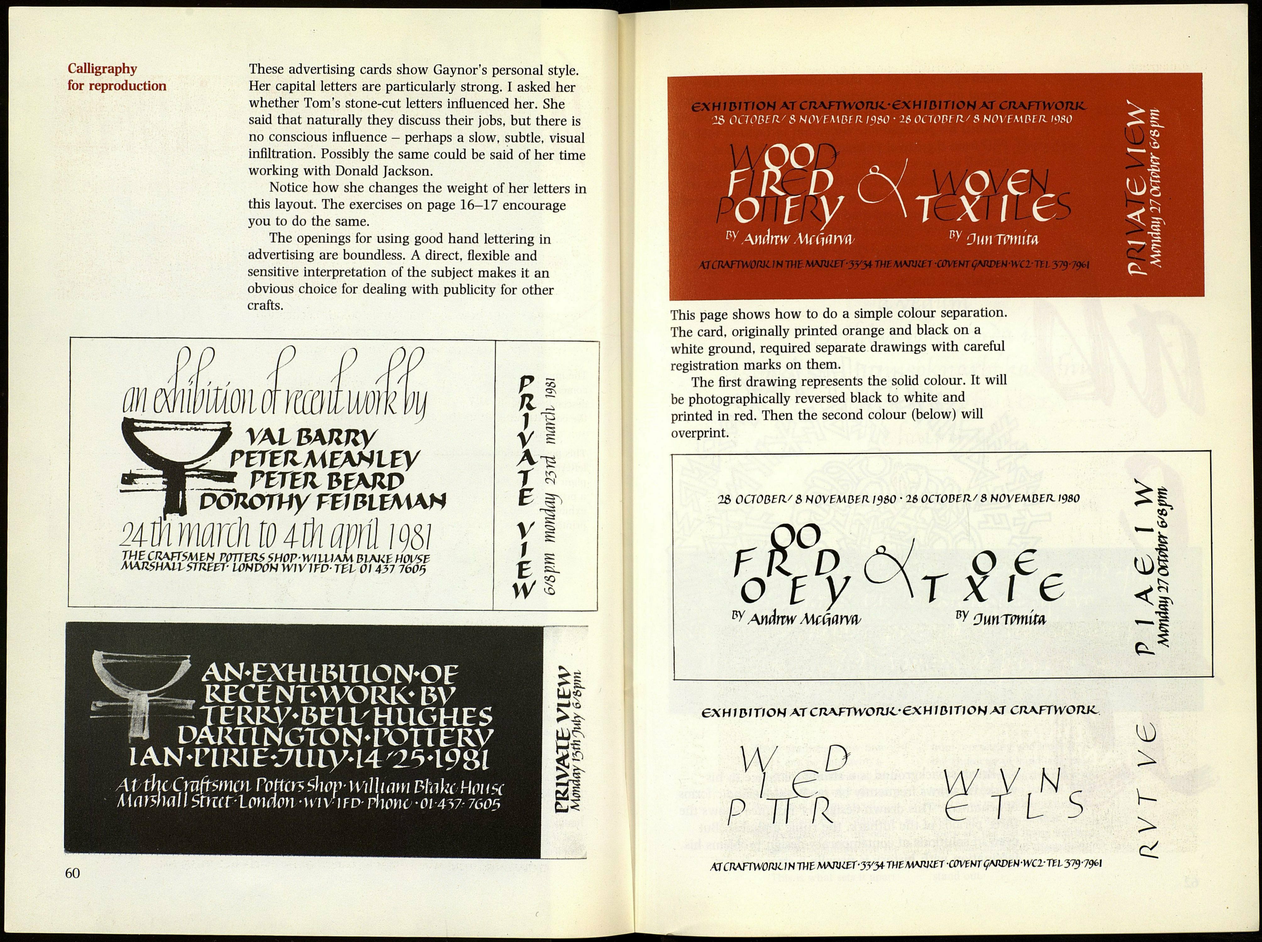
These advertising cards show Gaynor's personal style.
Her capital letters are particularly strong. I asked her
whether Tom's stone-cut letters influenced her. She
said that naturally they discuss their jobs, but there is
no conscious influence - perhaps a slow, subtle, visual
infiltration. Possibly the same could be said of her time
working with Donald Jackson.
Notice how she changes the weight of her letters in
this layout. The exercises on page 16-17 encourage
you to do the same.
The openings for using good hand lettering in
advertising are boundless. A direct, flexible and
sensitive interpretation of the subject makes it an
obvious choice for dealing with publicity for other
crafts.
ѴАІВАЯЛУ
РГГЕЯМЕЛНѴЕУ
РШЯВЕАЛѴ
X^J^f&WjyVV1* SHOP Will)AM BlAKtHOVSZ
MAJlSHMbSTRBtT WNWH WW ITP- ТЫ Ol 437 760$
ON
ï
SD
V
/
E
W
Si.
AN-EXHIBITLON-OE
RECENT-WORK* ЪУ
JERRy-BEU/HUGKES
MmNGTON-POTTERV
lAN-FLRlEv7lliy44/2^498[
AtyuicÇmftmcn rotten shov- William ШксНоич
Ma wa í / Stmt- London • wi v i fe>- riiono • 01 -аъі- ѵооь
60
еХН 1DITIOH AT CRAFTWOJVt.- €X H / DIЛ ON AT CTÍA.FTWOTIK.
'$N0^
о ty
рУ Andrew МсСійш
TX I
"У Ounromim
AtfCRAfTW0W-INTU£M\lViEr-3ytyngM*W&T-C(№NTÇARDM-WC2-TZl379-79(>l
This page shows how to do a simple colour separation.
The card, originally printed orange and black on a
white ground, required separate drawings with careful
registration marks on them.
The first drawing represents the solid colour. It will
be photographically reversed black to white and
printed in red. Then the second colour (below) will
overprint.
1& OCTOBER/ В NOVEMBER Ì9&0 ' 26 OCTODER/ 8 NOVEMBER Щ0
ÍPo
oty
w Andnw Мсйагѵйу
о e
rxi e
*У Оиптоткл
-.s
ex н i d i rioH at cTiAFTwonjL' ex H Í 01 Tí О H AT CRA.FTWOTUC
W D
P TÍR
^7lns
AICnAFÎWOWUN THE МХШІЕГ-ЗУЗ* THZWWIET -COVÍN!■ qW)W-WCbU\,yi57<&\
>
