Judith Hammer
The last three contributors were all in their early
twenties. Judith Hammer shows that you can take up
lettering later in life and still make a success of it. She
has trained part-time for five years, and has recently
finished a diploma course in Calligraphy, Heraldry and
Illuminating. Now she intends to teach students in
Adult Education and do freelance work as well.
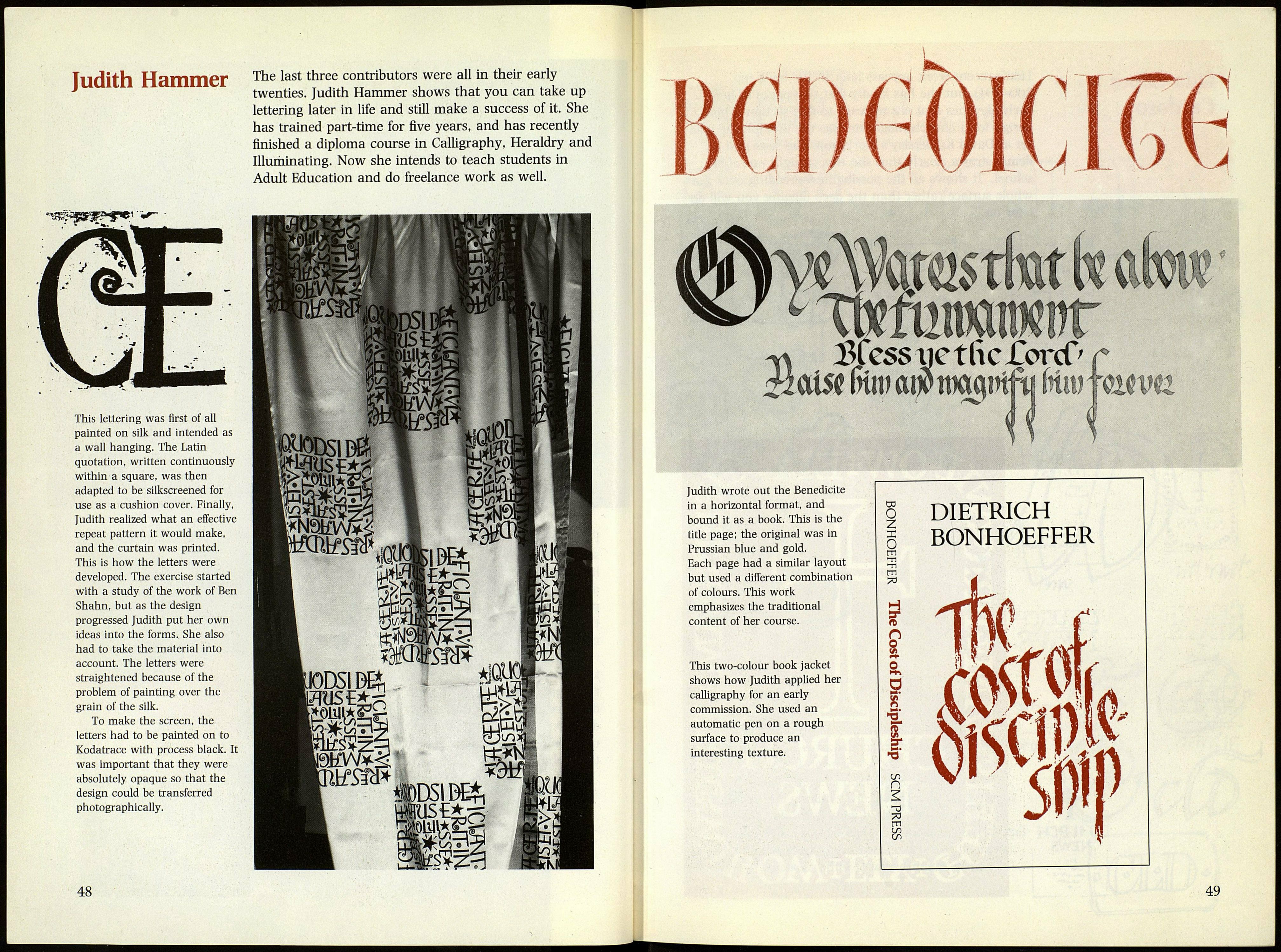
This lettering was first of all
painted on silk and intended as
a wall hanging. The Latin
quotation, written continuously
within a square, was then
adapted to be silkscreened for
use as a cushion cover. Finally,
Judith realized what an effective
repeat pattern it would make,
and the curtain was printed.
This is how the letters were
developed. The exercise started
with a study of the work of Ben
Shahn, but as the design
progressed Judith put her own
ideas into the forms. She also
had to take the material into
account. The letters were
straightened because of the
problem of painting over the
grain of the silk.
To make the screen, the
letters had to be painted on to
Kodatrace with process black. It
was important that they were
absolutely opaque so that the
design could be transferred
photographically.
48
€W1
k
ÎOStfotfc
ufalf "
XJi-a
n
ШШГОГ
ч\ $fessaietlic£orcf' r
ікШІпшв
ш/ШШЁЁШ \ ■■■■■■■■
Judith wrote out the Benedicite
in a horizontal format, and
bound it as a book. This is the
CO
0
DIETRICH
title page; the original was in
Prussian blue and gold.
X
0
m
BONHOEFFER
Each page had a similar layout
-n
TI
but used a different combination
m
73
A
of colours. This work
1^.
emphasizes the traditional
H
^vÍA./% m
content of her course.
ЯГ
n
0
1 llv S
This two-colour book jacket
0
1 W^ll^aìfF/'
shows how Judith applied her
s
/äili\k P m / 81
calligraphy for an early
■ % f 11. ' ^1/Í*
commission. She used an
automatic pen on a rough
"H.
y
surface to produce an
interesting texture.
1 il WPIíiV
L
LO
n
-a
a
m
U1
Vl Щ
)
