Designing for stone
and glass
This commission was intended to show off the new
material it was worked on. Therefore the placing of the
lettering on the block is unusually high. It was sand¬
blasted on to Petrarch - a reconstituted slate. The
design itself would make a good logo type as well.
In the workshop Fiona is lucky to be able to work
with a variety of materials and to be able to exploit
their varied characteristics.
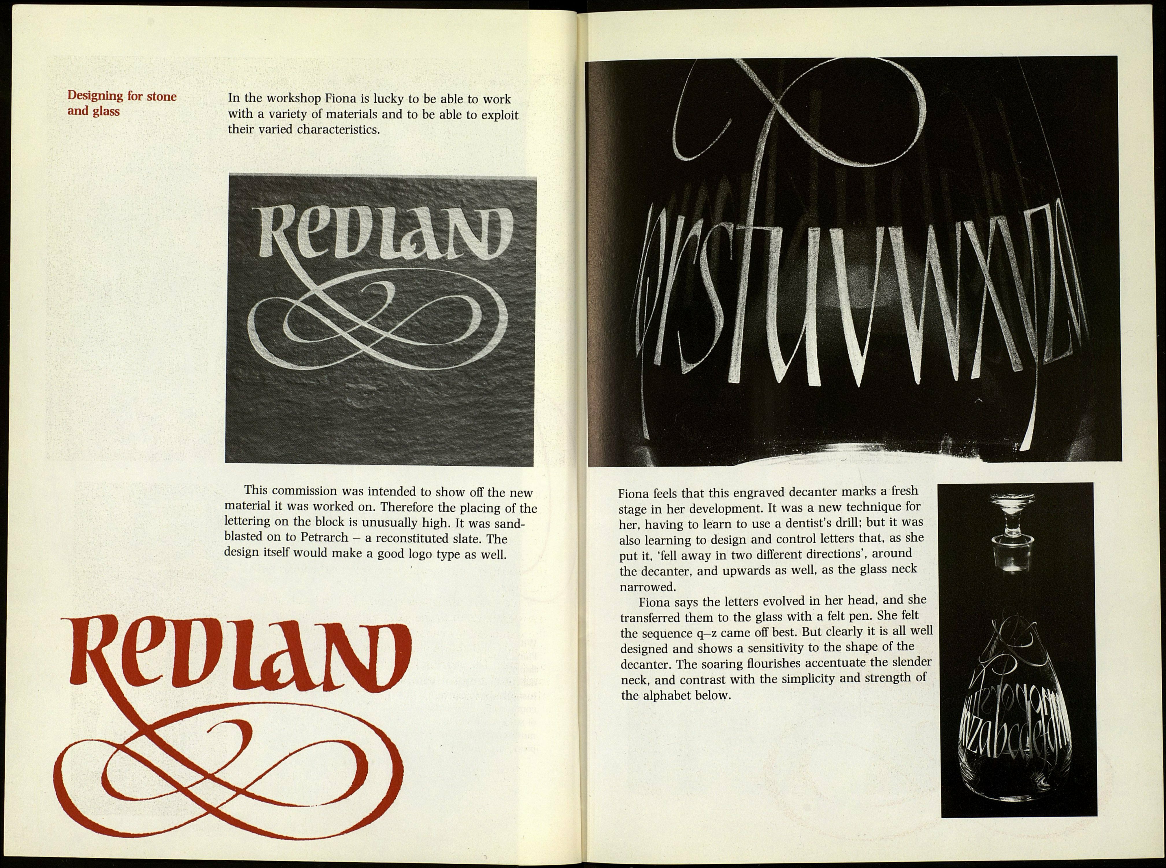
Fiona feels that this engraved decanter marks a fresh
stage in her development. It was a new technique for
her, having to learn to use a dentist's drill; but it was
also learning to design and control letters that, as she
put it, 'fell away in two different directions', around
the decanter, and upwards as well, as the glass neck
narrowed.
Fiona says the letters evolved in her head, and she
transferred them to the glass with a felt pen. She felt
the sequence q-z came off best. But clearly it is all well
designed and shows a sensitivity to the shape of the
decanter. The soaring flourishes accentuate the slender
neck, and contrast with the simplicity and strength of
the alphabet below.
