Patrick Knowles
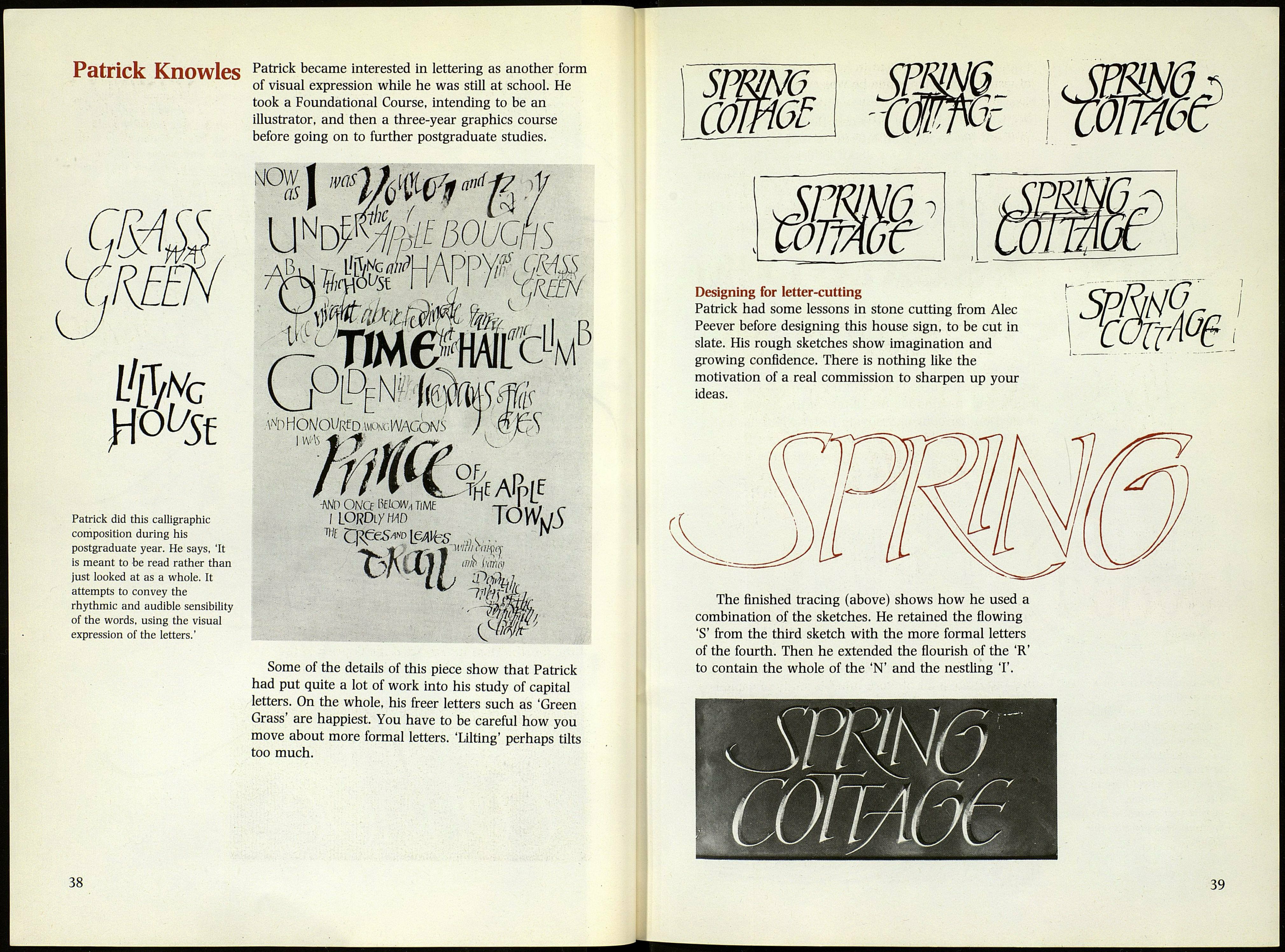
Patrick did this calligraphic
composition during his
postgraduate year. He says, 'It
is meant to be read rather than
just looked at as a whole. It
attempts to convey the
rhythmic and audible sensibility
of the words, using the visual
expression of the letters.'
Patrick became interested in lettering as another form
of visual expression while he was still at school. He
took a Foundational Course, intending to be an
illustrator, and then a three-year graphics course
before going on to further postgraduate studies.
NOW
as
A't> HON/Ol/Rf D wwcWACoNS /
■m once №m, time -t-J , S r
¡lORDiymo ЮуѴк/3
С у *'
lîl/O IVI'ifil
0¿fLi
Some of the details of this piece show that Patrick
had put quite a lot of work into his study of capital
letters. On the whole, his freer letters such as 'Green
Grass' are happiest. You have to be careful how you
move about more formal letters. 'Lilting' perhaps tilts
too much.
38
Designing for letter-cutting
Patrick had some lessons in stone cutting from Alec
Peever before designing this house sign, to be cut in
slate. His rough sketches show imagination and
growing confidence. There is nothing like the
motivation of a real commission to sharpen up your
ideas.
The finished tracing (above) shows how he used a
combination of the sketches. He retained the flowing
'S' from the third sketch with the more formal letters
of the fourth. Then he extended the flourish of the 'R'
to contain the whole of the 'N' and the nestling T.
Wh
39
