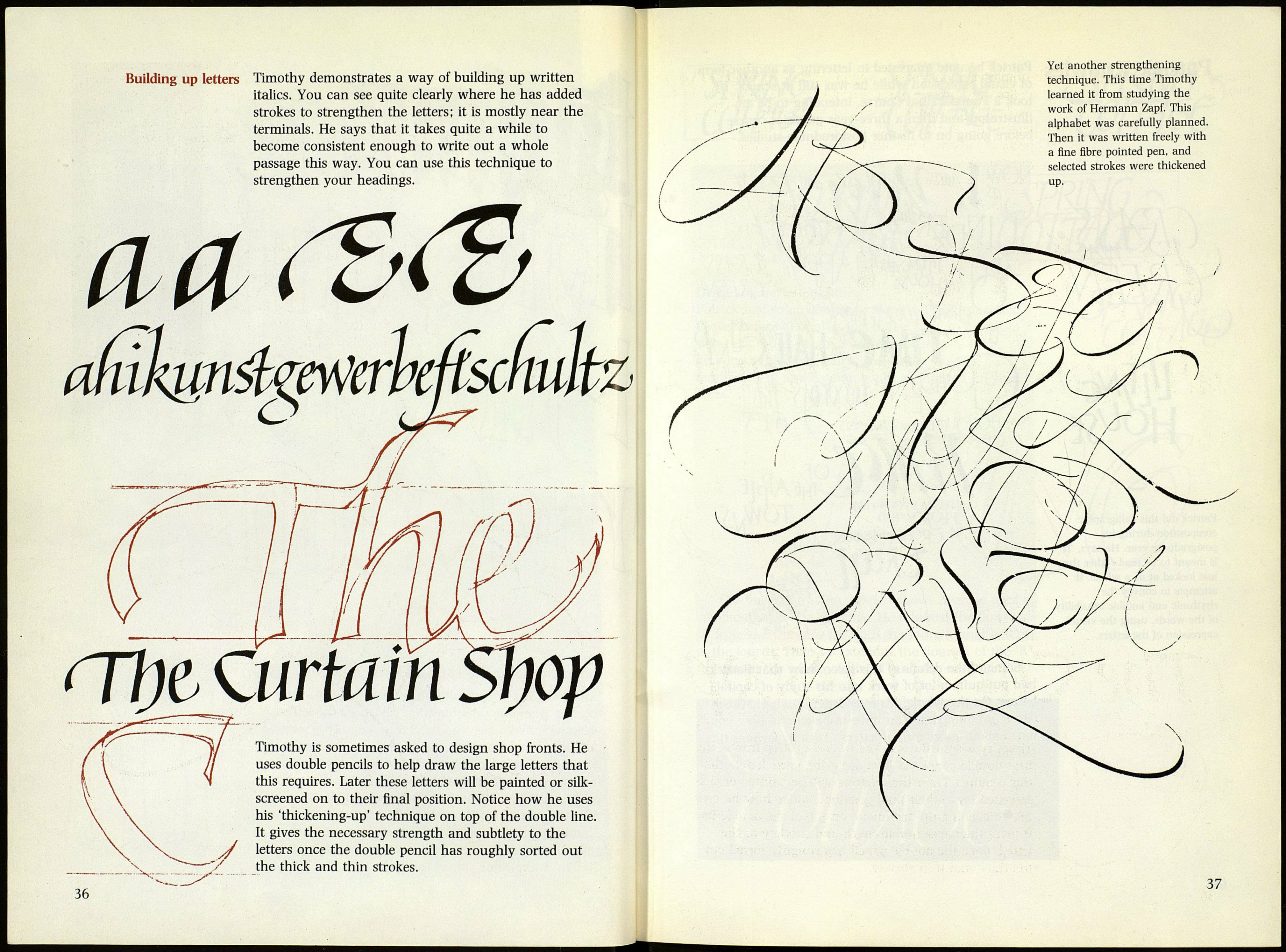
Building up letters Timothy demonstrates a way of building up written
italics. You can see quite clearly where he has added
strokes to strengthen the letters; it is mostly near the
terminals. He says that it takes quite a while to
become consistent enough to write out a whole
passage this way. You can use this technique to
strengthen your headings.
атіщпФгрѴегп
П7)с Curtain
у
V
Timothy is sometimes asked to design shop fronts. He
uses double pencils to help draw the large letters that
this requires. Later these letters will be painted or silk-
screened on to their final position. Notice how he uses
his 'thickening-up' technique on top of the double line.
It gives the necessary strength and subtlety to the
letters once the double pencil has roughly sorted out
the thick and thin strokes.
Yet another strengthening
technique. This time Timothy
learned it from studying the
work of Hermann Zapf. This
alphabet was carefully planned.
Then it was written freely with
a fine fibre pointed pen, and
selected strokes were thickened
