Expressive
calligraphy
After their short introduction to the history of the
development of letterforms, Miriam Stribley's students
are encouraged to experiment more freely. They apply
this free calligraphy to book jackets, record covers,
posters, etc.
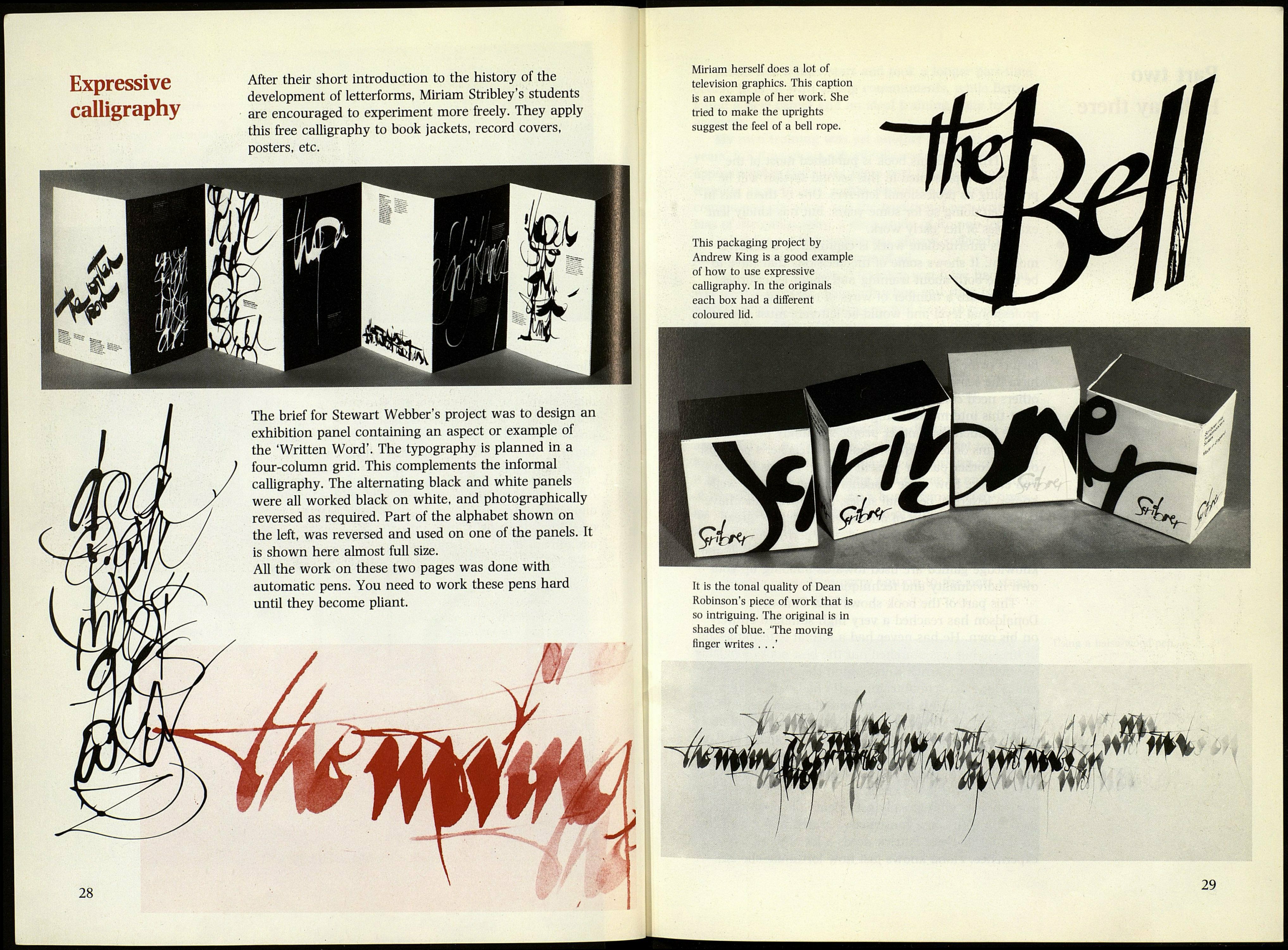
The brief for Stewart Webber's project was to design an
exhibition panel containing an aspect or example of
the 'Written Word'. The typography is planned in a
four-column grid. This complements the informal
calligraphy. The alternating black and white panels
were all worked black on white, and photographically
reversed as required. Part of the alphabet shown on
the left, was reversed and used on one of the panels. It
is shown here almost full size.
All the work on these two pages was done with
automatic pens. You need to work these pens hard
until they become pliant.
28
Ш
Miriam herself does a lot of
television graphics. This caption
is an example of her work. She
tried to make the uprights
suggest the feel of a bell rope.
This packaging project by
Andrew King is a good example
of how to use expressive
calligraphy. In the originals
each box had a different
coloured lid.
It is the tonal quality of Dean
Robinson's piece of work that is
so intriguing. The original is in
shades of blue. 'The moving
linger writes . . .'
29
