154 . THE NON-DESIGNER'S TYPE BOOK
Automatic drop caps
n both PageMaker and QuarkXPress you can apply drop
caps (one form of initial caps, as shown below) automati¬
cally. You can tell both applications how many lines you
want the letter to drop down. In Quark, you can specify
up to eight letters to act as drop caps in the first line.
(The drop cap in this paragraph is Massele, from the set of eps initial caps
called Initial Caps ш from Adobe Studios. They have a wonderful variety
of sets.)
In PageMaker, use the "Drop Cap" plug-in from the Utilities menu.
In QuarkXPress, look in the Formats dialog box under the Style
menu. You can add a drop cap to a style sheet, which can be a
wonderful and useful thing.
Also take a look at the initial letters offered by many font vendors. Many
come as graphics in eps format (as the one shown in the first paragraph,
above), which means you can text wrap them, color them, or resize them
endlessly. There are some incredibly beautiful caps to choose from— get a
set and see what they inspire.
Everything must end.
Meanwhile, we must
amuse ourselves.
Voltaire
This is a drop cap created instantly in
PageMaker using the drop cap feature.
Typeface is Jim Casual.
uvoarav
hie Color
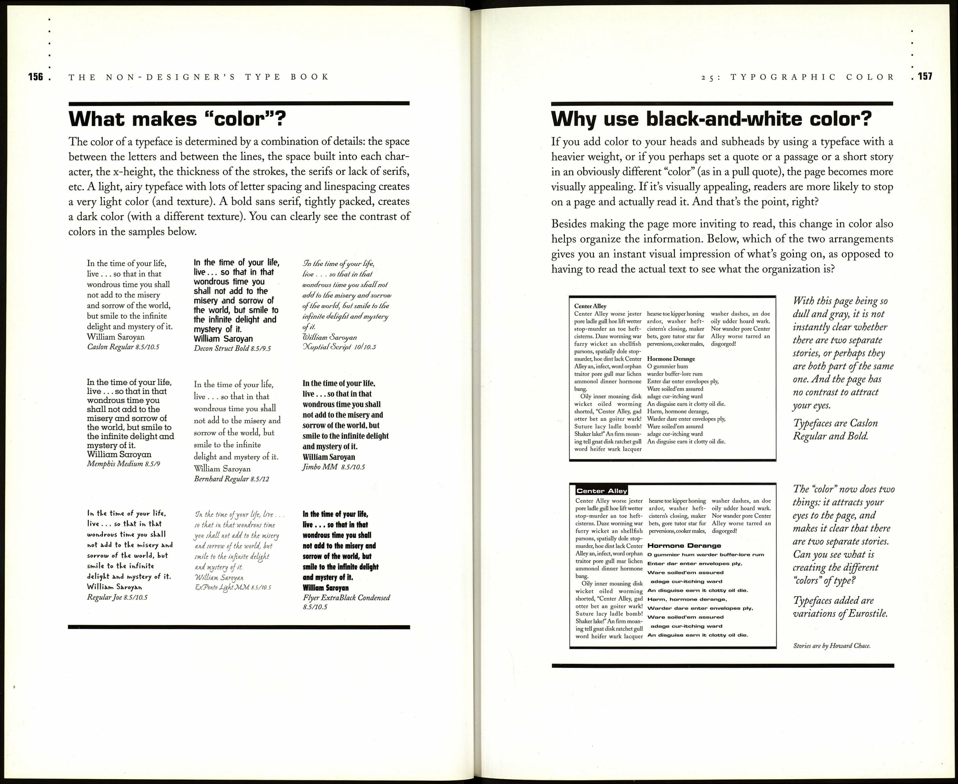
Typographers have always referred to black-and-white type on a page as
having "color." It's easy to create contrast with colorbox colors; it takes a
more sophisticated eye to see and take advantage of the color contrasts in
black-and-white. Often, black and white are the only "colors" available,
but don't let that limit you—this chapter will give you some ideas to use to
ferment your own.
A gray, text-only page can be very dull to look at and uninviting to read.
I'm sure you've opened up newsletters or technical documents and found
these dull pages, or perhaps you've had to create them. It's not always
possible to have graphics on a page to break up the text, but something
needs to be done. A gray page can also create confusion by not giving the
reader any clue as to the importance of a story or whether two separate stories
on the page are related to each other. An effective typographic technique
to aid in the organization of a page is to add "color."
Just as the voice adds emphasis
to important words,
so can type:
it shouts or whispers by variation of size.
Just as the pitch of the voice
adds interest to the words,
so can type:
it modulates by lightness or darkness.
Just as the voice adds color
to the words by inflection,
so can type:
it defines elegance, dignity, toughness
by choice of face.
Jen White
It's pretty easy to see what is creating the different colors in the typefaces
above. Not only is it the weight of the stroke, but also the structure of the
letterforms: tall and condensed vs. long and squatty. Also notice the color
of the lightweight text in the example compared to the body copy in the
paragraphs above. Typefaces are Eurostile Condensed and Eurostile Bold
Extended Two.
