126
THE NON-DESIGNER'S TYPE BOOK
rfee firn wfЬ iÛ
If appropriate for your content, experiment with different ways of setting
heads. Perhaps add a rule above and/or below the heads, or reverse them,
or set them extra large, or use an initial cap. If you have a special story,
perhaps create a special headline. Keep in mind, though, that if every story
has a special and different headline treatment, not one of them stands out
as different or more important. Most stories should have typographically
consistent headlines to retain the unity of the publication.
Always, always remember, your purpose is to communicate. No matter
which technique you use, your heads and subheads should support
that purpose.
Headline typeface is Mister Frisky.
full Quotes
Many times you must design or write a page that has no accompanying
graphic to lighten the page and make it more enticing to read. That's where
pull quotes come in so handy. A pull quote is when you take a quote from
an article, story, or dull report and emphasize it on the page in some
graphic way (as shown below). There are many ways to do this, and this
chapter shows you several examples and provides some basic guidelines.
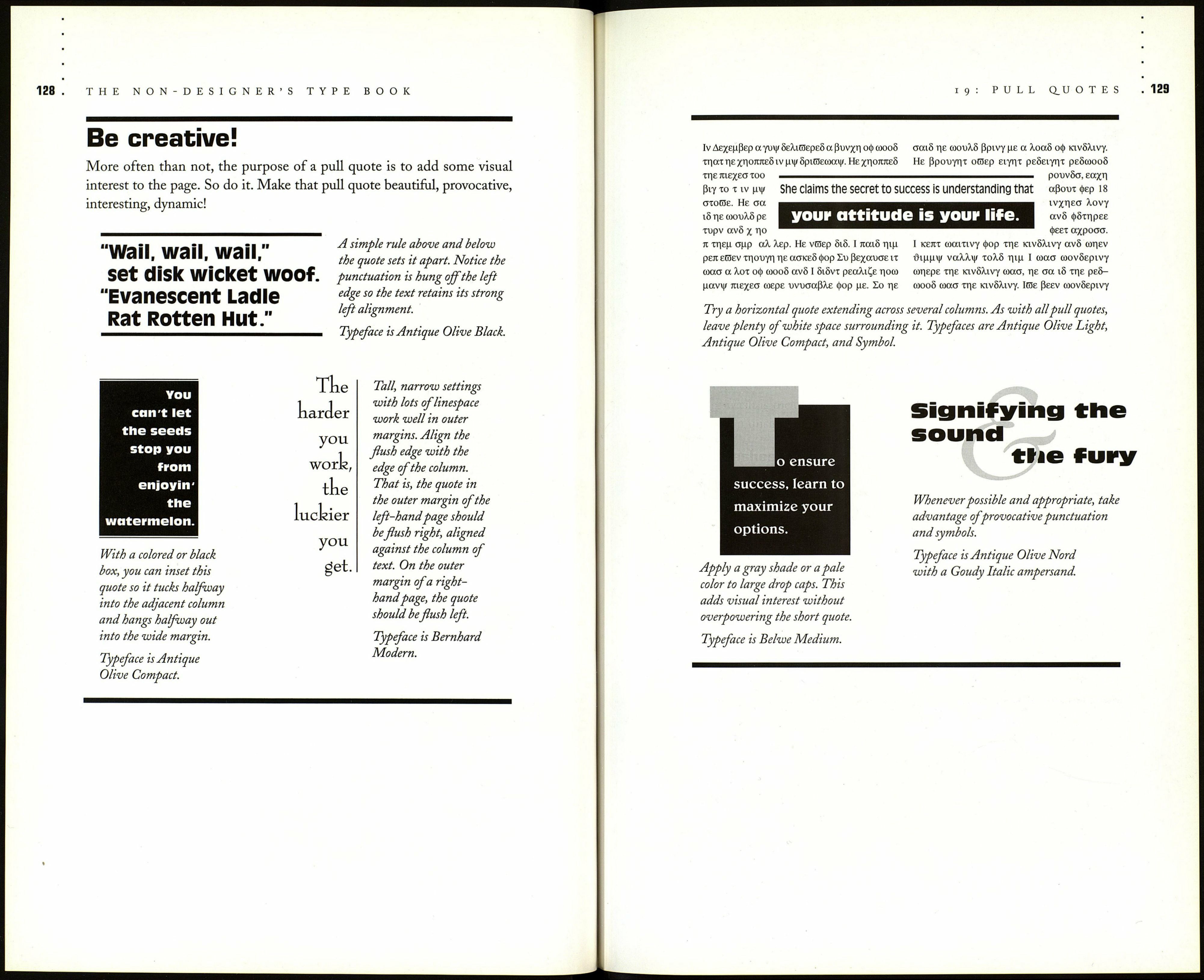
Pull quotes are often seen in the middle of the page, but there is no rule to
force you to do this. Try some variations, such ■ Elf CHlGSCGtlt
as a flush right or left quote in a wide outer I 1ЛГС1П ttlinlC,
margin (flush with the column of text); a quote I ËtChÎnçj UddGf.
in a background that cuts into one column of text; or a quote that runs
horizontally across 1.5 or 2 columns. Use interesting punctuation marks,
such as ampersands or questions marks, as graphic elements; perhaps set
them large or colorful.
On the following two pages are samples of pull quotes. Have fun with
them, make them attractive—that's their point! Be sure to read page 130
for guidelines on working with pull quotes.
