56
THE NON-DESIGNER'S TYPE BOOK
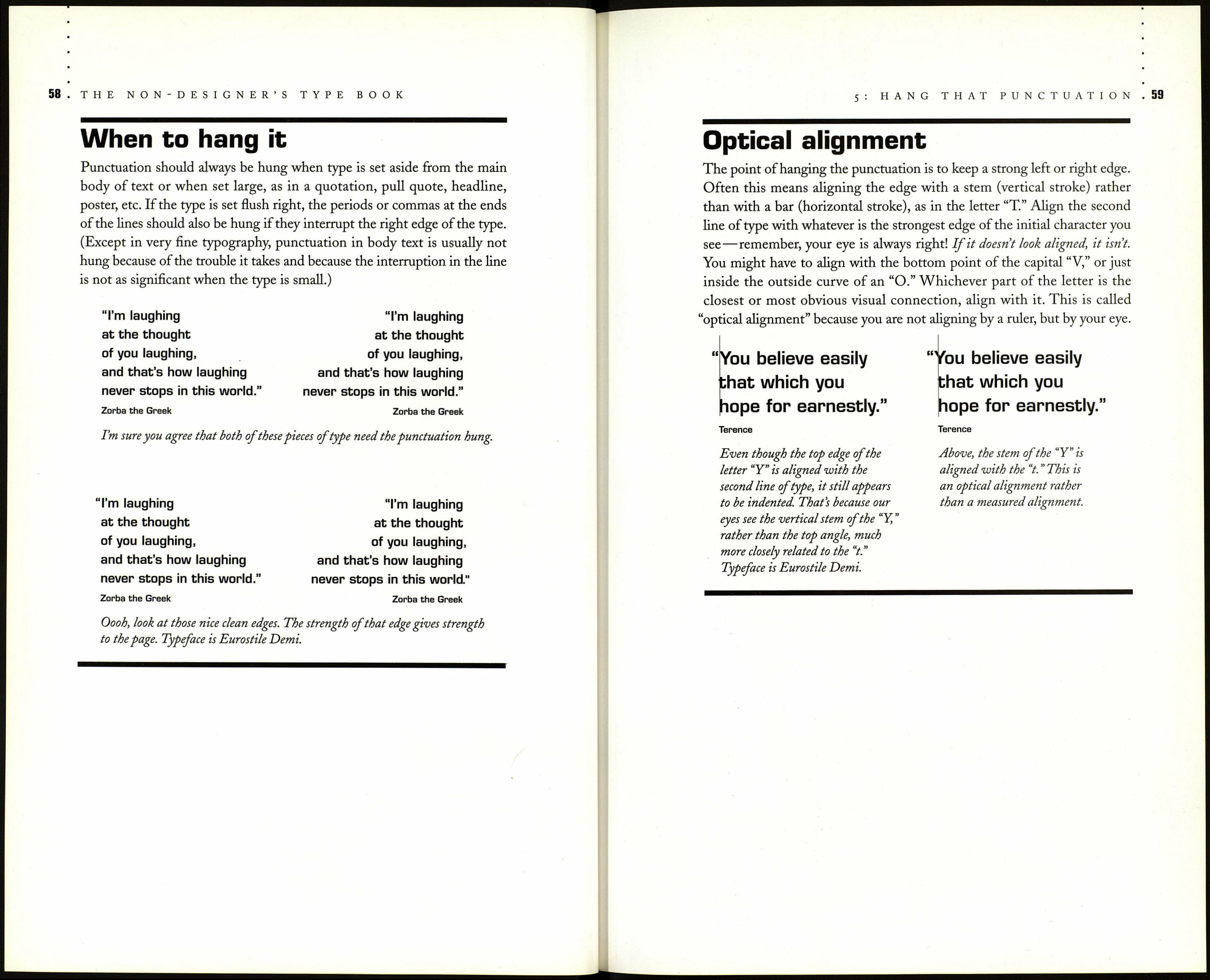
Ditto marks
So what good are those characters on your keyboard? Well, go ahead and
use them in e-mail because it's too much trouble to take the time to set real
quotation marks. And until every browser used on the World Wide Web
can interpret the code correctly, we are stuck with typewriter apostrophes
and quote marks there. You can use these as ditto marks, should you ever
need to set ditto marks to show that an item is repeated, as shown below
(although some people do prefer to use double prime marks as ditto marks).
Superman 128 Power Street Metropolis USA
■ - i no-, r, ,», « " ditto marks
Lois Lane 327 Reporter Way
Д helpful chart
In case you are still confused, here is a little chart that sums up the wrongs
and the rights. Find the phrase that matches what you want to say and
follow its example.
Wrong Why it's wrong Right
Food at it's best
The phrase does not say,
"Food at it is best."
Food at its best
In it's sheU
The phrase does not say,
"In it is sheU."
In its sheU
Where its at
The phrase says,
"Where it is at."
Where it's at
HaU 'o' Fame
House "0" Glass
The "f " is missing from "of."
There is nothing missing
in front of the letter "o."
HaU o' Fame
House o' Glass
Gone fishi'n
The "g" is missing.
Gone fishin'
Rock'n'RoU
Rock'n RoU
Rock n' RoU
Rock n RoU
Both the "a" and the "d" are
missing from "and." So an
apostrophe belongs where each
letter is missing—an apostrophe,
not an opening single quote mark!
Rock 'n' RoU
Rock 'n' RoU
Rock 'n' RoU
Rock'n'RoU
In the 60 s (decade)
This is not possessive, it is plural.
The "19" is missing from "1960."
In the '60s
Juma that
lunctuation
Using real quotation marks and apostrophes is a good sign that you've
progressed beyond typewriter mentality. Now that you're using the correct
punctuation, the next step is to hang it (where appropriate).
What does it mean to hang the punctuation? Well, take a look at the
quotations below. In the left one, would you agree that the first line appears
to be indented? Obviously, it is the empty space below the quotation mark
that creates that illusion. Take a look at the same quotation on the right.
Now the left edge ofthat text has a strong, clean alignment, and the punc¬
tuation is "hanging" outside that edge. That clean edge is what you want;
it is a sign of being conscious of your typography.
"What you do "What you do
speaks so loudly speaks so loudly
that I cannot hear that I cannot hear
what you say." what you say."
Ralph Waldo Emerson Ralph Waldo Emerson
You can easily see, in the example on the left, what a visual
gap the quotation mark creates. Hanging the punctuation off
the edge of the text maintains the strong, clean alignment.
Typeface is Eurostile Demi.