42
THE NON-DESIGNER'S TYPE BOOK
тншпнгн typographic
now
IJTnî.nIlt:., Ill One ¡nuce,
both the mes¬
sage and the
pictorial idea.
Sometimes,
this "playing"
with typé has
resulted in th-
e loss of a cer¬
tain amount of
legibility. Re¬
searchers con¬
sider this a
deplorable,
state of •♦—
butpn *h-
e other
hand, the ex¬
citement cre¬
ated by a no¬
vel im¬
age someti¬
mes more than
compensates
for the slight
*
DIFFICULTY
in readabil¬
ity.
LubdMnI
JheoArt ofJbeaiviiitu
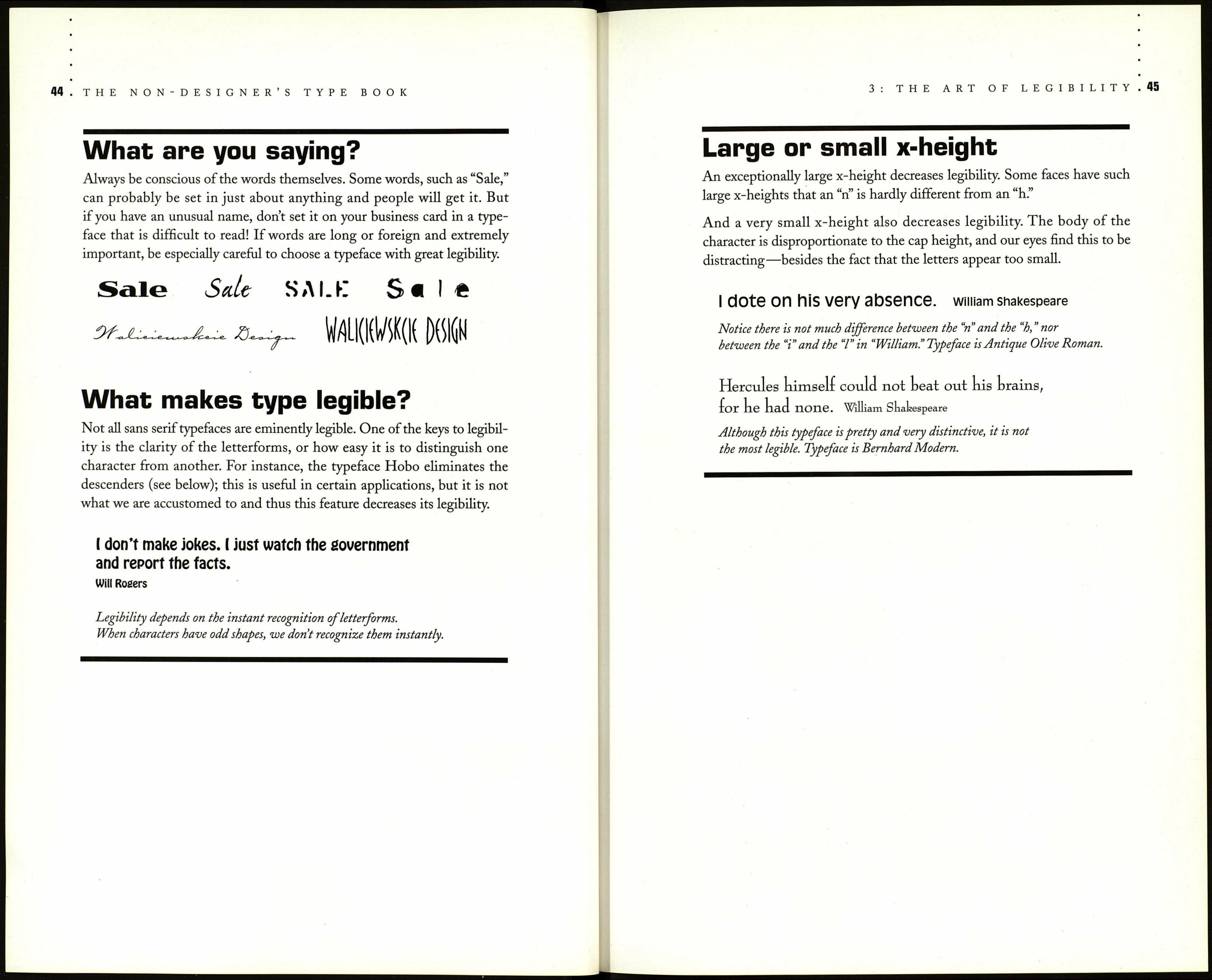
С Readability, as discussed in the previous chapter, refers to whether an
extended amount of text—such as an article, book, or annual report—is
easy to read. Legibility refers to whether a short burst of text—such as a
headline, catalog listing, or stop sign—is instantly recognizable.
There have been extensive studies on type to determine which factors
influence different aspects of reading, such as reading speed, retention of
information, recognition of letterforms, etc. Interestingly, these studies
show that in our culture and in our era, serif typefaces are easier to read
when there is a lot of text, but sans serif letterforms are more instantly
recognizable when there is a small amount of text. Sans serif characters
tend to be direct and clear, with no serifs to add unnecessary tidbits to the
shapes. When we read a large body of text, however, those same serifs help
to guide us along the lines.
We don't read letter by letter; we see the entire word or the phrase and it
goes straight to our brains. When text is less than perfectly legible, we have
to spend extra time to read it. Sometimes this is only a split second, some¬
times it's a more significant struggle, but it can make a big difference in
whether the information is absorbed or tossed aside.
Text needs to be most legible (as opposed to readable) in situations where
people are scanning pages, reading signs, or skimming through catalogs or
lists—wherever they need to instantly recognize words without having to
spend extra seconds to read them. For instance, in a newsletter, the head¬
lines should just pop right off the page into the reader's brain. In a parts
list, the reader should be able to slide down the page, absorbing the names
of parts. In a table of contents, a reader should be able to scan the contents.
Street signs, "Warning," "Danger," and all freeway signs should be instantly
recognizable.
