34. THE NON-DESIGNER'S TYPE BOOK
The most readable
The typefaces that make the most readable text are the classic oldstyle serif
faces (remember those from Chapter 1?), either remakes of the original
ones or new faces built on oldstyle characteristics. These typefaces were
originally designed for long documents, since that's all there was in print at
that time (late fifteenth to early seventeenth century). There were no
brochures, advertising, business cards, packaging, freeway signs—there
were only books. Big books. (In fact, it was Aldus Manutius, whose face
you see still whenever you open PageMaker, who printed the first portable
books in 1495.)
Other factors
Besides the distinguishing features of the typeface, there are other factors
that can make text more or less readable, as described on the following
pages. Once you are conscious of these factors, you can work with them to
make even the least readable face more usable.
This is Behve Light. Does your This is Bernhard Modern, a very
eye trip over the lowercase g or beautiful face, but too distinctive
v or y? If your eye stumbles over for extended readability. Great for
the look of the type, it's not good brochures or other places where there
for extended text. is not an extended amount or text.
These faces have strong, noticeable features which make them quite
distinctive. They are thus attractive for many uses, but there is too much
distraction built into the faces to make them easy to read in extended text.
This is Minion Regular, a This is Garamond Book, also
lovely font that was created a lovely font that was created
specifically for lots of reading. specifically for lots of reading.
Oldstyle typefaces have moderate features: there is moderation in the serifs,
in the weight of the strokes, in the contrast between the thick and thin parts
of the strokes, and in the x-height. Til bet you can hardly tell these typefaces
apart, right? It is this moderation, this lack of calling attention to the typeface
itself that makes oldstyles "invisible, " which is ideal for communicating
without an attitude.
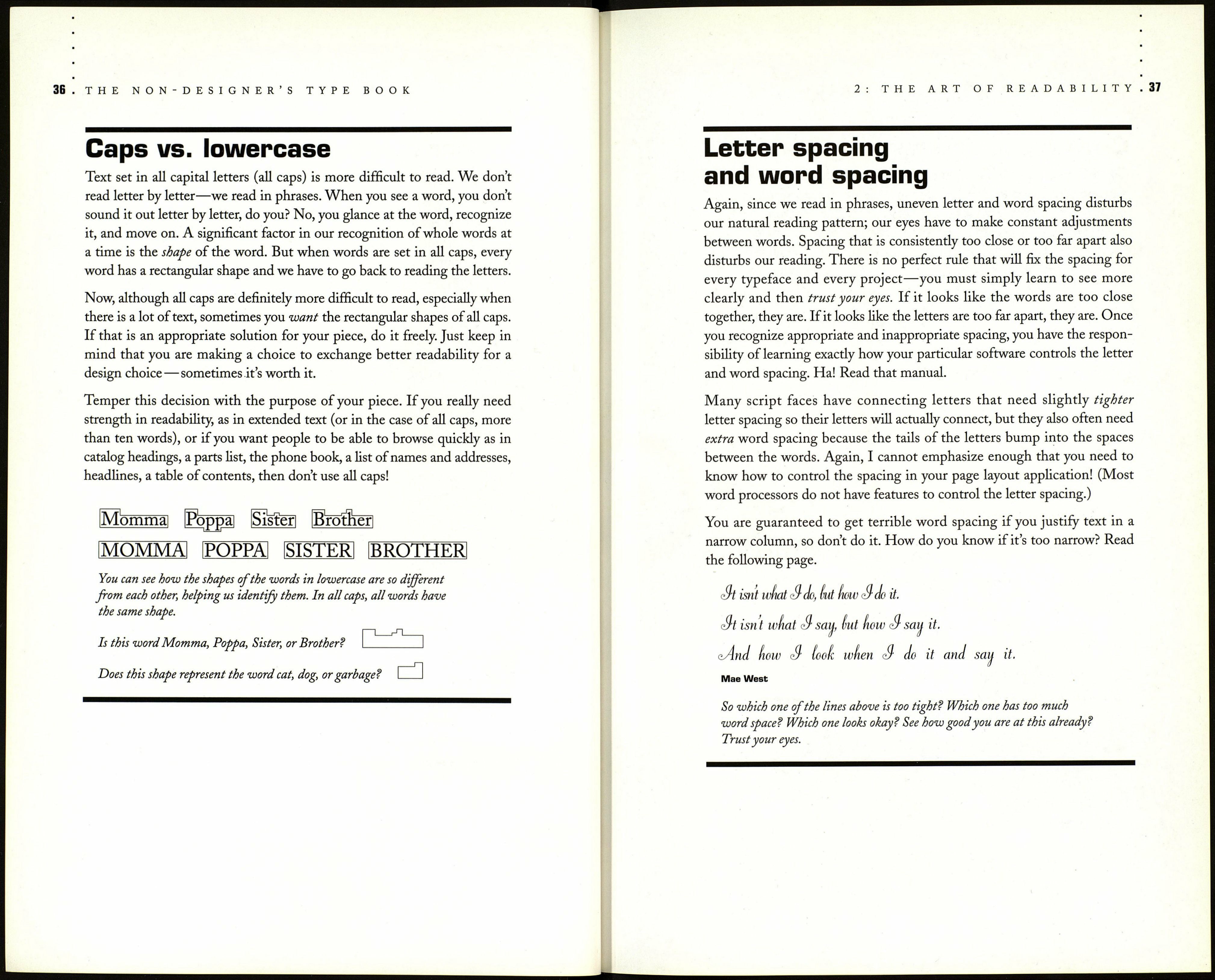
2 : THE ART OF READABILITY
Serif vs. sans serif
There are arguments about exactly why, but extensive studies do show that
today in our society it is easier to read an extended amount of text when it
is set in a serif typeface. Perhaps it is the serifs themselves that lead the eye
from one character to the next, linking the letters into words. Perhaps it is
the subtle thick-thin contrast in the strokes, which most sans serifs do not
have. Perhaps it is the moderate ratio of x-height to cap height (the body
of the letter in relation to the height of the capital letters or the ascenders),
since sans serif letterforms tend to have larger x-heights.
Whatever the reason may be, accept the truth of it and use the knowledge
in your typography.
Garamond Light, 10-point type
She had not gone much farther
before she came in sight of the
house of the March Hare; she
thought it must be the right house,
because the chimneys were shaped
like ears and the roof was thatched
with fur. It was so large a house,
that she did not like to go nearer
till she had nibbled some more
of the left-hand bit of mushroom,
and raised herself to about two
feet high: even then she walked
up towards it rather timidly, saying
to herself, "Suppose it should be
raving mad after all! I almost wish
I'd gone to see the Hatter instead!"
Lewis Carroll, Alice in Wonderland
Formata Regular, 10-point type
She had not gone much farther
before she came in sight of the
house of the March Hare; she
thought it must be the right house,
because the chimneys were shaped
like ears and the roof was thatched
with fur. It was so large a house,
that she did not like to go nearer
till she had nibbled some more
of the left-hand bit of mushroom,
and raised herself to about two
feet high: even then she walked
up towards it rather timidly, saying
to herself, "Suppose it should be
raving mad after all! I almost wish
I'd gone to see the Hatter instead!"
Lewis Carroll, Alice in Wonderland
Which of these feels easier to read? If you really want to use sans serif in your
body copy, shorten the line length, add linespace, and use a smaller size type
than for a serif.
