Gill sans
WAS DESIGNED BY ERIC GILL
AND SHOWS SOME TRACES OF INFLUENCE
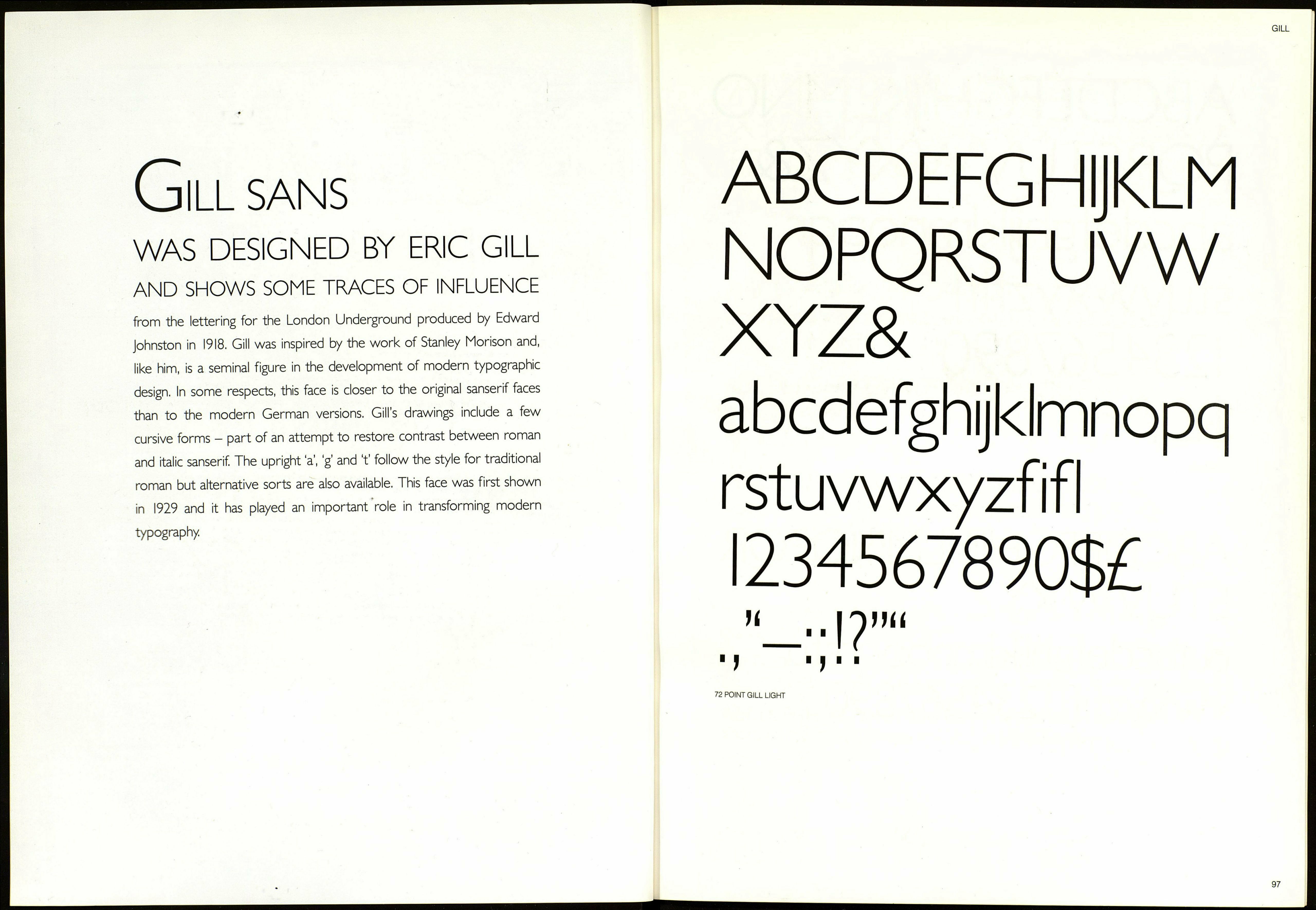
from the lettering for the London Underground produced by Edward
Johnston in 1918. Gill was inspired by the work of Stanley Morison and,
like him, is a seminal figure in the development of modern typographic
design. In some respects, this face is closer to the original sanserif faces
than to the modern German versions. Gill’s drawings include a few
cursive forms - part of an attempt to restore contrast between roman
and italic sanserif. The upright ‘a’, g’ and f follow the style for traditional
roman but alternative sorts are also available. This face was first shown
in 1929 and it has played an important role in transforming modern
typography
ABCDEFGHIJKLM
NOPQRSTUVW
XYZ&
abcdefghijklmnopq
rstuvwxyzfifl
I234567890$£
“—••I?”“
11 4"
72 POINT GILL LIGHT
