Century
WHICH IS SUPPLIED BY
A NUMBER OF FOUNDRIES IN DIFFERENT
forms, was cut in 1894 by Linn Boyd Benton in collaboration with
T. L. DeVinne to meet the needs of the Century Magazine, who
wanted a blacker and more readable face than the one they had
been previously using, and one that was slightly condensed to fit
the double-column layout of the magazine. It was first used in
1895. Morris Fuller Benton designed several versions of this
typeface and around 1900 American Typefounders brought out
Century Expanded to meet the Typographical Union Standard of
the day. The Expanded italic is very different from the roman in its
lower case, which has graceful finials rather than roman serifs. The
upper case does not show such a marked difference. Century
Nova, which was designed for American Typefounders in 1966 by
Charles E. Hughes, is a new condensed version of the Expanded
face, with larger than usual x-height in the lower case.
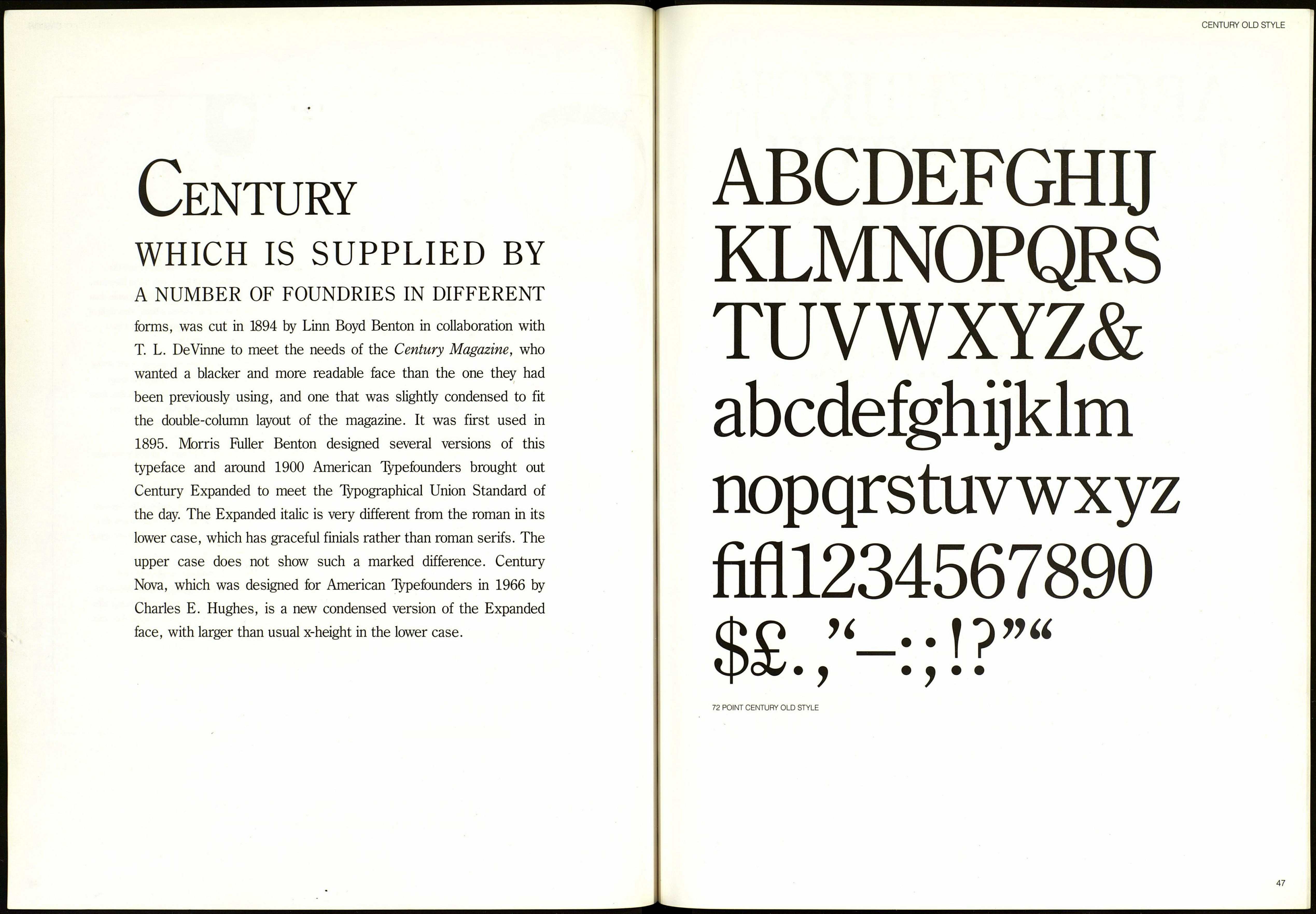
CENTURY OLD STYLE
ABCDEFGHU
KLMNOPQRS
TUVWXYZ&
abcdefghijklm
nopqrstuvwxyz
fifll234567890
72 POINT CENTURY OLD STYLE
47
