Bodoni
ORIGINATED IN ITALY,
WHERE IT WAS DESIGNED BY ONE OF THE
most prolific of type designers, Gianbattista Bodoni of Parma
(1740-1813), and introduced in around 1800. Although he
copied Fournier in his earlier years, Bodoni later contributed
to the development of the Modern Face, of which this elegant
neo-classical type is considered among the most letter
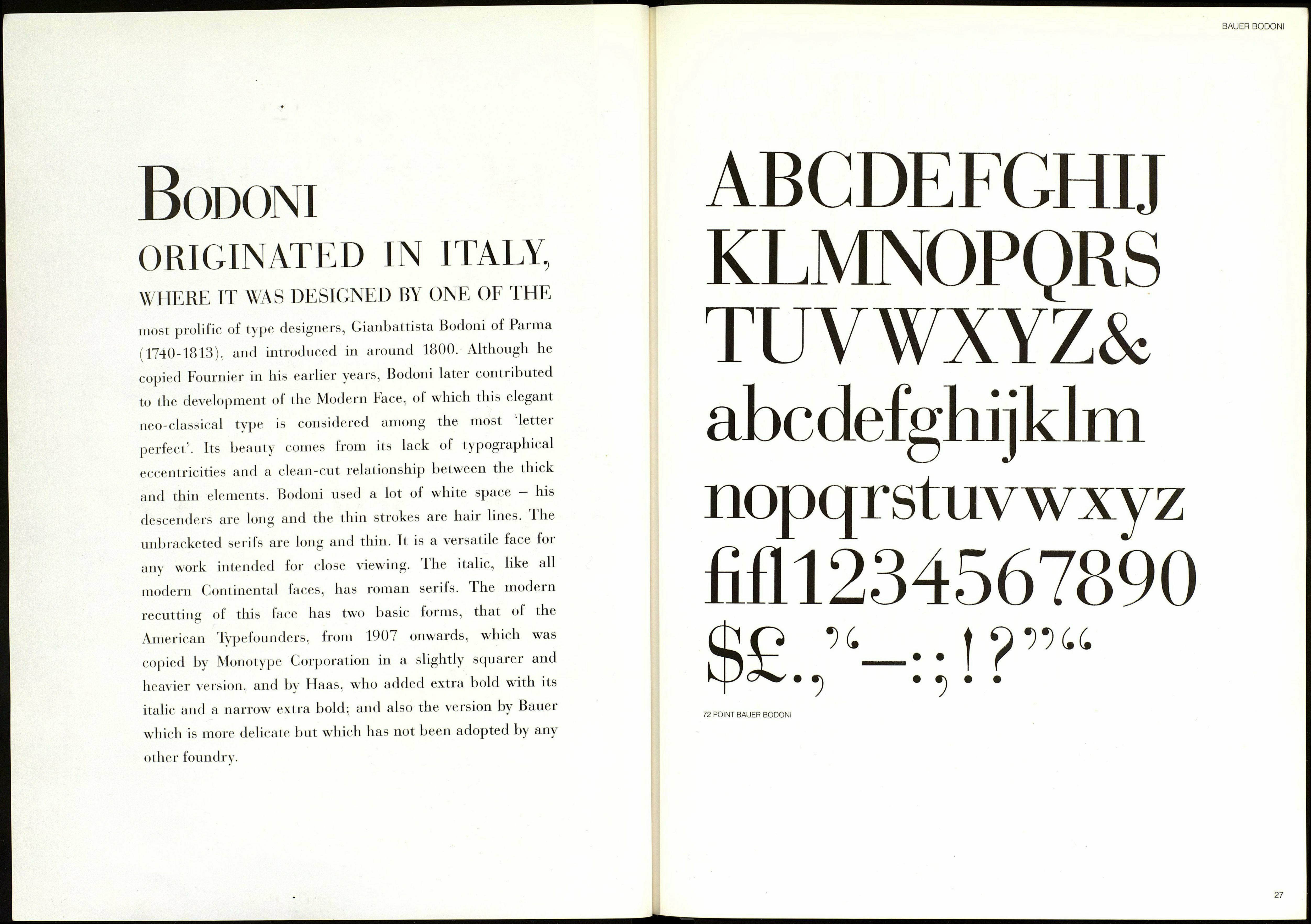
perfect’. Its beauty comes from its lack of typographical
eccentricities and a clean-cut relationship between the thick
and thin elements. Bodoni used a lot of white space — his
descenders are long and the thin strokes are haii lines. The
unbracketed serifs are long and thin. It is a versatile face for
any work intended for close viewing. The italic, like all
modern Continental laces, has roman serifs. The modern
recutting ol this face lias two basic forms, that of the
American Typefounders, from 1907 onwards, which was
copied by Monotype Corporation in a slightly scjuarer and
heavier version, and by Flaas, who added extra bold with its
italic and a narrow extra bold; and also the version by Bauer
which is more delicate but which has not been adopted by any
other foundry.
BAUER BODONI
ABCDEFGHtr
KLMNOPQRS
TUVWXYZ&
abcdefghijklm
nopqrstuvwxyz
fifll234567890
Çhp u e e i о me
h У • ІГ| • •
72 POINT BAUER BODONI
27
