юб SHADY CHARACTERS
a welcome nod to civility amid the increasingly vehement rhetoric
flying back and forth in the years after Luther’s broadside against the
Church.
Eck s Obelisci and Luther’s Asterisci are now footnotes in the his¬
tory of the Reformation, but the asterisk and obelus-especiallyinits
modern form of the dagger (f), of which more later-continue to play
a role in liturgical documents. In psalmody, for example, the musi¬
cal recital of psalms, the dagger is used to mark a minor pause with
the asterisk indicating a longer one.« In Roman Catholic services the
dagger may act as a substitute for the more proper Maltese, or square,
cross (*) to indicate points at which the priest must make the sign
of the cross.36
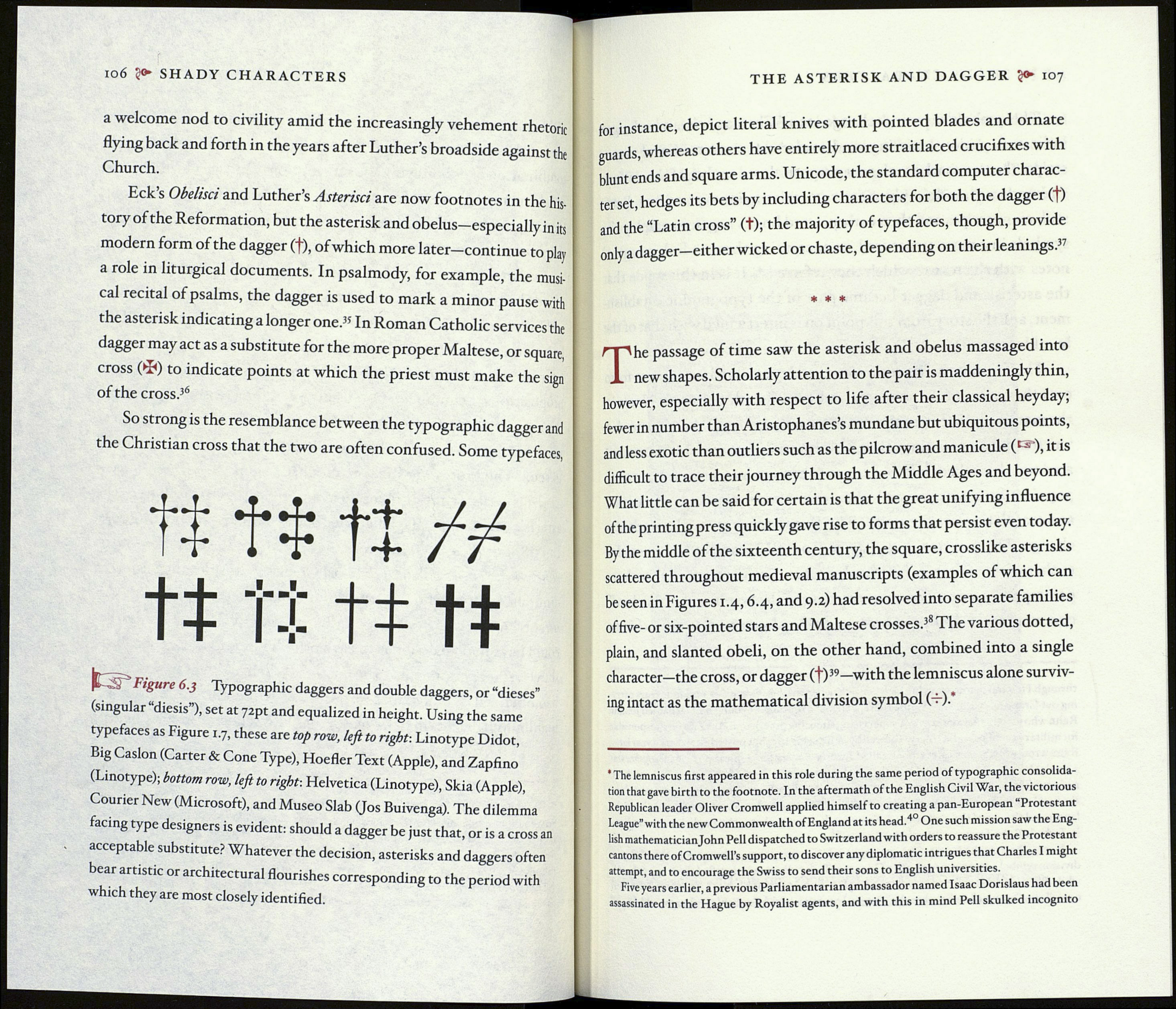
So strong is the resemblance between the typographic dagger and
the Christian cross that the two are often confused. Some typefaces,
tí tí tí
tí tí tí tí
|f , Figure 6.3 Typographie daggers and double daggers, or “dieses”
(singular “diesis”), set at 72pt and equalized in height. Using the same
typefaces as Figure 1.7, these are top row, left to right-. Linotype Didot,
Big Caslon (Carter & Cone Type), Hoefler Text (Apple), and Zapfino
(Linotype); bottom row, left to right: Helvetica (Linotype), Skia (Apple),
Courier New (Microsoft), and Museo Slab (Jos Buivenga). The dilemma
facing type designers is evident: should a dagger be just that, or is a cross an
acceptable substitute? Whatever the decision, asterisks and dagg ers often
bear artistic or architectural flourishes corresponding to the period with
which they are most closely identified.
THE ASTERISK AND DAGGER ?<► 107
for instance, depict literal knives with pointed blades and ornate
guards, whereas others have entirely more straitlaced crucifixes with
blunt ends and square arms. Unicode, the standard computer charac¬
ter set, hedges its bets by including characters for both the dagger (f)
and the “Latin cross” (+); the majority of typefaces, though, provide
only a dagger—either wicked or chaste, depending on their leanings.37
* * *
The passage of time saw the asterisk and obelus massaged into
new shapes. Scholarly attention to the pair is maddeningly thin,
however, especially with respect to life after their classical heyday;
fewer in number than Aristophanes’s mundane but ubiquitous points,
and less exotic than outliers such as the pilcrow and manicule (1 -• ), it is
difficult to trace their journey through the Middle Ages and beyond.
What little can be said for certain is that the great unifying influence
of the printing press quickly gave rise to forms that persist even today.
By the middle of the sixteenth century, the square, crosslike asterisks
scattered throughout medieval manuscripts (examples of which can
be seen in Figures 1.4,6.4, and 9.2) had resolved into separate families
of five- or six-pointed stars and Maltese crosses.38 The various dotted,
plain, and slanted obeli, on the other hand, combined into a single
character—the cross, or dagger (f)39—with the lemniscus alone surviv¬
ing intact as the mathematical division symbol (—).*
* The lemniscus first appeared in this role during the same period of typographic consolida¬
tion that gave birth to the footnote. In the aftermath of the English Civil War, the victorious
Republican leader Oliver Cromwell applied himself to creating a pan-European Protestant
League” with the new Commonwealth of England at its head.40 One such mission saw the Eng¬
lish mathematician John Pell dispatched to Switzerland with orders to reassure the Protestant
cantons there of Cromwell’s support, to discover any diplomatic intrigues that Charles I might
attempt, and to encourage the Swiss to send their sons to English universities.
Five years earlier, a previous Parliamentarian ambassador named Isaac Dorislaus had been
assassinated in the Hague by Royalist agents, and with this in mind Pell skulked incognito
