70 SHADY CHARACTERS
& & & &
&&ё&
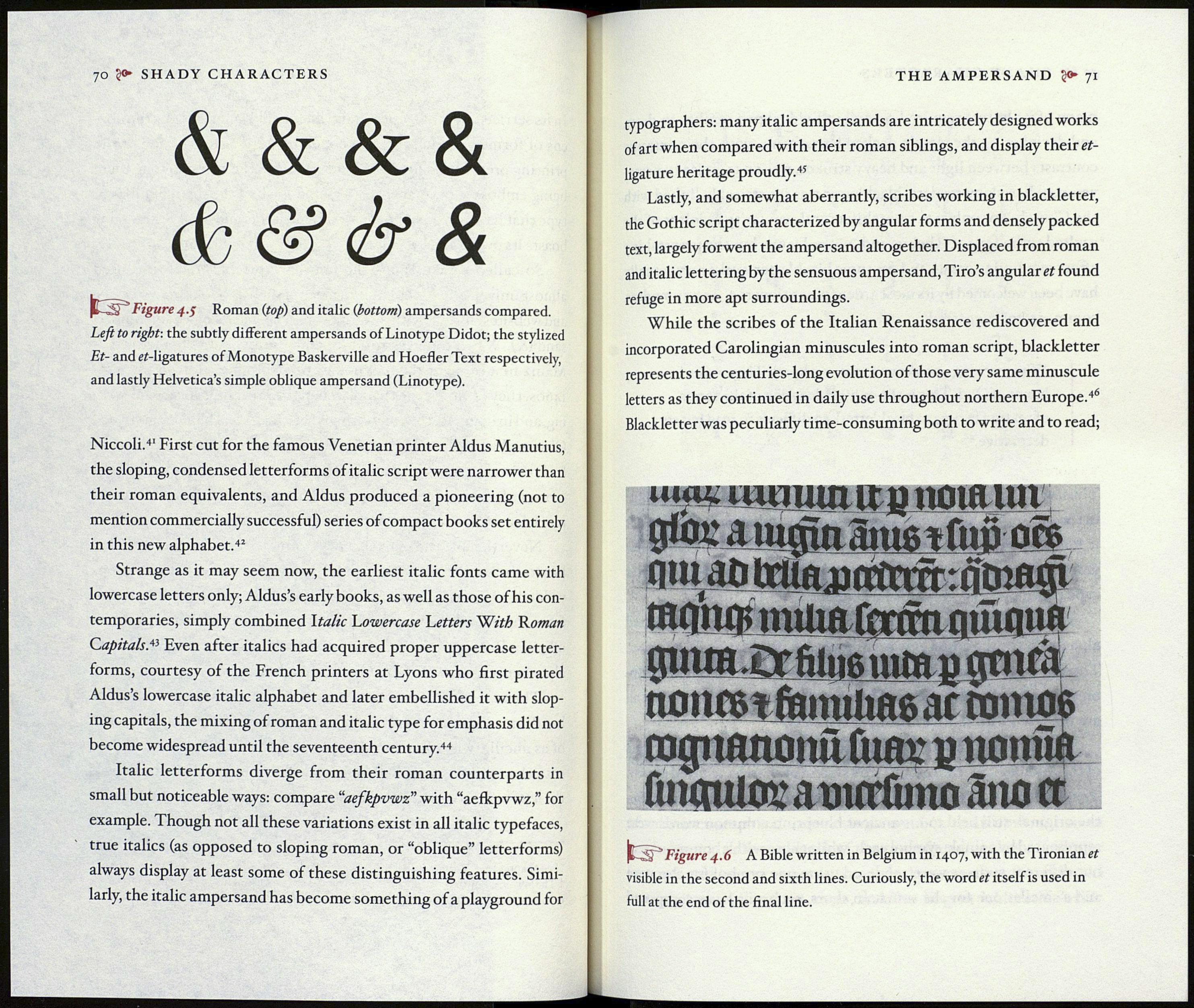
Figure 4.5 Roman (top) and italic (bottom) ampersands compared.
Left to right-, the subtly different ampersands of Linotype Didot; the stylized
Et- and ei-ligatures of Monotype Baskerville and Hoefler Text respectively,
and lastly Helvetica’s simple oblique ampersand (Linotype).
Niccoli.4' First cut for the famous Venetian printer Aldus Manutius,
the sloping, condensed letterforms of italic script were narrower than
their roman equivalents, and Aldus produced a pioneering (not to
mention commercially successful) series of compact books set entirely
in this new alphabet.42
Strange as it may seem now, the earliest italic fonts came with
lowercase letters only; Aldus’s early books, as well as those of his con¬
temporaries, simply combined Italic Lowercase Letters With Roman
Capitals.43 Even after italics had acquired proper uppercase letter¬
forms, courtesy of the French printers at Lyons who first pirated
Aldus’s lowercase italic alphabet and later embellished it with slop¬
ing capitals, the mixing of roman and italic type for emphasis did not
become widespread until the seventeenth century.44
Italic letterforms diverge from their roman counterparts in
small but noticeable ways: compare “aefkpvwz” with “aefkpvwz,” for
example. Though not all these variations exist in all italic typefaces,
true italics (as opposed to sloping roman, or “oblique” letterforms)
always display at least some of these distinguishing features. Simi-
larly, the italic ampersand has become something of a playground for
THE AMPERSAND <><► 71
typographers: many italic ampersands are intricately designed works
of art when compared with their roman siblings, and display their et-
ligature heritage proudly.4S
Lastly, and somewhat aberrantly, scribes working in blackletter,
the Gothic script characterized by angular forms and densely packed
text, largely forwent the ampersand altogether. Displaced from roman
and italic lettering by the sensuous ampersand, Tiro’s angular et found
refuge in more apt surroundings.
While the scribes of the Italian Renaissance rediscovered and
incorporated Carolingian minuscules into roman script, blackletter
represents the centuries-long evolution of those very same minuscule
letters as they continued in daily use throughout northern Europe.46
Blackletter was peculiarly time-consuming both to write and to read;
uwuin ir p nom un
9% л щ cym gme t flifr ore
qm at> ІШптТітіг: nomcp
ЩЩЩ mum fmmnmmjo
gmm.Cr fiammm g 0t»rà
nmimtfamüws ас готоб
rotpmnontifum; р noniía
fuuntiotaumfuno âno et
|Е1;Й ''Figure 4.6 A Bible written in Belgium in 1407, with the Tironian et
visible in the second and sixth lines. Curiously, the word et itself is used in
full at the end of the final line.
