68 $<► SHADY CHARACTERS
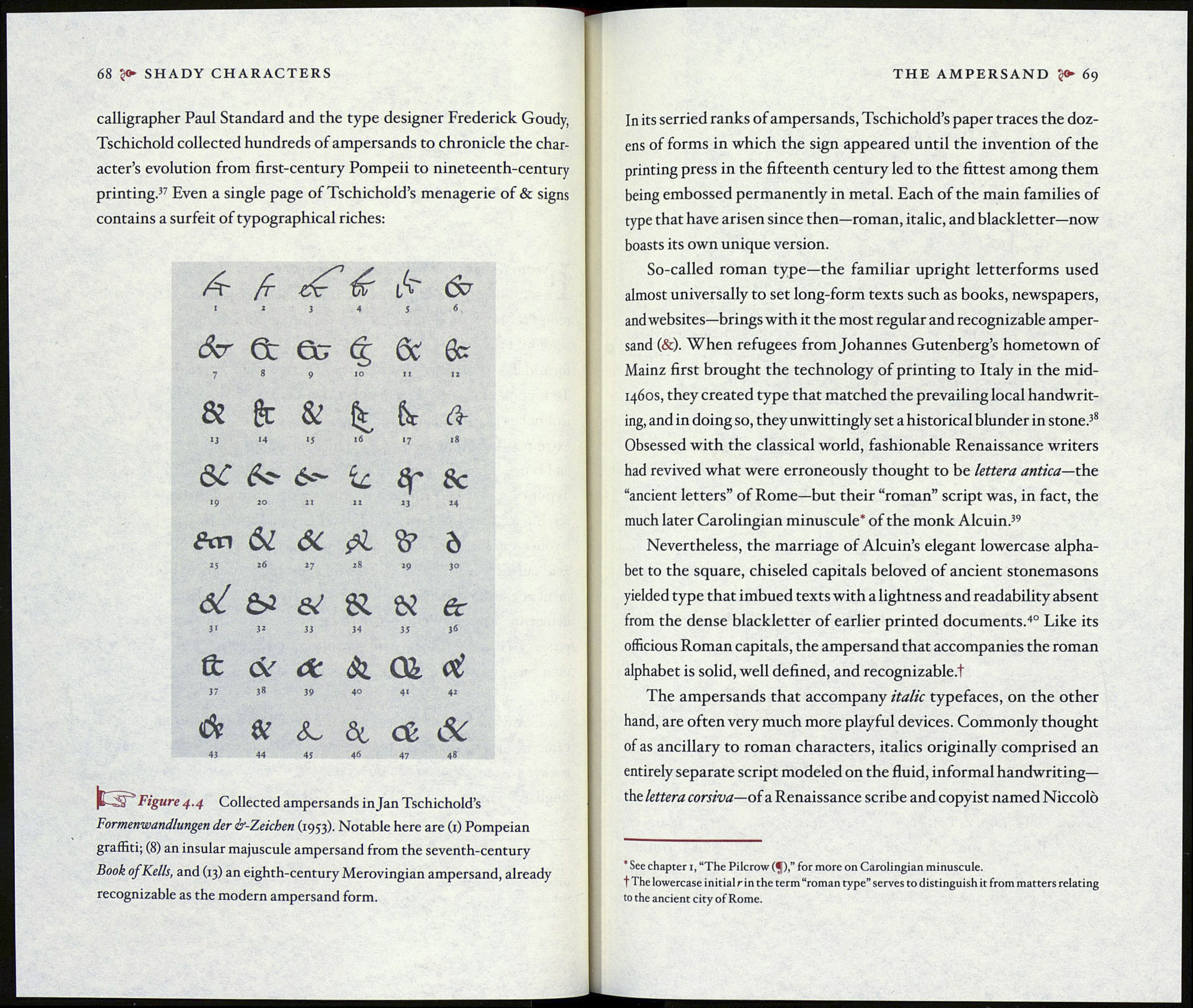
calligrapher Paul Standard and the type designer Frederick Goudy,
Tschichold collected hundreds of ampersands to chronicle the char¬
acter’s evolution from first-century Pompeii to nineteenth-century
printing.37 Even a single page of Tschichold’s menagerie of & signs
contains a surfeit of typographical riches:
i
Æ
2
3 4
lA"
5
6
Scr
7
et
8
Gg
9
£
IO
&
11
0cr
12
&
13
ft
И
&
»5
16
6c
*7
ât
l8
ÔC
l9
fr?
20
21
ÍL
IX
sr
23
Sc
24
An
25
61
гб
27
Я
28
29
Ò
30
6¿
31
ы
32
&
зз
34
&
35
6c
36
б:
37
<$г
3»
âc
39
&
40
41
ci
42
á
43
&
44
Sw
45
ài
46
cê &
47 48
ItSP’ Figure 4.4 Collected ampersands in Jan Tschichold’s
Formenwandlungen der ¿r-Zeichen (1953). Notable here are (1) Pompeian
graffiti; (8) an insular majuscule ampersand from the seventh-century
Book of Kells, and (13) an eighth-century Merovingian ampersand, already
recognizable as the modern ampersand form.
THE AMPERSAND 69
In its serried ranks of ampersands, Tschichold’s paper traces the doz¬
ens of forms in which the sign appeared until the invention of the
printing press in the fifteenth century led to the fittest among them
being embossed permanently in metal. Each of the main families of
type that have arisen since then—roman, italic, and blackletter—now
boasts its own unique version.
So-called roman type—the familiar upright letterforms used
almost universally to set long-form texts such as books, newspapers,
and websites—brings with it the most regular and recognizable amper¬
sand (&). When refugees from Johannes Gutenberg’s hometown of
Mainz first brought the technology of printing to Italy in the mid-
1460S, they created type that matched the prevailing local handwrit¬
ing, and in doing so, they unwittingly set a historical blunder in stone.38
Obsessed with the classical world, fashionable Renaissance writers
had revived what were erroneously thought to be lettera antica—the.
“ancient letters” of Rome—but their “roman” script was, in fact, the
much later Carolingian minuscule* of the monk Alcuin.39
Nevertheless, the marriage of Alcuin’s elegant lowercase alpha¬
bet to the square, chiseled capitals beloved of ancient stonemasons
yielded type that imbued texts with a lightness and readability absent
from the dense blackletter of earlier printed documents.40 Like its
officious Roman capitals, the ampersand that accompanies the roman
alphabet is solid, well defined, and recognizable.t
The ampersands that accompany italic typefaces, on the other
hand, are often very much more playful devices. Commonly thought
of as ancillary to roman characters, italics originally comprised an
entirely separate script modeled on the fluid, informal handwriting—
the lettera corsiva—oí a Renaissance scribe and copyist named Niccolò
* See chapter i, “The Pilcrow (^j)for more on Carolingian minuscule,
t The lowercase initial r in the term “roman type” serves to distinguish it from matters relating
to the ancient city of Rome.
