66 5е* SHADY CHARACTERS
fi fl ffffi ffl fb fli fj fk ffb ffh fik
MODERN LIGATURES
&.§ta$£teshümM$pEtTbttu8
QUAINT LIGATURES
fíbíbfiíkílfl:
ARCHAIC LIGATURES
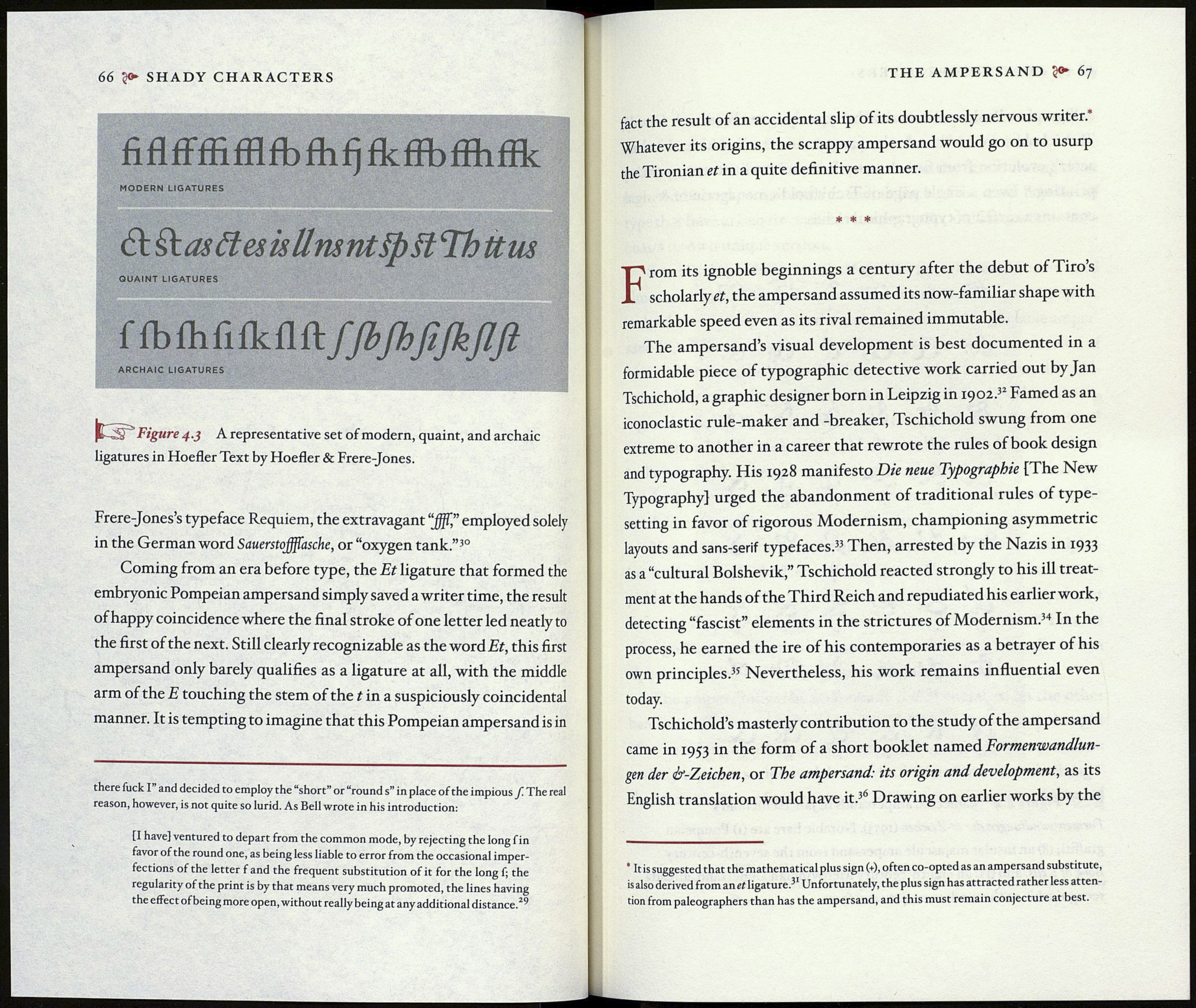
Figure 4.3 A representative set of modern, quaint, and archaic
ligatures in Hoefler Text by Hoefler & Frere-Jones.
Frere-Jones’s typeface Requiem, the extravagant “jfff” employed solely
in the German word Sauerstojfffasche, or “oxygen tank.”30
Coming from an era before type, the Et ligature that formed the
embryonic Pompeian ampersand simply saved a writer time, the result
of happy coincidence where the final stroke of one letter led neatly to
the first of the next. Still clearly recognizable as the word Et, this first
ampersand only barely qualifies as a ligature at all, with the middle
arm of the E touching the stem of the t in a suspiciously coincidental
manner. It is tempting to imagine that this Pompeian ampersand is in
there fuck I and decided to employ the “short” or “round s” in place of the impious У The real
reason, however, is not quite so lurid. As Bell wrote in his introduction:
[I have} ventured to depart from the common mode, by rejecting the long f in
favor of the round one, as being less liable to error from the occasional imper¬
fections of the letter f and the frequent substitution of it for the long f; the
regularity of the print is by that means very much promoted, the lines having
the effect of being more open, without really being at any additional distance.2^
THE AMPERSAND 67
fact the result of an accidental slip of its doubtlessly nervous writer. '
Whatever its origins, the scrappy ampersand would go on to usurp
the Tironian et in a quite definitive manner.
* * *
From its ignoble beginnings a century after the debut of Tiro’s
scholarly et, the ampersand assumed its now-familiar shape with
remarkable speed even as its rival remained immutable.
The ampersand’s visual development is best documented in a
formidable piece of typographic detective work carried out by Jan
Tschichold, a graphic designer born in Leipzig in 1902.32 Famed as an
iconoclastic rule-maker and -breaker, Tschichold swung from one
extreme to another in a career that rewrote the rules of book design
and typography. His 1928 manifesto Die neue Typographie [The New
Typography] urged the abandonment of traditional rules of type¬
setting in favor of rigorous Modernism, championing asymmetric
layouts and sans-serif typefaces.33 Then, arrested by the Nazis in 1933
as a “cultural Bolshevik,” Tschichold reacted strongly to his ill treat¬
ment at the hands of the Third Reich and repudiated his earlier work,
detecting “fascist” elements in the strictures of Modernism.34 In the
process, he earned the ire of his contemporaries as a betrayer of his
own principles.35 Nevertheless, his work remains influential even
today.
Tschichold’s masterly contribution to the study of the ampersand
came in 1953 in the form of a short booklet named Formenwandlun¬
gen der if-Zeichen, or The ampersand: its origin and development, as its
English translation would have it.36 Drawing on earlier works by the
* It is suggested that the mathematical plus sign (+), often co-opted as an ampersand substitute,
is also derived from an et ligature.^1 Unfortunately, the plus sign has attracted rather less atten¬
tion from paleographers than has the ampersand, and this must remain conjecture at best.
