i8 SHADY CHARACTERS
spare time he will make something, if only a window box
flower garden.)50
f Essay made creative use of the pilcrow, simultaneously recalling
its medieval heyday and introducing a subtle extra level of semantic
meaning: a pilcrow at the start of a line introduced a new thread of
discussion, whereas a pilcrow in running text separated paragraphs
within that discussion.51 The result is text that appears haphazard
at first (why does the pilcrow jump from the start of one line to the
middle of another?) but which echoes the Arts and Crafts ideology
in its marriage of simplicity of expression and richness of mean¬
ing. Ç Gill’s book abounds with other hints of that same philosophy.
Whereas many books “justify” text (in other words, they align it to
both left- and right-hand margins) to provide a uniform appearance,
Gill used a “ragged right” setting to mimic a handwritten manuscript.
Abbreviations such as “tho’,” and “sh’ld” evoked medieval scribal
tradition and, providing narrower alternatives to the full words they
represent, could be judiciously employed to prevent too ragged a right-
hand margin. Illustrations were all taken from engravings cut by the
author himself. The abiding impression, when confronted with one
of the five hundred first edition copies of Essay, with its ragged hand-
cut pages and the fading ink of Hague & Gill’s signatures on the final
page, is one of a labor of love.
Gill’s Joanna, the blocky yet elegant typeface in which Essay is
set, was based in part on his earlier Perpetua type and was described
by the artist himself as “a book face free from all fancy business.”
This is not the whole truth, however, and Joanna bears a number of
idiosyncratic touches that defy its supposed plainness. Unlike tra¬
ditional roman typefaces, Gill used horizontal and vertical strokes
of similar width, married to square serifs that had been fashionable
a century earlier.52 Perhaps most noticeably, the narrow italics slope
.
THE PILCROW ?<► 19
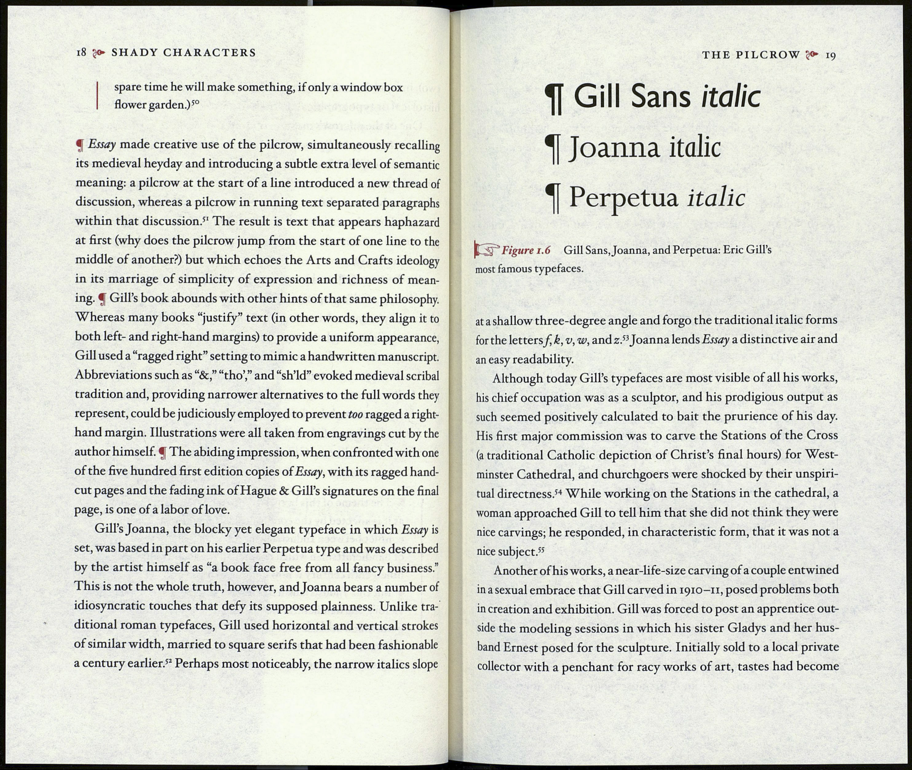
Gill Sans
Tf Joanna italic
Tf Perpetua
Figure 1.6 Gill Sans, Joanna, and Perpetua: Eric Gill’s
most famous typefaces.
at a shallow three-degree angle and forgo the traditional italic forms
for the letters/ k, v, w, and z.53 Joanna lends Essay a distinctive air and
an easy readability.
Although today Gill’s typefaces are most visible of all his works,
his chief occupation was as a sculptor, and his prodigious output as
such seemed positively calculated to bait the prurience of his day.
His first major commission was to carve the Stations of the Cross
(a traditional Catholic depiction of Christ’s final hours) for West¬
minster Cathedral, and churchgoers were shocked by their unspiri¬
tual directness.54 While working on the Stations in the cathedral, a
woman approached Gill to tell him that she did not think they were
nice carvings; he responded, in characteristic form, that it was not a
nice subject.55
Another of his works, a near-life-size carving of a couple entwined
in a sexual embrace that Gill carved in 1910-11, posed problems both
in creation and exhibition. Gill was forced to post an apprentice out¬
side the modeling sessions in which his sister Gladys and her hus¬
band Ernest posed for the sculpture. Initially sold to a local private
collector with a penchant for racy works of art, tastes had become
