i8z ?o* SHADY CHARACTERS
«'Ö Ahi m
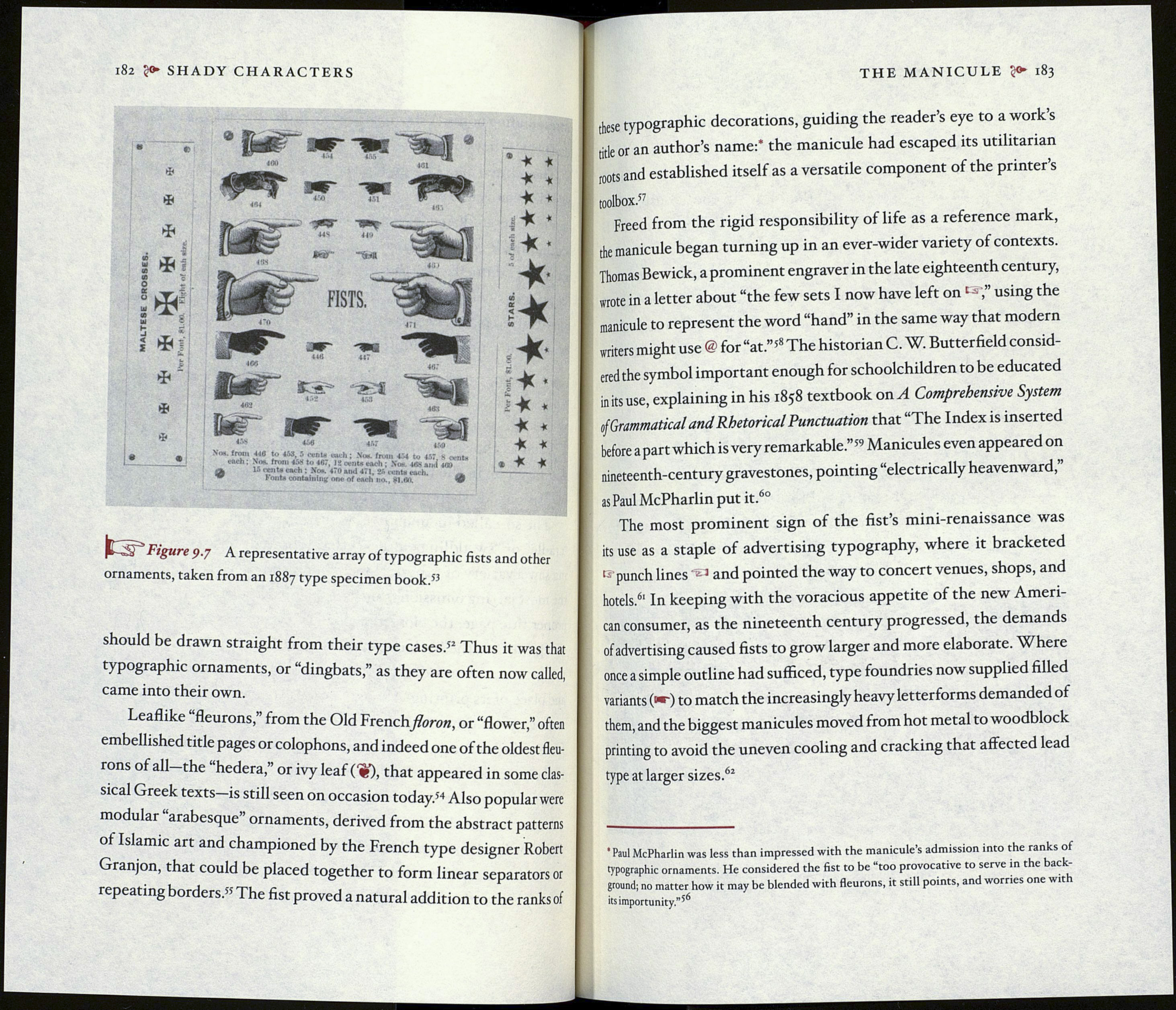
440 to 469 5 (X'DU euch ; Noe. from 4'4 to 457. 8 «
No*, from 458 to 407, J2 ovnt# each ; Хан. 4Й8 ami 4/S)
15 cent* each : No«. 470 and 471, 25 cent* each.
Fou ta containing one of each no., 81.00.
t-S" FiSure 9-7 A representative array of typographic fists and other
ornaments, taken from an 1887 type specimen book.5^
should be drawn straight from their type cases.52 Thus it was that
typographic ornaments, or “dingbats,” as they are often now called,
came into their own.
Leaflike “fleurons,” from the Old French flor on, or “flower,” often
embellished title pages or colophons, and indeed one of the oldest fleu¬
rons of all the “hederá,” or ivy leaf (W), that appeared in some clas¬
sical Greek texts is still seen on occasion today.54 Also popular were
modular arabesque ornaments, derived from the abstract patterns
of Islamic art and championed by the French type designer Robert
Granjon, that could be placed together to form linear separators or
repeating borders.55 The fist proved a natural addition to the ranks of
THE MANICULE ?<► 183
these typographic decorations, guiding the reader’s eye to a work’s
title or an author’s name:* the manicule had escaped its utilitarian
toots and established itself as a versatile component of the printer’s
toolbox.57
Freed from the rigid responsibility of life as a reference mark,
the manicule began turning up in an ever-wider variety of contexts.
Thomas Bewick, a prominent engraver in the late eighteenth century,
wrote in a letter about “the few sets I now have left onc ,” using the
manicule to represent the word “hand” in the same way that modern
writers might use @ for “at.”58 The historian C. W. Butterfield consid¬
ered the symbol important enough for schoolchildren to be educated
in its use, explaining in his 1858 textbook on A Comprehensive System
ofGrammatical and Rhetorical Punctuation that “The Index is inserted
before apart which is very remarkable.”’9 Manicules even appeared on
nineteenth-century gravestones, pointing “electrically heavenward,
as Paul McPharlin put it.60
The most prominent sign of the fist’s mini-renaissance was
its use as a staple of advertising typography, where it bracketed
i- punch lines J and pointed the way to concert venues, shops, and
hotels.6' In keeping with the voracious appetite of the new Ameri¬
can consumer, as the nineteenth century progressed, the demands
of advertising caused fists to grow larger and more elaborate. Where
once a simple outline had sufficed, type foundries now supplied filled
variants (°«~) to match the increasingly heavy letterforms demanded of
them, and the biggest manicules moved from hot metal to woodblock
printing to avoid the uneven cooling and cracking that affected lead
type at larger sizes.62
• Paul McPharlin was less than impressed with the manicule’s admission into the ranks of
typographic ornaments. He considered the fist to be “too provocative to serve in the back¬
ground; no matter how it may be blended with fleurons, it still points, and worries one wit
its importunity.”56
