154
DRAWING LETTERS THE LESLIE CABARGA WAY
METHOD TWO: Parts Department
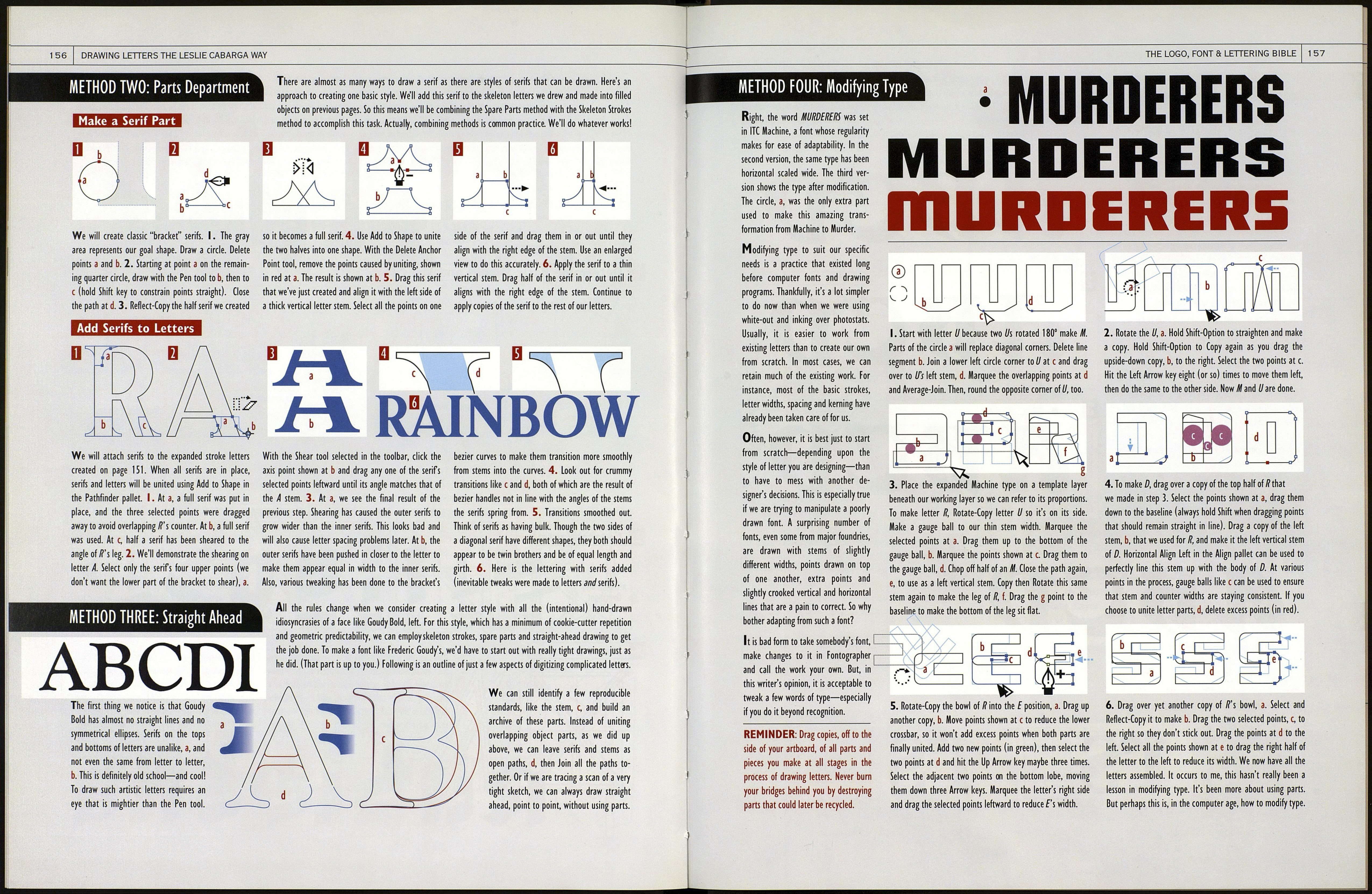
With this method, we draw an archive of "parts" and combine them to build all the letters in an alphabet.
Usually, these parts will apply to only 90 percent of our letterforms, after which we must create additional parts
as we go along. Since consistency in lettering is our goal, the best way to achieve it is to use an archive of parts.
My font Magneto Bold is a
perfect example of the use of
spare parts in constructing an
alphabet. Of course, it is a font
designed to be predictably re¬
petitive and so lends itself well
to the parts treatment. At right
are the nine basic parts used to
construct all the lowercase
letters. One-of-a-kind parts are
shown in black. The uppercase
required its own slightly more
extensive set of parts.
OL Li M.
9
II
tua»*.
Konstruct It Like Koch
Rudolf Koch was hip to the parts idea. These
aufbauzeichnungen, or construction drawings,
for his font Kabel show the seven "systems" he
devised, based on the four divisions of the
square, to create this uppercase alphabet. We
take sans-serif fonts so for granted, it's hard to
believe that when such fonts as Kabel began to
come to America from Germany in the 1920s,
many printers considered them a type heresy.
==
A
THE LOGO, FONT & LETTERING BIBLE
155
j/ \ from an idle musing that produced this sketch of an r, I create as few parts as possible and hope they'll work with as many letters as
^ч Л left, I was inspired to design the alphabet below. It is a possible. Then I compose the parts into letters, nipping and tucking as I go along.
\ <ло J complicated style that, due to the angled bottoms of the The final letterforms, some of which are seen at the bottom of the page, are always
\ V^_^ letters and rounded corners, is especially difficult to draw, affected by how the parts come out. We discover that certain shapes that seemed
------S Because I like to go right to computer instead of working viable in the sketch don't work in reality. This alphabet won't be completed here,
from tight, measured sketches, I must first choose the best portions of the best but you can see it beginning to evolve. Plenty of tweaking comes next. Practically
letters in my sketcìì to^e/eTraine/blsie^hapes and sizes for my parts archive. Next, speaking, this style is toounusual so if it were a font, sales would be limited.
Determine Basic Shapes and Sizes
x-Height and
Overshoot
Guides
Angle of
"Horizontal" Strokes
Stroke-
End-style
Secondary Thin Stem Dots for
Angle Width /and/
Make Letters
Now that the parts (at least the basic ones) are done, composited parts were selected, then Subtract From
it's time to make letters. I. Three parts of r have been Shape knocked out the counter to make the final r.
assembled. The tall counter part, a, will be used as a Below, more letters composed of parts. Weird shapes,
knockout. 2. Two parts united, b, with the Pathfinder especially within letters b, /and e, result from dragging
tool Add to Shape. 3. Three parts comprising the letter points out of the way when we're using only pieces of
shape have also been selected and united. 4. The two parts. The process is complex, but I know no other way.
ftdfelPAIUl
